William Geddes: A 360° Look at Photographer Constantly Redefining Life + Style
Some projects we’re asked to work on involve rethinking everything. Whatever was there before needs to go. Get rid of it — and fast. Yet, others are more subtle. They require a bit more time to get at the essence of what a brand is. That’s exactly the challenge that photographer William Geddes came to us with: to help him clarify brand/philosophy of all promotional materials.
According to William: “The environments in which we live, and the objects we choose to surround ourselves with reveal as much about our personalities as the actual pictures of us do. I photograph people, objects and environments. To me its all about Life + Style or Life/Style.”
Our 360° approach to branding presented an opportunity to let William’s work speak for itself to the right audience. 
Brand Identity
The first thing that was needed was a strong brand identity that would allow William stand out in the competitive lifestyle photography market. We knew that this mark would have to be flexible, as it would have to work in a variety of settings from the website, to the direct mail, emailer, blog and portfolio book.
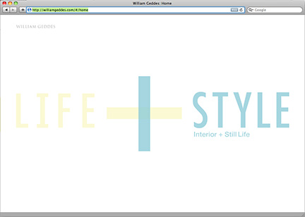
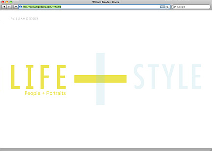
We decided that William’s main identifier would be the Life + Style message itself, focusing on the themes of his work — rather than his name. Within the logo, we sought to convey that Life means people + portraits, and Style means still life + interiors.
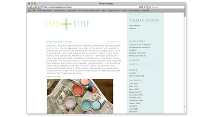
We created a clean and modern logo that works in a variety of settings. The plus sign became a bold graphic that is used as an informational element throughout the system.
Website
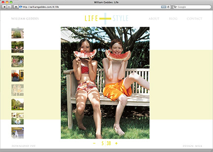
As the brand’s number one touchpoint, the website needed to display his images clearly while being easy to navigate. Additionally, it would have a dynamic backend with the ability to upload new content regularly.
We chose to make the two categories, Life and Style, the basis for the navigation and organization of the site. Based strongly upon our pre-established methods for crafting portfolio sites, we tailored the website to the needs of three different types of art browsers: those that love thumbnails, those that click on big imagery, and those that advance linearly via the arrows.
His blog was also brought up to date with the same identity, as well.
Direct Mail and Email Campaigns
In order to maximize William Geddes’s exposure, we decided to use a one-two punch strategy in which his direct mail is followed up with an emailer.
The direct mail campaign consists of four mailings, each with carefully chosen image pairings playing up a different aspect of Life + Style. The tangibility of well-designed direct mail pieces makes them memorable items that art directors often want to keep. With this in mind, we sought to make a piece that was to the point, displaying the photos as large as possible within the Life + Style messaging.
The direct mail presented a unique design challenge in that we had to display large images of both categories on the same card, while still adhering to mailing specifications. We decided to showcase Life images on the front and Style images on the back. Taking cues from the website, we deconstructed the plus sign into background stripes that are used to identify the category of each side. Knowing that this direct mail piece would soon be followed up with an emailer, we allowed the direct mail to reveal the visual part of the narrative, while the emailer’s written content reveals the full story behind the images.
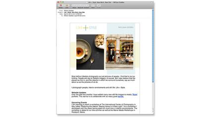
In order to maximize the amount of website traffic, the emailer is the follow-up to a direct mail campaign. As such, both the emailer and direct mail would contain the same promotional images. In addition, we chose to use an emailer service that would link to an existing database system, allowing him to reach people beyond his mailing list.
Potential clients would first receive the direct mail containing a Life image on the front and a Style image on the back. Given William Geddes’s expertise at shooting people and environments to tell a story, the text of the emailer reveals the narrative behind each of these featured images. Only after receiving the emailer would potential clients understand the full story behind the image pairing.
Portfolio
Although we live in a digital age, there is still a place for printed books on the art director’s table. After all, books are the only place where high-resolution imagery can be displayed, allowing viewers to see the nuances in the work. A printed portfolio book is still needed to sent out to potential clients. The book would have to be refined yet easily producible and cost-effective.
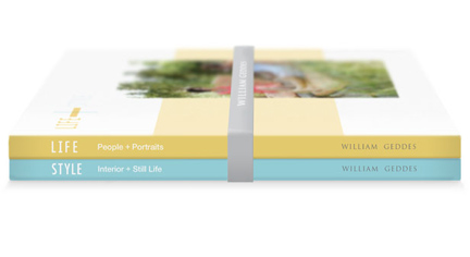
We chose to use an online service that allows anyone to upload files and get their books printed and bound. The solution is cost-effective because the books are printed digitally, and users can order one book at time. Aligning with the system that we set up, we split William’s portfolio into two books, Life and Style. These are combined into one package by having a rubber band imprinted with his name wrap around them. The solution is minimal and is meant to stand out among the overblown, high-production books of other photographers.
Taking cues from the website and direct mail, the covers of each of the books contain a large image that represents either of the two portfolio sections, Life or Style. These images sit on top of large background stripes that serve to define the book’s category. Additionally, we color-coded the spines according to each category, making it easy to quickly distinguish one book from the other.
Results
Perhaps William said it best himself, “I was looking for a way to bridge the gap in my two main sources of work: people and portraits with still life. MSLK’s design solutions, materials, and marketing support allowed me to effectively target to these two very different audiences with one clear message”
