MSLK’s Commentary on the 2010 ID Annual Design Review
For over 55 years, the I.D. Annual Design Review has recognized the best in graphic, environmental, product, and furniture design. We are very proud that MSLK’s own Sheri L Koetting has taken her place among a jury of the field’s leading practitioners. Her voice and sensibility played a large role in the winners chosen this year in the graphics category. Viewing everything through a lens of sustainability, Sheri not only examined the purpose and aesthetics of each piece, she questioned its material usage and life expectancy.
You can see all of the winning pieces on view now until September 10th at the AIGA National Design Center. Read more to view some of the winners and see what Sheri had to say about each of the pieces.
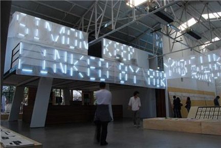
Best of Category – X Exhibition Space
“I appreciate the innovative use of light and type, as well as the way luminosity engages viewers throughout the project—from the exhibit’s interior to posters and lights mounted on outdoor fences.”
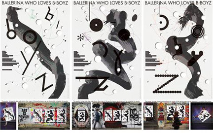
Design Distinction – Ballerina Who Loves B-Boyz
“I really love the die cuts that expose the walls and graffiti beneath. It’s a poster that engages with its environment”

Design Distinction – BOOKtiga 2009
“To me, the message and the medium are in perfect harmony. As designers, we’re so compelled to trash what we did last year and start over. Here they’re incorporating last year’s materials into this year’s campaign by literally painting over last year’s poster.”
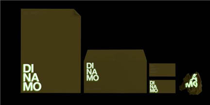
Design Distinction – Dinamo
“Designers often want to use special effects, but for a company that focuses on harnessing solar energy, glow-in-the-dark ink acts as a communication tool rather than a gimmick.”
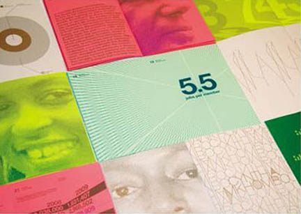
Design Distinction – Expansion in all Dimensions
“This tiny set of 5″ x 7″ booklets made me smile—the bright colors, the cover. I was expecting it to be a bunch of zines, so when it turned out to be a corporate report, I loved that juxtaposition.”

Design Distinction – Human Rights Watch 2009 Annual Report
“The handling of the information is incredibly compelling and drew me in. They’re successfully using information graphic to advocate their cause.
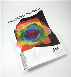
Design Distinction – Ring Roads of the World
“They’ve taken something people might not even think about—urban sprawl—and turned it into a design that’s beautiful and meaningful. Each layer of color here represents the relative size and shape of the ring road around American cities.

