LMCCE

Challenges
Larchmont Mamaroneck Center for Continuing Education had been distributing the same course catalog with a giant circle on the cover for the past ten years. Worse yet, the catalog design was juvenile, poorly showcasing the high-level education the program provided. The board sought to create a fresh design template that could be maintained in-house while attracting new, younger students.
Strategy
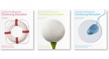
Although the board was willing to decommission their iconographic circle, MSLK found equity within the shape as an imperative legacy to the program’s heritage. To reassure older enrollees that LMCCE’s quality of education remained consistent, we recommended that the cover continue to employ a circular theme. Through photographs of circular objects relevant to the curriculum, the catalog could promote a course on each cover while keeping its identity.
Design
To accommodate the in-house director that would be working with these templates, MSLK utilized simple layouts that could easily accommodate flexible content. We further standardized a sophisticated color system that would distinguish each issue while maintaining the structure of the template.
Success
Upon launch of the redesign, there was a 30% increase in student enrollment and an overwhelming request for the course catalogs—depleting their supply, an unprecedented triumph for the school. In addition, MSLK’s design solution has been honored with an American Graphic Design Award by GD USA in 2004 and has been featured in numerous press publications.

