Enhancing the E-Commerce Shopping Experience with Rich Interactivity
Brands such as Gucci, Converse and Ikea are leading the pack in elevating the e-commerce experience by offering alternative and exciting ways to browse their product lines. They are fighting traditional notions of e-commerce— cluttered menus, heavy-handed ads, and dense product grids with web applications that allow for less linear, more memorable ways to shop online. The result is that users are spending more time on these sites, leading to greater brand recognition and increased sales.
As web design experts, we have identified three distinct user profiles on e-commerce sites:
1. Users who like to click on large images.
2. Users who explore the menus because they aren’t sure what they are looking for.
3. Users who know exactly what they want.
Adding more interactivity to your site will mostly target the big image clickers, and menu explorers, so it is still important to offer a more traditional navigation system as well. However, by having the more experiential system up front, it will be an inviting change, especially to new customers who need inspiration and aren’t yet familiar with your brand.
Let’s take a look at the navigational strategies the previously mentioned brands are using on their sites.
Gucci: Large Horizontal Scrolling Stage

Gucci’s site has a single big idea that makes the experience elegant and memorable. All of the products occur within a horizontal stage in the center, with backgrounds changing per section. Major categories such as “handbags” contain larger featured projects that occur in between grids of smaller products. Upon clicking on a product, you get an overlay with simple controls to add the product to your cart, see other views, share on social media platforms and print. The horizontal structure of the site also makes for a great swiping experience on smart devices.
Ikea: Virtual Showroom

I’m not suggesting that the overall design of this site is anything extraordinary. However, the interactive modules that are within the “Ideas & Inspiration” tab of each of the major sections are so enjoyable to browse that I just had to include it. The module expands to full screen and mimics the experience of the showroom in the store. Don’t we all love showrooms? Each room has a number of hotspots that allow you to zoom into the area and click to find out what products are being featured in the space. You can easily save the product to your list, see related products, and seamlessly return to browsing the rooms. If you have products that are meant to be arranged together, consider employing a similar strategy. Show the products in the context they are meant to be seen and inspire your followers.

Converse: Innovative Customized Experience

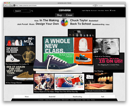
The converse site offers streamlined navigation, cool animation/transitional effects, and numerous ways to customize their product line, making each visit to the site a unique exploration. I love the homepage experience, which is an interesting take on traditional marketing sliders. A combination of products and brand building content- a variety of ads, posters, and videos, are highly reactive to mouse movement and arrange themselves into interesting collages. One of the most prominent filters on the homepage is the interactive color wheel, which brings up products, brand events and promotions that relate to the chosen color.
The top-level menu structure is extremely smart and minimal—users only have two choices, you can either “shop” or “create.” Under the shop menu option, you get a somewhat traditional method of navigating the products with a limited amount of filters. Under the “create” option, there is a rich internet application that allows you to customize the shoes. Clicking on a particular region of the shoe pulls up a contextual menu with options for colors, text etc. You can easily save your creations, add them to your cart and share on social media platforms.


