The “Times Square” of Websites
 New York Magazine recently redesigned their website, and I can’t say it’s for the better. At first glance it doesn’t look all that different—a bigger logo, bigger headers. But it quickly becomes apparent that the homepage has turned into a giant spew of information. It seems as though their approach to redesigning the website was to take every piece of information they could get their hands on and post it on the homepage. They’ve traded in their sophisticated-tabloid look for a so-overwhelming-I-don’t-remember-what-I-came-here-for-tabloid look. In the past, I’ve been a firm supporter of their design changes. They’ve rebuilt a magazine that was considered trashy tabloid journalism at best in the ’80s, to an iconic publication that feels fun and fresh, with great contributions from a range of design talent. All this while giving a design nod to their tabloid roots. Their website always seemed to manage the fine balance of showcasing fresh features on the homepage in an exciting way while still being easy to use and navigate (see a screenshot of the old site after the jump).
 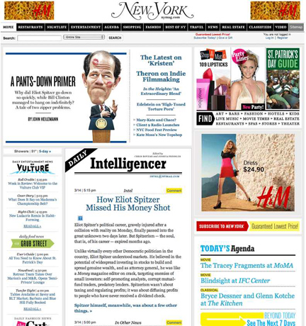 Don’t get me wrong, I like feeling like I have a world of information at my fingertips, but I need some sort of hierarchy. I’m going to take a guess that a visitor has at least 200 navigational options from the homepage. And from a design standpoint they haven’t provided any sort of clue as to what’s important. I frequently used the site for the database of information they have on every restaurant and bar in the city. I’d often visit the site for one reason, and end up reading a feature article or checking out something I hadn’t intended to. One might call this a success. So why the sudden information reconfiguration?
Want To See More Content About Award Winning Art + Design?
Stay up to date with expert information on the ever-evolving beauty industry. We share the best practices brands are using to connect with consumers in new and meaningful ways.
More Like This
Calling All Target Plastic Bags
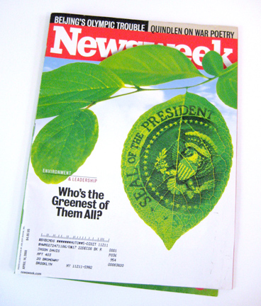
Target used Newsweek's green issue last week to offer a solution to some of the plastic bag waste they're responsible ...
NYC Soon to Pay for Plastic Bags?
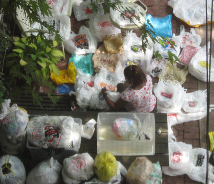
It seems that MSLK's awareness campaign to reduce plastic bag consumption is working...okay maybe we had nothing to with it, ...
Monday Coolness
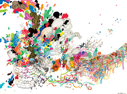
Artist Jen Stark creates some amazing sculptures from cut construction paper. She uses layers of paper, precisely cut, to make ...