MSLK Does Not Shift Towards Trends, We Set Them!
It’s interesting to see how brands either are leading or following visual trends, especially as technology impacts the media that brands are showcased. The old rules about logos (i.e. must exist as a black & white version for faxing, fewer colors for ease of printing) are being completely re-written in the digital age.
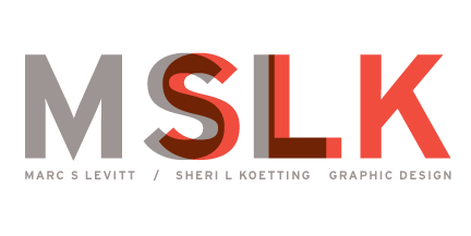
MSLK’s logo — the embodiment of our brand featuring overlapping initial of its founders “MSL” and “SLK” — was borne from the concept of wanting to showcase that the company is the overlapping of two initials, and talents. We experimented with a number of different ways to showcase this (different fonts, different sizes, etc.), and has existed intact for almost 14 years. The result still garners compliments from those who are being introduced to our brand.
I was reminded of this while looking through the latest issue of Graphic Design USA, as it featured logo trends from Logo Lounge, and it gave me a chuckle to see a trend they’ve identified as “Shift,” using examples of recent logos using a similar effect as the MSLK logo:
While these logos share the same visual trait of overlapping colors, none seem to have been done for any particular reason other than to add “pizazz” (my least favorite reason for anything.) Don’t get me wrong, they’re all very nice… but I’m not really sure of the significance of the overlapping “ones” in the One Journal Square logo. Is there more than one “one”? Or did it just look nice?
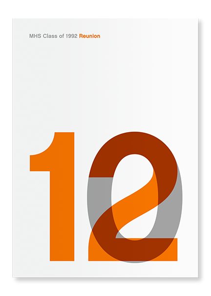
It also brought to mind another project we created for my high school reunion a few years ago. My good friend Mark was our class president, and didn’t realize that it was his duty to organize our first reunion. Time had passed, and our 10-year reunion was more likely to be a 12-year reunion. Rather than sweep this issue under the rug, it seems like perfect opportunity to embrace it.
Sheri and I found the solution again using the so-called “shift” technique, which in this case was more of an overlap:
This epitomizes the unique way MSLK approaches design: boil the problem down to its smallest part, and make the unique point the star of the show. As a result, we managed to turn this 2-year oversight into a selling point, rallying more people to turn out due to this “special” reunion.
It’s not about following what’s “hot” or the latest visual effect.
What your brand’s unique selling point? Are you exploiting it as well as you can?


