Print Promotions that Make a Lasting Impression

Marketers are constantly exploring novel ways to reach their customers. How can you get people to notice your brand, buy your product, join your organization, go to your event or become a sponsor? Whatever the case may be, the goal is always the same: reaching your audience in a meaningful way that captures their attention. While your online and social media presence is definitely the most important viral way to engage with your audience, a recent print promotion for the Type Directors Club reminded me of how powerful a unique, well-thought out print campaign can be. Perhaps there is still a bit of room in the marketplace for this type of work. Sometimes it’s exactly what’s needed to make people notice just how great your company or organization is.
So what makes for a spectacular print promotion? I’d say it’s a combination of a unique concept, thoughtful material selection, a healthy dose of graphic wit, and flawless execution. All of these elements should come together seamlessly to create something that people want to hold on to.
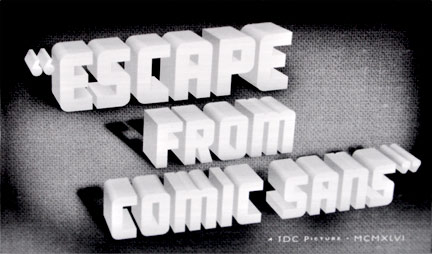
This direct mail piece does all of these things, and I am extremely enticed to join! In a series of six post-cards, the language of typography is placed within the context old movie posters, making for a charming and humorous promotion. The use of a unique metaphor makes the piece a quintessential example of graphic wit at its best. To finish it off, the postcards are wrapped in a printed vellum belly-band with Type Directors’ Club branding and imagery that reinforces the movie metaphor. I am keeping this!
Over the years, MSLK has created similar promotions that have made lasting impressions on our clients and their audiences. Here is a quick tour of four award-winning pieces that you should check out on our site:
Kristine Foley Direct Mail Campaign

Kristine Foley, an emerging garden and landscape photographer, was looking for a direct mail campaign that would connect her with art buyers at Martha Stewart Living, Real Simple, and Better Homes & Garden. Learn how we created an eye-catching, low cost promotion by capitalizing on a garden metaphor.
View Project>>
MHS Reunion Invite

Mamaroneck High School’s class of 1992 was two years too late in planning their 10-year reunion. Discover how we exploited this situation to create a compelling and humorous invitation.
View Project>>
Christian Press Kit

Emerging installation artist Christian Grattan needed to establish himself and promote his first interactive exhibit entitled Tom Welling in a Swimsuit. Find out how we created a multi-component interactive press kit that generated buzz around this event.
View Project>>
Redken Elite Color Invitation

Leading hair care brand, Redken 5th Avenue NYC, was looking to recruit members for their Elite Color Product Testing Team. Learn how we used unique materials to reinforce both the theme of color and confidential nature of the team.
View Project>>
//Ryan Nussbaum


