Use the 20-10-5-1 Analysis to Evaluate Your Packaging

Most packaging projects pose the same marketing and design challenge: How do you present a large amount of information within a small area, while simultaneously conveying your brand’s voice?
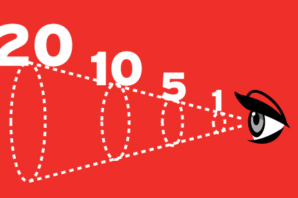
We know you have many stories you want to tell, such as your brand’s core messages, the product’s purpose, ingredients etc. Since you have limited time to engage with consumers, it’s important to eliminate the extraneous and be clear about the hierarchy of elements. It’s all about balancing branding with information design. The brand is the macro story and is the first thing that should be noticed about the package. Following that should be the purpose, and the micro stories which could include benefits, ingredients, technologies etc. MSLK has found that the best way to examine these issues is by playing the role of the consumer in the retail space. What do I see when I’m 20 ft from the package vs. 10 ft vs. 5 ft vs. 1 ft?
At 20 feet you should notice the brand. What are the colors and graphics that are within your brand’s vocabulary? These must be used in the boldest way possible, so your package can be noticed from across the room. Studies have shown that color is the first thing to be noticed about a product, so it is vital that your brand have a color palette that can be used consistently across the range of products you produce.
At 10 feet the imagery and biggest, boldest type should become recognizable. This could convey the product’s purpose and/or that it is a part of a specific line or category within the brand.
At 5 Feet you should understand what the product does. What is its primary use and what can it do for me? Usually product uses are conveyed through imagery and/or with bold typographic statements. Consumers definitely want to have a sense as to what the product is for without having to go over and pick up the package.
At 1 foot you should notice tertiary levels of information. The product is a particular flavor, or contains a specific technology or special ingredient. Micro stories such as these should be shown in the simplest way on the front, while the back should be used for more in-depth explanations of these items. All of the details such as the copy, icons etc. matter at this level, allowing for easy comparison with other products.
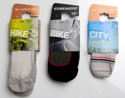
Icebreaker’s sock packaging is a good example to illustrate this concept.

Although the packaging is a bit generic, it is definitely successful in grabbing my attention from across the room. The background mood imagery is the first thing that you see, and communicates where the product can be used by showing setting. The imagery becomes the Icebreaker brand itself as the logo is relatively unimportant. As you get closer, you can read the bold type, which states the activity, and when you get very close, you can see information about it’s construction.
So the next time you think about your packaging, use the 20-10-5-1 analysis. Is your product performing as well as it could? Is the package in need of a re-design?

