Paper Promotions Look to Paper For Inspiration
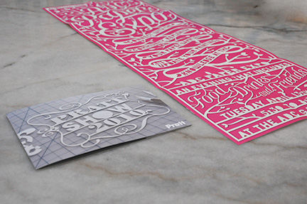 Two direct mail promotions ended up in our mailbox. One a poster whose message revealed itself when opened, the other a had its concept on the outside. Both appeared similar at first glance, yet a closer look revealed two different techniques. However, one seemed to be more effective.
  Art Directors Club Paper Expo Poster This is a paper promotion using paper to promote a trade show showing (you guessed it…) paper. I have always look forward to receiving these promotions, as every designer who steps up to the plate has usually has a fascinating solution to such a seemingly simple challenge.
  This year was no exception, with a very large vertical format using beautifully ornate, filigreed typography that looked like it was hand-cut out of a single piece of paper. Upon closer inspection, it seemed unlikely to be the case — I figure this to be a computer-based illustration, using a drop-shadow effect to give this more visual depth. – – –
  Pratt Show 2010 Promotional Mailer Arriving a day later was a literal version of the ADC poster. Using the same sort of style of über-fancy frilly fonts, the design for this promotion exists to showcase the delicate handwork involved. The end result is a photograph of the designer’s handwork on a cutting board, replete with the X-Acto knife off the the side, along with the negative forms in a carefully assembled, tidy pile. So which one is the winner here? Well, for one, there’s no need to, really, to determine a winner. They’re two different solutions to two different design problems. Hats off to both designers, I really haven’t a bad thing to say in either case. Yet, I’m still drawn more to the Pratt promotion. While incredibly self-conscious in its execution, I like that it’s showing of the design process itself — a fitting theme for student work. Yet I continued to wonder…
Would the ADC poster have been better if it had been hand cut?
Does the extra effort involved in cutting something out count for more than simply using the computer?
Is the the Pratt promotion really a better design, or am I letting the effort I assume to be involved influence my idea of design?
I then continued to think more about the Pratt piece:
What if the designer didn’t cut this out themselves?
Perhaps I would think less of them as a result.
And if they’d used a modern technology like laser-cutting… would that have been better or worse?
Yes, I am indeed a design-freak. Mind you, nothing passes through the studio here without the same sort of scrutiny. My point here is that design can — and needs to — be thought about from many angles. It’s never about things that only you find interesting, rather it’s the things that others will be intrigued by, and making sure the concept clarifies the message. Regardless of all my pondering, I would encourage everyone to check both out events: Art Directors Club Tuesday April 13, 2010 5:30-8:30 pm @ ADC Gallery 106 West 29th Street, NYC ADC Members Free with RSVP APC, SPD, TDC Members $5.00 Non-Members $10.00 Pratt Show 2010 May 11 – May 14 Manhattan Center 311 West 34th Street New York, New York Reception for Industry Professionals, 6-9pm, May 11th
Want To See More Content About Award Winning Art + Design?
Stay up to date with expert information on the ever-evolving beauty industry. We share the best practices brands are using to connect with consumers in new and meaningful ways.
More Like This

A Better Reusable Bag
Last week I was in Italy for a wedding, and I noticed this reusable grocery bag in a supermarket. (They've ...

It’s Tru, A Fantasy Brand Comes to Life
On July 25th the Tru Beverage Company announced that they will be bringing the fictitious beverage Tru Blood to a ...
One Cold Hand
Last week my mom sent me a newspaper clipping about a woman in Pittsburgh dedicated to reuniting lost gloves and ...