Portfolio Websites: Catering to 3 Different Users
MSLK has had the pleasure of crafting engaging portfolio websites for many artists and artist representatives. The process of hiring creative talent has certainly changed in recent years. Physical books are still wonderful tools to solidify an engagement — once you’ve been short listed for a job, but reviewing printed portfolios has become few and far between. Websites have become the number one sales tool for any business, even creative individuals.
Creative websites needs to grab the attention of busy individuals, place emphasis on the work itself and be easy to navigate. The easier your site is for viewers to use, the more of your work they’ll actually see. Experience has shown that users absorb information in different ways, so it is important to implement multiple methods of navigation into your site in order to tailor to the needs of all user types.
Here at MSLK we’ve identified three unique types of viewers on portfolio sites.
1. Users who are drawn to and click on imagery.
People love pretty pictures. Those who aren’t sure exactly what they want are certain to be swayed by a cool image. Hoping to see more of “that” they’ll surely click on your compelling images again and again. People also naturally gravitate towards clicking on the largest thing on the page. If that’s your imagery, better make sure it is a link to something, hopefully the next image in your book.
2. Users who scroll and click on thumbnails.
In contrast some users know exactly what they want. They aren’t in the mood to be taken on an extended journey through your work. They are more interested in an overall survey and will jump in where they see appropriate. Thumbnails or preview images are very useful for these users. They want to know what’s in store for them before they click.
3. Users who are click happy
Some users dive into your book and then want to plow through it as quickly as possible. These users love to keep their mouse in one spot and will keep clicking till either they’ve seen everything or you frustrate them into leaving. What frustrates these users? Navigation that moves and jumps all around the page. These users don’t want to have to keep searching for your forward and backward arrows, they want to keep their mouse in one place.
The name of the game is to keep users engaged in your site and make your work easily accessible. Every portfolio site should have multiple methods of navigating the same content in anticipation of the needs of each of these core types of users.
Below are some examples of portfolio sites MSLK has created, all of which follow these strategies.

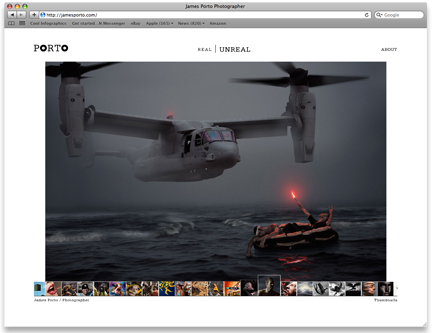
James Porto
Find out how MSLK translated a comprehensive brand repositioning into an intuitive site that has increased leads for photo illustrator and conceptual photographer, James Porto. View project>>

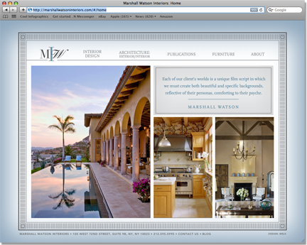
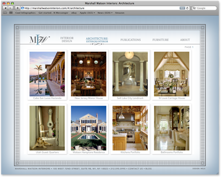
Marshall Watson
Discover how we created a strong online brand presence for this leading interior design firm. View project>>

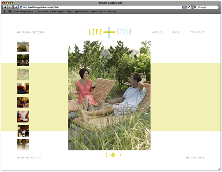
William Geddes
Learn how our bold and elegantly designed site for lifestyle photographer William Geddes has helped him build relationships with art directors across the county. View project>>


