Mini Cooper Zig Zags With Its Target Market
Here’s how you know that your branding is great: when it is so distinct that you can do something innovative and connect with your target audience without leaving an actual “mark” anywhere.
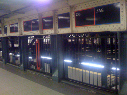
Such is the case with these subway ads for Mini Cooper. As I wandered through the 14th Street/Union Square subway station the other night I noticed that every ad space contained the same simple message, “Zig, Zag.” This may not resonate well in print, but if you are a busy New Yorker rushing through a crowded subway station you know that the art of weaving through the masses at a generous clip is pretty analogous to the handling you’d expect in a tiny sports car.
Now a nervous advertiser might get concerned that I’d confuse this ad as a promotion for Zig Zag the rolling paper company, but a smart one knows I’m not that stupid. I get it….Mini I know it’s you, telling me I should be driving my car rather than waiting 20 minutes for the train at 2 am.

You should also know that no where in the entire station could I find an actual reference to Mini Cooper. No logo, no photo of a car, just the words “Zig” and “Zag”. So…how did I know? Because Mini knows its target audience. They know we frequent the East Village and they know that we will be intrigued enough to think, “Hmm, all black background with white type set in all caps, minimal use of red/blue, how could it not be Mini.” Their graphic branding system is so simple it doesn’t take much to “get it.”
The real art is how they apply these simple graphic tools—the perfect combination of unique applications and clever copy that never ceases to amaze and inspire me. How could a designer, in love with a designer car, possibly ask for more?