Berkshire Hosiery: Marble Packaging
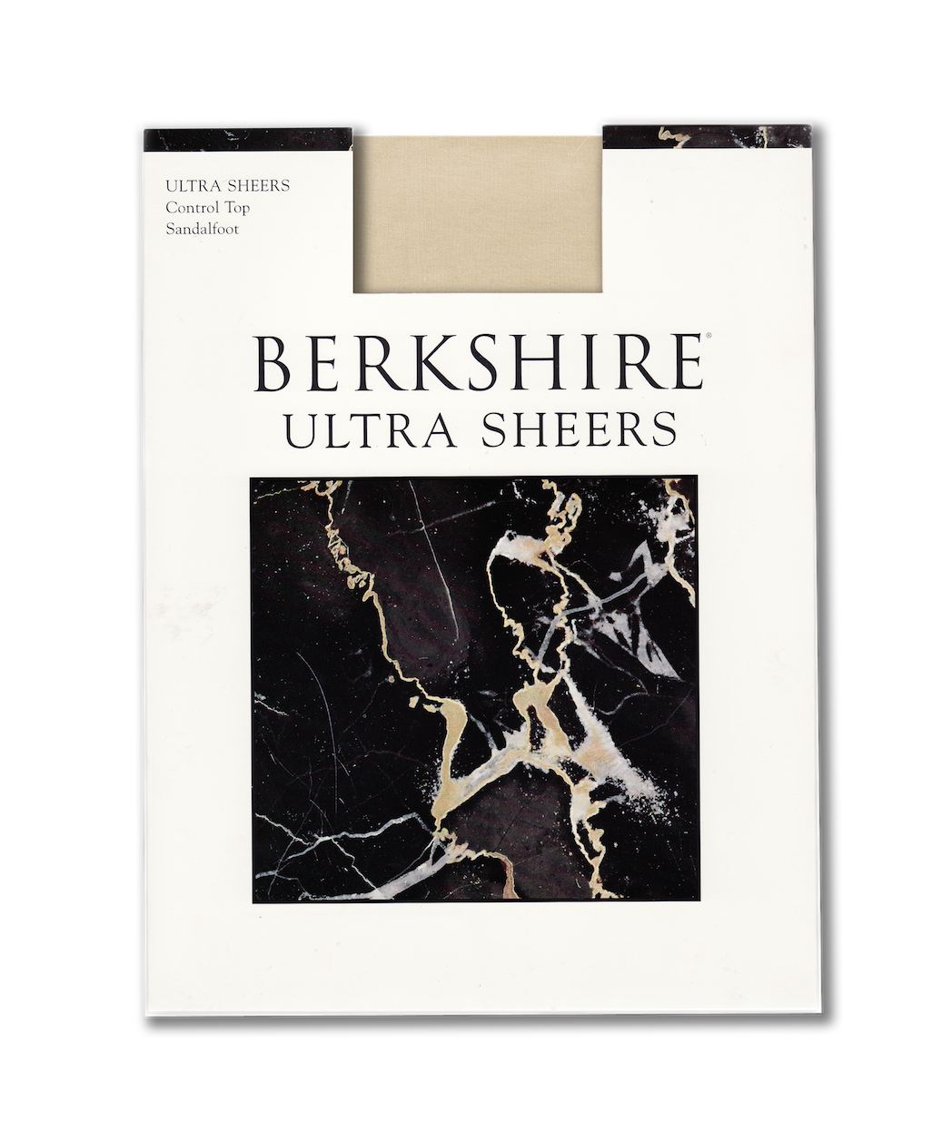 Challenges The family-owned Mayer Berkshire Corporation had been selling their hosiery in the same marble-themed packaging for 25 years. Over time, the varied typography created an inconsistent brand identity and the need for a fresh new look was imminent. The challenge was to create a design solution that would make them current without triggering a store buy-back, or worse yet, confuse their aging, loyal customers. Strategy Customers associated the marble pattern that Berkshire identified with as a symbol of quality. Rather than change their brand iconography, MSLK sought to create a more consistent brand identity that would be classically Berkshire yet appear fresh. Design MSLK began by refining the logo and typography in order to bring the Berkshire brand first and foremost. Our straightforward and simple layout allowed the marble texture to become a package identifier rather than a heavy overall pattern. Lastly, our subtle shift from an off-white paper stock to a bright white for the packaging instantly breathed new life into the brand. Success MSLK’s design solution paved the way for an effortless transition between the old and new packaging. These redesigned packages are currently sold in major department stores and continue to display a fresh-from-the-factory quality on retail shelve.
Want To See More Content About Things We Love?
Stay up to date with expert information on the ever-evolving beauty industry. We share the best practices brands are using to connect with consumers in new and meaningful ways.
More Like This

The Good, The Bad, The Ugly. And The Useless.
I was recently thinking about the "stuff" we surround ourselves with, and the degree to which good design plays ...
The Secret to Abandoning Bottled Water is Convenience
Twelve months after resolving to give up bottled water I can safely say my days of drinking bottled water are ...

So Long, Farewell, auf Wiedersehen, Goodbye
Tis the finale, one of MSLK's favorite art collaboratives, Flux Factory, is leaving us. And while it is not the ...