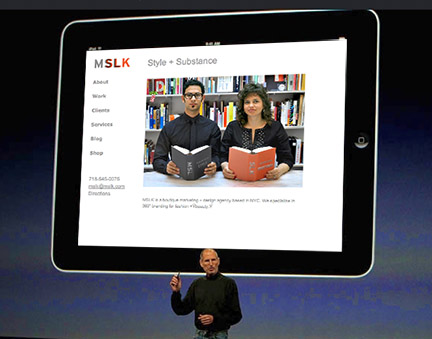
How to Get Flash Sites to Mobile Platforms Without Giving Up On Design
These days many people are visiting websites from their mobile devices. As we become as completely untethered and free to roam the internet at will, customers are checking emails and Googling key phrases as soon as the mood strikes.
Is your website ready for their call?
Apple’s iPhone captures the largest percentage of mobile users, and with the launch of the latest iPhone and iPad, we can only expect those numbers to increase. What does that mean for you? It means that any Flash technology on your website won’t be visible on a mobile device. To read my previous thoughts on why Apple isn’t playing friendly with Flash you can read this article here.
MSLK has been feeling the effects of new challenge for a few years now, and as a result we’ve come to limit our use of Flash on websites. However, when it comes to movement, effects, and a seamless control of the design experience nothing compares to Flash.
It’s ironic that Steve Jobs calls the iPhone the “ultimate web viewing experience yet it cannot handle many of the best online experiences created to date.
There’s new technologies on the rise like HTML5 and JQuery which promise to take some of Flash’s… well, flash, and bring it to the mobile realm. Another option is to develop a mobile-friendly version with content and design specifically tailored to the platform. That’s exactly what we did by developing an alternate site which has the ability to detect which browser you’re on (Safari, Chrome, etc) and it automatically redirects to the mobile.mslk.com address.
This mobile site is not a mere translation of our main site. Rather, it’s optimized for touch screens by having large buttons for easy navigation, and simplified content.
Instead of getting mad, we got even better. Have a look on an Apple — or any — mobile device!


