Final Verdict: New Tropicana Branding is a Lemon
I realize that picking on Tropicana’s ill-fated new branding has become as common as picking on AIG’s improperly compensated managers. However, I’m choosing to lambaste Tropicana here not because of aesthetics, but because of their incredibly poor and inconsistent graphic system.
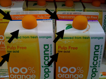
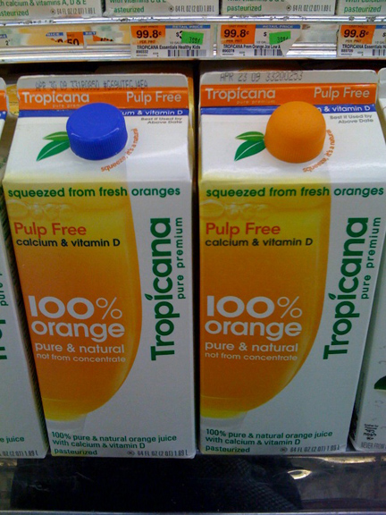
I was just in the supermarket today trying to buy some orange juice, and became totally confused. One box had the much-hyped orange cap, while another had a squarish blue cap. Okay, that’s understandable. However, their color system was totally out of whack: A blue band for “Low Acid” and then a purple band also for “Low Acid.” To further add confusion, one of the boxes featured a leaf next to the orange cap, the other didn’t.
Am I just being a nitpicky designer here?
No. In fact, I was simply trying to understand a new system as a consumer, and I found myself utterly confused. While I might concede that a simple orange juice purchase is far more involved than it should be (pulp, no pulp, some pulp, lots of pulp, no pulp with vitamin C and vitamin D, some pulp with vitamin C and vitamin D, low acid, etc) — a graphic system which is poorly thought out, and rife with errors from such a high-profile brand is totally unacceptable.
I don’t fault Tropicana for the fact that they took a risk with the new branding — even if it turned out poorly. However, not taking the time to properly flesh-out the system to eliminate confusion is a serious error which is just inexcusable.


