How to Effectively Present Your Rebrand to the Public

Everyone’s a critic. Over the years, graphic design has become more mainstream. And as more people have become more aware of design, more people have become quick to judge and criticize any change in a well known corporate brand. Because of this, it’s not unheard of for a brand to change their look and then have a public backlash force them to change it back and pretend nothing ever happened (Think Gap and Tropicana). Of course, it’s impossible to make everyone happy, but with so many people responding to rebrands, selling a new look to the public is starting to become a crucial part of the rebranding process.
Starbucks and Comedy Central were both given an overhaul recently and are very good examples of this. While they are two vastly different companies, what they do have in common is that both of the companies took the time to present these rebrands in a way that says, “Yes, we did change our look, and we are going to show you why this is a change in the right direction.”

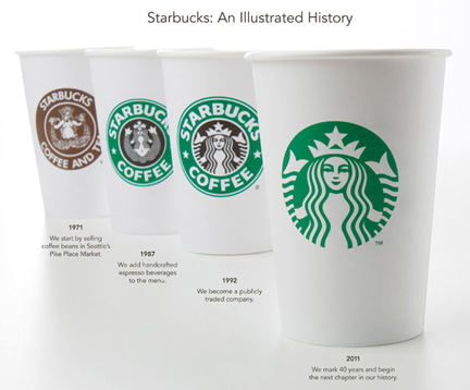
First let’s take a look at Starbucks. It’s hard to find anybody that isn’t at least somewhat familiar with the logo, and as a company who had the same look for nearly twenty years, any change isn’t going to go unnoticed. Their new logo, I believe, is just different enough. It’s simpler, but every bit as recognizable as it was before. But just incase you weren’t convinced that this was a step in the right direction, Starbucks also launched a short video of CEO Howard Shultz explaining the new look.
http://vimeo.com/18477169
As a former barista, I am aware that using a video to announce any change is something Starbucks does frequently so it is no surprise that this was done for the rebrand as well. The format is always similar. Howard will explain how a change relates to Starbucks’ past, why they are doing it now, how it will help position them for the future, and how Starbucks is still all about the coffee. The video shows that Starbucks knows how they want to present themselves. It definitely doesn’t hurt that the new logo is beautiful as well.

Comedy Central’s new logo is definitely a more drastic change. I, for one, think that the simple look is a welcome change, but not everyone has been immediately on board with the new mark. Most people think that it looks too much like the copyright symbol or that is simply boring. But like Starbucks, Comedy Central made the move of presenting the new logo with a video reel, and it’s hard to deny that the video is expertly done. The video not only literally states, “Yes, our logo has changed and It works way f**king better,” but it shows you how the logo moves, changes, punctuates, and vomits (towards the end and it is fantastic). It’s brilliant, and it works. One fellow employee wasn’t a fan of the logo until he watched the video reel.
http://vimeo.com/17695336
In addition to the videos, both brands used imagery to show the progression from the old logo to the new logo. Starbucks effectively demonstrates how the siren has progressed to its sleek new look. Comedy Central (whose change is far more drastic) depicts the change in an appropriate more humorous light, which can be seen in the image above. It’s very clear that both of these brands know what they’re doing. With such effective videos, the added imagery is just icing on the cake.
Using a video to present a new identity is a smart move. Especially with bigger brands, it’s impossible for a brand to change their whole look without people noticing, and not everybody is going to welcome the change. It’s easy for people to criticize, but it’s not easy for everyone to think like a designer. A video may not make everyone love the new look, but it can definitely help people understand WHY a change was made and WHY it works.
-Cristina Gomez

