AIGA: Justified
![]()
The AIGA is the oldest and largest professional organization for design whose design competitions have always been well-regarded. Recently, they needed to reclaim their relevancy amongst a slew of newer competitions, diluting the AIGA’s efforts. In an effort to emphasize design thinking and strategy, they sought to merge all of their design competitions into one, which would recognize visual design solutions as well as written case studies. Our directive was to position this recognition with the gravitas that it truly deserved.
1. Challenge
After MSLK won two “Making the Case” Awards in 2011, the AIGA — the Professional Association for Design — believed we were uniquely qualified to redesign the competition branding and promotion. This request came at a crucial time, as “Making the Case” was set to become the sole competition of America’s oldest and most prestigious organization. Upon receiving the design brief, we found ourselves questioning the name “Making the Case,” a phrase commonly associated with business student competitions. In order for the AIGA to gain the widest recognition for this competition, it was crucial that the theme resonate not only with designers, but with clients. MSLK believed that true success would be to elevate the status of this award to that of a Grammy or Oscar.
2. Strategy
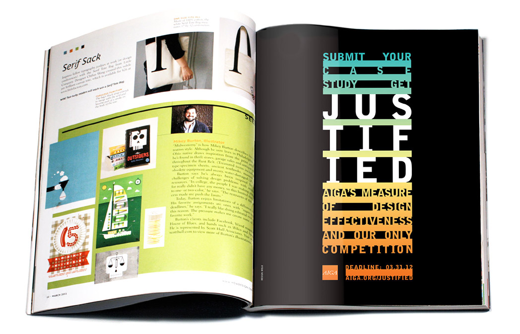
We began with a brand audit and competitive analysis to help the AIGA reaffirm their positioning among their competitors. We then presented a creative brief with several targeted design directions and corresponding naming options. Each direction dialed up a unique angle, tone of voice, and value that the competition could bring. After a thorough investigation, we decided to use a common industry term, “Justified.” Besides the literal reference to design and typography, Justified also communicated that entrants would need to justify their design solutions with a written case study— a feature unique to this competition.
3. Design
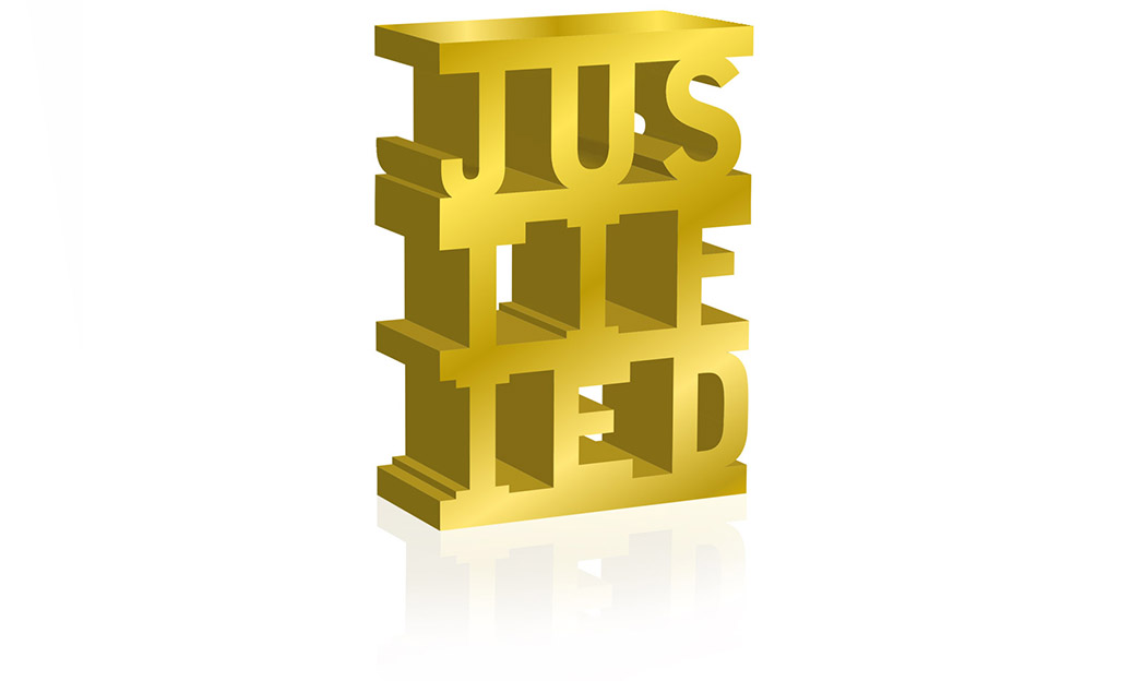
There were numerous requirements to satisfy. The design would have to stand among other attention-getting visuals in design magazines and on design websites. In addition, the identity would need to be flexible, able to accommodate a variety of different formats — from vertical magazine ads to horizontal web banners, and small icons. Our solution is a modern take on the graphic work that came out of the Wiener Werkstätte (Vienna Workshop) at the turn of the 20th century. Brightly colored, force-justified stacks of typography in between bars on a black background create a bold presence on the page. The shorthand identity is the 9 letters of “Justified” broken into three rows in between bars.
4. Success
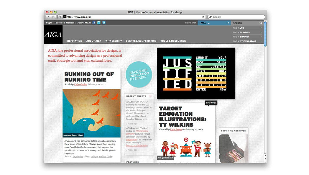
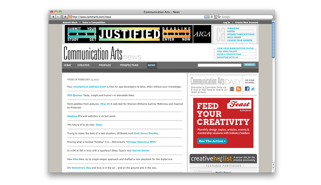
The identity has made its way into design publications such as HOW and Print, and across the web on Creative Hotlist, Communication Arts, and on the popular AIGA website itself. Our solution was cost-effective, as the AIGA no longer needs to rebrand multiple competitions each year as they have done in the past. The mark we created allows the AIGA, designers, and their clients to proudly showcase that their investment in good design and strategy was truly “Justified.”