Dear MTA,
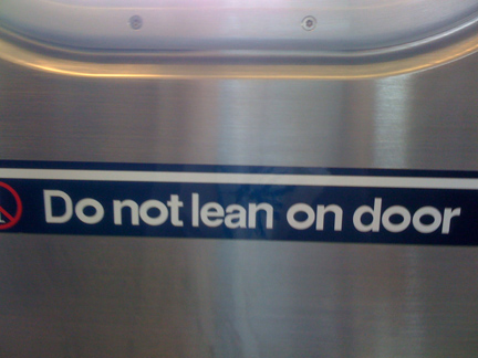 Why do you choose to torture the graphic designers of New York with the crazy “O”s in the signage on your N/W trains? Do you think this is funny? Are you laughing in the face of a system many have heralded as a design masterpiece? Did you simply replace the carefully chosen Helvetica Bold “O”s with something more standard (Arial, per se)? Or did you go a step further and rotate each letter so it sits on its side? We demand (properly typeset) answers! Frustratingly Yours, The Designers of New York City
Want To See More Content About Award Winning Art + Design?
Stay up to date with expert information on the ever-evolving beauty industry. We share the best practices brands are using to connect with consumers in new and meaningful ways.
More Like This

Sparkle Collagen 360° Branding Case Study
http://vimeo.com/143639410 MSLK just launched our newest case study video for Sparkle Collagen, an ingestible beauty brand. Sparkle is consumed as a ...
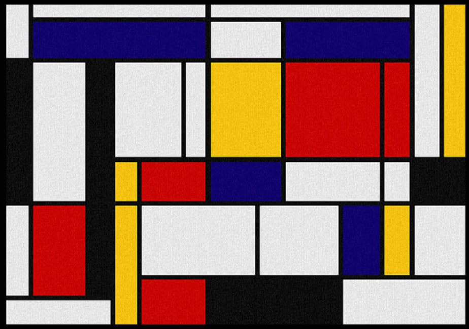
Mondrian Compostion With JavaScript
This website is amazing: http://www.compositionwithjavascript.com/ It's an interactive work based on artist Piet Mondrian's “Composition with Yellow, Red, Black, Blue ...
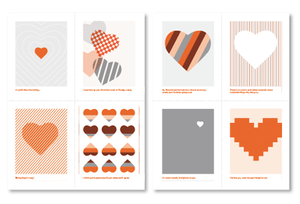
Spread the Valentine’s Day Love
Ahh, the day of love has arrived! Did you forget to make cards for your friends and lovers? No worries. ...