MSLK Designs Identity for AIGA’s 2012 Competition: Justified
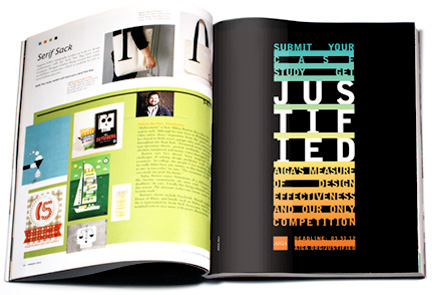
We are honored that the AIGA approached us to create the branding program for their new one and only design competition, Justified. Justified seeks examples of great design with proven track records vis a vis case studies that demonstrate how design has created value for clients and/or society. The landscape of design competitions has changed, and the AIGA is at the forefront, awarding those projects where design has produced measurable results. Read more to get a behind the scenes of our process in crafting this identity.
Challenge
After MSLK won two “Making the Case” Awards in 2011, AIGA, the Professional Association for Design, felt we were uniquely qualified to create a new identity for this year’s competition. Upon receiving the design brief, we found ourselves questioning the fundamental theme of “Making the Case,” down to the name itself. In order for the AIGA to gain the widest recognition for this competition, it was crucial that the theme resonate not only with designers, but with clients. MSLK redefined the challenge by elevating the competition to that of an Emmy or Oscar.
Strategy
We began by researching a variety of awards and competitions, categorizing them, and developing viable names within each category. This exercise was crucial in helping the AIGA determine the competition’s positioning. After a thorough investigation, we decided that it would be most effective to use a common industry term, “Justified.” As a word, Justified has a number of connotations, all relevant:
1. Entrants would need to justify their work through a written case study
2. Entrants seeking justification from your peers and by the AIGA
3. Justified type, which refers to the alignment of words in a column of text.
Design
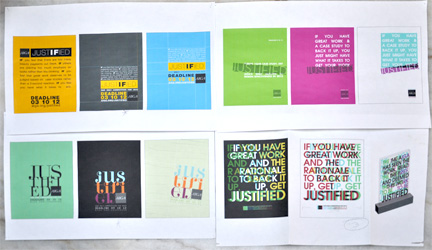
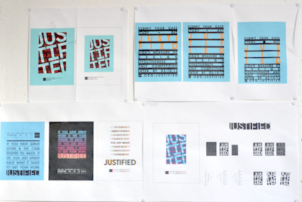
There were numerous requirements to satisfy. The design would have to stand among other attention-getting visuals in design magazines and on design websites. In addition, the identity would need to be flexible, able to accommodate a variety of different formats — from vertical magazine ads to horizontal web banners and small icons. Our solution is a modern take on the graphic work that came out of the Wiener Werkstätte (Vienna Workshop) at the turn of the 20th century. Brightly colored, force-justified type stacks in between bars on a black background, creating a bold presence on the page. The shorthand identity is the 9 letters of “Justified” broken into three rows in between bars.
Success
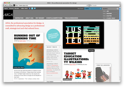
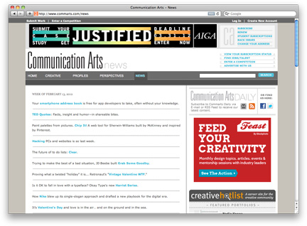
The identity has made its way into design publications such as HOW and Print, and across the web on Creative Hotlist, Communication Arts, and of course on the AIGA website itself. Our solution was cost-effective, as the AIGA will no longer have to rebrand their competitions each year as they’ve done in the past. They now have the tools, as will clients and designers, to brand their award-winning work with the Justified logo in years to come.
