M. Erbs: Identity
Challenges
Following a recent change in ownership, the company, Mrs. Erbs was in need of a comprehensive brand identity. Varying logos had been used across multiple branding elements, each failing to convey the high-end work they were executing. MSLK sought to create a new logo that conveyed their deep-rooted knowledge of plants and design sensibility to their target audience.
Strategy
Because the brand was named for its original owner, we chose to keep the name but change it slightly. The new name M. Erbs is still familiar to people who have known the brand for a while but has an element of mystery and gender ambiguity. The tagline was cut down from “stonescaping and fine gardens” to just “fine gardens” in order to simplify the logo.
Design
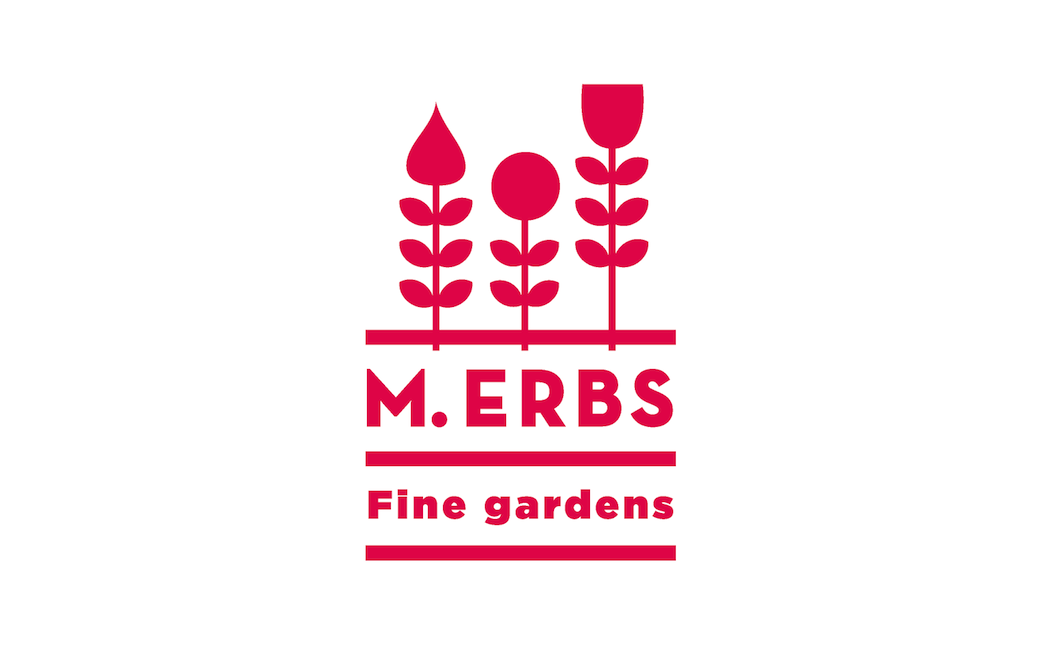
A logo consisting of three graphic flowers was devised to work across each of the brand elements. The flowers are shown growing out of a line with the tagline underneath could represent layers of soil while illustrating M. Erbs’ knowledge of all things gardening.
Success
The staff immediately embraced the new identity. Keith noted, “The identity MSLK created for me speaks perfectly to my audience. The interviews gave me new insight to my brand, and I am amazed at how MSLK was able to interpret them to design something unique and creative.”


