New Wigwam Packaging Hitting The Stores
For the past year, we have had the pleasure of working with Wigwam Mills on their biggest re-branding and re-positioning project in the company’s 103 year history. We proudly announce that the new Wigwam packaging, designed by MSLK, is hitting the stores!
Founded in 1905, Wigwam Mills wanted a new look to secure their future as a performance-based sock company that uses advanced fibers. Over the years, they had introduced technologically advanced socks under the sub-brands Ultimax and INgenius, but this left consumers thinking of Wigwam as a basic sock company and watered down their in-store brand recognition. MSLK needed to create a system that unified the brand, but allowed the products to compete against a wide range of brands, from the cute and funky Smartwool to techno-sleek Nike.
After a careful analysis of the competitive market, MSLK recommended a complete restructuring the product line based on how stores actually displayed the products in the retail environment. This meant going from 11 different categories of sock assortment down to 5: Sport, Outdoor, Snowsports, Medical, and At Work.
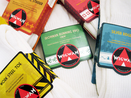
The sub-brands Ultimax and Ingenius were also eliminated and turned into “Pro” level styles within the new overall structure. Now stores that previously carried an assortment of Ultimax, INgenius, and Wigwam products would have a set of socks clearly and consistently branded with the Wigwam name.
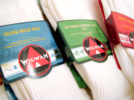
The next challenge was how to help consumers navigate through the dense, competitive retail environment. We began by clearly establishing the Wigwam brand from 20 feet away through the use of the Wigwam logo as a seal of approval. Consumers should be drawn to the bold graphics and the unspoken feeling that Wigwam stands behind the quality of their products, ie: “come over here, there’s really no bad choice.”
We created a bold color system by category that allowed consumers at 10 feet away to navigate to the “red” or “blue” style that they may have purchased previously.
This color system allowed us to dial up different emotional touch points in individual retail sections. For example, all of the competitors in the Outdoor sales department use the color green to communicate nature and outdoors, so MSLK chose a turquoise blue color. Likewise all of the Snowports brands utilize chilly, blistry cold packages in blue and silver so we choose to convey warmth with a red package.
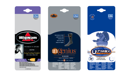
By 5 feet away consumers can find a specific product by style name, and individual sock features are decipherable when consumers closely examine the socks at 2 feet.
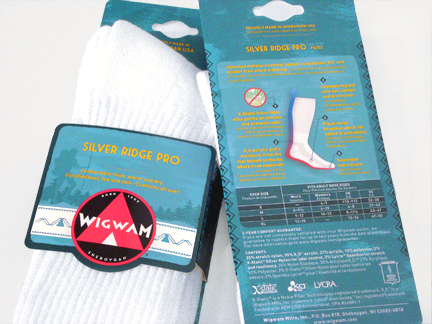
We streamlined the information on the packaging overall, in order to effectively communicate complex sock features to consumers. The back was designed to allow consumers an at-a-glance view of the sock construction, features, and benefits through a large illustration with call-outs. This allows consumers to compare similar styles easily.
During the process, we sought the advice of Minneapolis-based Strategic Name Development to align the Wigwam brand architecture, product naming and packaging copy system with the new brand image to create common naming and nomenclature for the many sock styles in five competency areas.
Prior to the relaunch, the new nomenclature was tested extensively with target market consumers across the United States and Canada, and was favorably endorsed.
We are excited to see the new packaging in stores and hope that customers are as happy as we are. So far the feedback has been super-positive with sales reps, retailers, and store buyers impressed and excited about the new system and branding.
Here’s a note from Wigwam sales rep, Mary E. Gustafson to the executive team: “The new packaging has made a huge impression! We have worked about 13 accounts so far and they all love it! They are saying that we have hit the nail on the head! The colors are great and the package looks rich. Everyone’s is excited to move into the next phase of merchandising. The feedback has been unanimous – the brand has been renewed and it ‘rocks’!”
We look forward to seeing good things in the coming year for Wigwam. They are a 3rd & 4th generation, family-run business, passionately making great products, right here in the United States. Sheboygan, WI, to be exact. Their price point is lower than their competitors because they control the manufacturing costs, and they have a new look and brand to help you find them and passionately share their story with others.
We are happy to announce that our collaboration with Wigwam continues as we are currently planning a new website to launch this summer.Now get out there and buy some Wigwam socks!