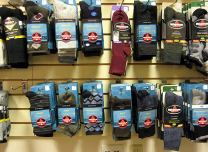
The “Wall of Socks”
 This past Wednesday, MSLK travelled to Sheboygan, WI for a presentation to Wigwam socks. Last year we redesigned their entire packaging system which is about to hit stores. In Wigwam’s conference room they have a display area they call the “wall of socks.” They use the wall to reference products during meetings. While we are anxiously waiting to see the new packages in stores, I was excited to see the pictures that Sheri took of some of the new packaging hanging on the wall.You can see how much the new packaging pops compared to the previous packaging. We designed the color system to do just that – stand out. Each line has its own color. The outdoor socks are packaged in blue, setting Wigwam apart from their outdoor competitors’ packages that are primarily earthy greens and browns.
 We used bright green for the new sport socks packaging to contrast from the other sports brands that primarily use black, white, and red. Green not only differentiates Wigwam in the retail environment, it also reminds consumers of the fields and astro turf where most of their sports are played on.I can not wait to see the “wall of socks” fill up with the the dynamic colors of all the redesigned packaging – bright yellow for the “At Work” line, warm red for the “Snowsports” line and vibrant orange for the “Health” line. Keep an eye out for the new bright packages the next time you are shopping for socks.

