Obama’s Amazingly Designed Campaign
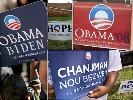 Regardless of where you sit politically, one cannot help but marvel at the amazing strength and cohesiveness of the recent political campaign of Barack Obama. At least from a visual standpoint. Not even counting the grassroots efforts of Shepard Fairey, the campaign had a disciplined approach in its choice of colors, and consistent typeface. Mostly, it was the logo that did it for me. The amazingly prolific graphic design author and historian (and MSLK fave) Steven Heller recently interviewed Sol Sender, the logo’s creator. For an interesting read on how all the rules of traditional political campaigns were broken, have a read here.
Want To See More Content About Award Winning Art + Design?
Stay up to date with expert information on the ever-evolving beauty industry. We share the best practices brands are using to connect with consumers in new and meaningful ways.
More Like This

Honk If You See a Similarity
Am I crazy, or is there something a little too similar about the MINI, Bentley, and Chrysler logos? Obviously the ...
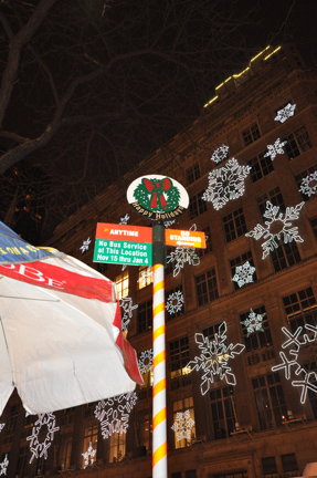
Recap of the Best 2009 Holiday Windows
Even though the season is behind us there's still time for a quick recap of the best windows of 2009. ...
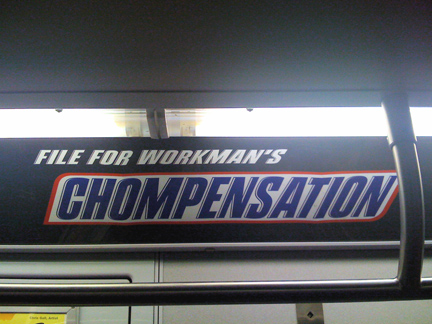
Snacklish Might Be My New Favorite Word
Do you ever have one of those days where you could eat anything in sight and simply never feel full? ...