Time Out For Design
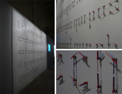
We’re suckers for anything arty, especially when it involves unusual things done with type. Our intern Mariana found this, an amazingly creative project where a designer created a beautiful typeface out of clocks. Just as a broken clock is right twice a day, the message “time passes, and every time the time passes, there is something that fades” is revealed when the clock hands align every twelve hours.
Want To See More Content About Award Winning Art + Design?
Stay up to date with expert information on the ever-evolving beauty industry. We share the best practices brands are using to connect with consumers in new and meaningful ways.
More Like This
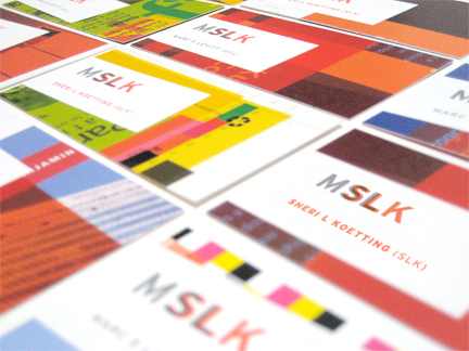
MSLK’s New Business Cards
Last week we received the final printed elements to assemble our new business cards! The design capitalizes on the ideas ...

Brooklyn Lights
Dyker Heights is a neighborhood in south Brooklyn. I had never heard of it before, but the other night we ...
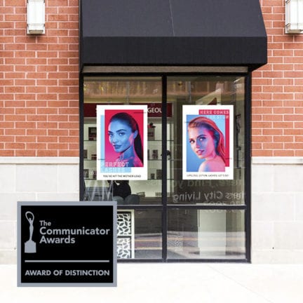
MSLK’s rebrand for amazing lash studios receives communicator award
We are thrilled to share that MSLK has won a 2020 Communicator Award of Distinction! For 26 years, the Communicator ...