Carbon Copier
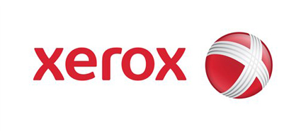
New logo alert: Xerox. But is it really anything new?
Apparently this is an attempt to appear more youthful. For that, I think they’ve succeeded. Unfortunately, the logo seems to have fallen into the trappings many larger corporations have been trending towards: a glossy, dimensional sphere. I find it’s very similar to the logo for “the New AT&T” which also employs a glossy sphere.
This is too bad, since there’s really nothing particularly “special” going on here. In fact, it’s really quite lame.
While their name has achieved the highest honor of becoming a verb (a la “google”), they seem to be embarrassed by their association with copiers. Ironic, though, that in their attempt to deny their roots, they’ve ended up copying other brand identities. They’ve even dropped their tagline of “the Document Company.” Now they’re ugly, and stand for nothing!
Yes, the logotype is in its execution, intermixing quasi-capital letters with lowercase ones. Yet the relationship of the sphere to the typeface has no visual connection, and feels overscaled. And those lines wrapping around? What does it mean? What do they stand for? What are they trying to communicate? Don’t ask me.
Their original logo, designed in the 60s by my mentors Chermayeff & Geismar, said so much more by doing so much less. Nothing more than a handsome logotype, which served them well for nearly three decades.
Over the years, they’ve implemented updates to the logo which included an “X” that was rendered in midway through a morphing from high res to low res. That was at least innovative and meaningful, albeit homely in its attempt to acknowledge the digital age. During their financial meltdown in the 90s, it took on an unintentionally meaning of a company which was falling apart:
I could certainly go on and on, but apparently my sentiments are already shared around the blogosphere: this logo is a dud. People already hip to the fact that this identity looks and feels cheap, and reminiscent current identities such as Xbox, SonyEricsson, etc.
In fact, I came across this incredible animation (created by someone with who has waaaaay too much time on their hands) implicating the agency responsible for this. I think it says everything I’m trying to convey quite succinctly:
As much as I want to believe that a great logo can help even the most anemic of companies, it’s just not the answer to every problem. If a company does not have a compelling new message to directly tie-in with its new branding initiative, it’ll never be successful. In this case, it’s not merely a carbon copy of what everyone else has already done…it’s carbon dated.
Grade: C+


