Wes Anderson’s Futura
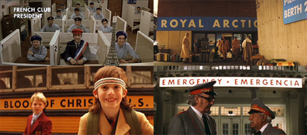
I recently saw The Darjeeling Limited, Wes Anderson’s new film. I’m a big Wes Anderson fan, from both a film and graphic design perspective. From his unique cinematic “dollhouse” style to working with the same cast and crew, he has a way of visually branding his films so the are unmistakably his. Typographically, he uses Futura (and altered versions of Futura) as his house font. Though it’s not as omnipresent in Darjeeling as it has been in many of his past films (Rushmore, The Royal Tennenbaums, The Life Acquatic), it does appear on some key elements such as the luggage insignia and many of the train amenitites. The Futura montage above is from a combination of his films.
Unlike the ubiquitous and easily adaptable Helvetica, Futura can often be challenging to use. It was one of the first sans-serif fonts developed, and it was a radical departure from typography’s past. Developed by Paul Renner in 1928, Futura was a study in geometry. The characters are based on perfectly proportioned squares, triangles and circles, and the stroke is almost perfectly even throughout. These geometric shapes, however, coupled with exaggerated ascenders and descenders often create awkward spaces and can be problematic from a readability standpoint.
As a display typeface, though, Futura evokes the modern and often goofy spirit of the ’60s. It seems the perfect companion to the endearing characters in Anderson’s films who take themselves a tad too seriously. The idiosyncrasies that the typeface makes when the nearly perfect characters combine to form words and sentences somehow matches that of the characters and experience of a Wes Anderson film. Simultaneously perfect and imperfect.