
Rethinking Responsive Web Design
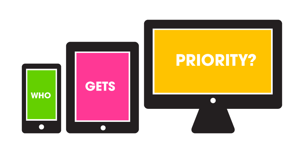
Responsive web design has become one of the most ubiquitous buzz phrases in the web world for the past three years or so. In case you aren’t familiar, the phrase refers to a set of web development techniques used to create the optimal viewing experience of a website across all devices. Perhaps you’re thinking of redoing your website, and maybe you’ve already been sold on responsive design as a “must have.” With all of the articles out there, it can be difficult to cut through the clutter.
MSLK’s philosophy has always been to respond to client needs and project objectives over industry trends. Over the past three years, we’ve created a number of responsive sites (including our own), and we’ve gleaned new insights along the way. We have found that responsive design is essential in many instances, while in others it is over-scaled for our client’s needs and/or doesn’t make sense with kind of site that is being created. Read more to determine when it’s best to invest in a responsive site.
1. CONSIDER YOUR TARGET CUSTOMER
Where is your target customer viewing your site? For MSLK’s clients that are in the creative services industry, we’ve found that fewer than 5% of users are browsing these sites on mobile devices. In these cases, creating a responsive site was not justified. If over 20% of your users are browsing on mobile devices, then you should consider investing in a responsive site.
If you have an existing website with google analytics you can easily find information about your users, their demographics and where they are viewing your site. If you haven’t been running analytics or you are creating a website for the first time, obtaining this information will be more difficult. You will have to think about your target customers and rely on outside research to make an educated decision. Remember that you can always make a site responsive at a later point, but there is usually a savings in doing everything at once.
2. CONSIDER THE TYPE OF SITE
Is your site a portfolio site or e-commerce? Is it text-heavy or image heavy? Is it about getting news or is it a fun unique experience? There are many different kinds of sites, and some lend themselves better to responsive design than others.
You should consider investing in a responsive site if:
Your site is primarily about getting news and/or registering for events.
People tend to get news and read on the go, so thinking about the mobile user is most important in this scenario.
Example: Spark Design Professionals
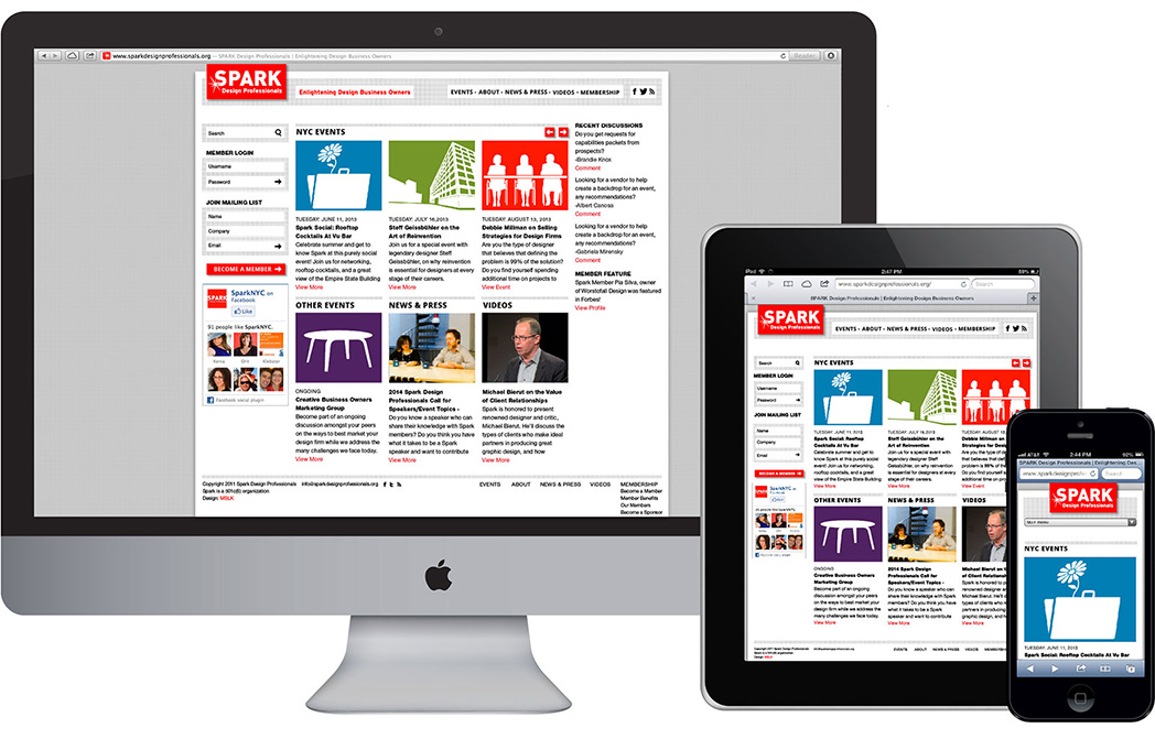
Spark is a design business organization founded by MSLK’s partners and other designers. We’ve also designed their new site, which is responsive and allows users to easily browse news, register for events and become members.
Your site is e-commerce
More and more people are buying things on the go because they want to immediately seize a sale or offer. Instant gratification is satisfying! If you have a pragmatic e-commerce site about moving product quickly, investing in responsive technology makes sense.
However, if your e-commerce site has some romance, perhaps a unique gallery or sorting experience, this aspect might not lend itself well to mobile devices. If you have the budget for both a responsive site AND a unique experience, a viable solution could be to make the site fully responsive, but to remove or simplify this experience for mobile.
Example: Prucheek Greeting Cards
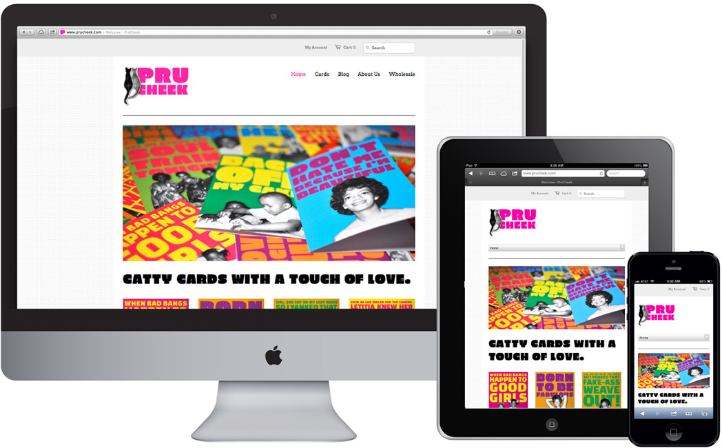
MSLK designed the Prucheek website as part of our 360° rebranding program. It’s a great example of a pragmatic e-commerce responsive site, where users can easily sort, browse and purchase cheeky greeting cards.
It may not make sense to invest in a responsive site if:
Your site is an image-driven portfolio site.
If you are an artist, photographer, architect or another kind of creative professional with an image heavy site, it might not make sense to invest in responsive technology. Image heavy sites lend themselves to large monitors and tablets where people can take their time to appreciate the images. As long as your site works on mobile, you are probably doing enough to accommodate your users. If people like what they see, they will likely return to your site to view it later on a larger device.
Example: Friend + Johnson Artist’s Reps

MSLK redesigned the website for this established artist rep. The site’s audience, predominantly art directors at ad agencies, view these images on very large monitors, so that is the experience we prioritized. In the portfolio section, there is no limit to how big images can get.
Your site is about a fun and unique experience.
Innovative web experiences with unusual design and navigation usually will not translate well to mobile, where there is little room for reinventing the user experience wheel.
Example: Warby Parker Annual Report
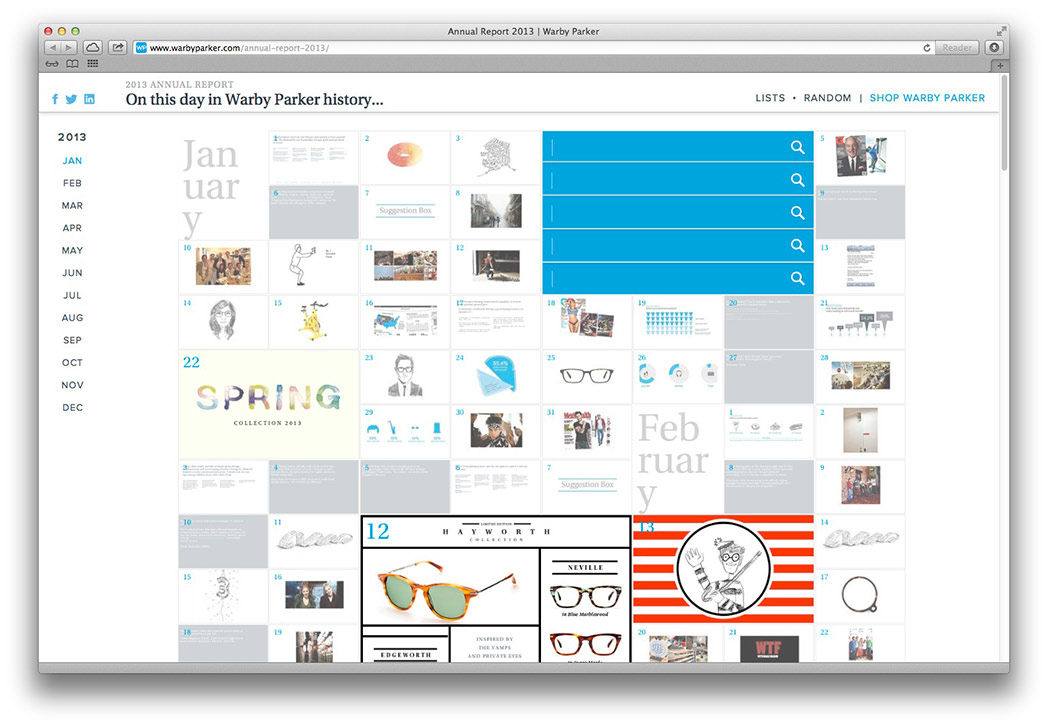
Marc blogged about this recently—The Warby Parker annual report is an innovative experience where users can engage with an eclectic mix of stories in a non-linear fashion. This experience is simplified for mobile where it follows a more traditional paradigm. If you view the site on a mobile device Warby Parker states: “To see the full annual report, please switch to a desktop device. It’s too mega for mobile!”
3. CONSIDER YOUR BUDGET
Here’s what most articles won’t tell you: responsive websites cost more. Multiple layouts need to be created accommodating for every device, which makes for a longer production process with the development team. If your budget is small, investing more in your content and branding is definitely more essential. If you are cost sensitive, think of responsive design as an added bonus.