An Exercise in Coolness
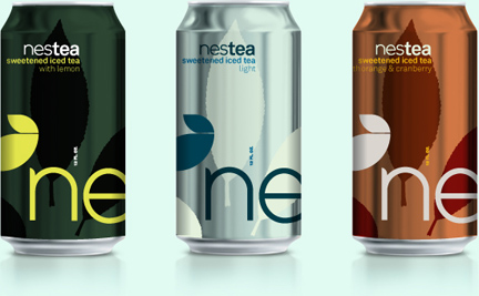
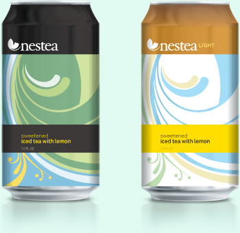
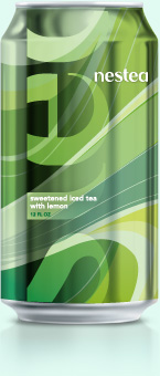
It’s things like this that make designers want to throw in the hat… I recently stumbled across this beautiful packaging for Nestea. I was immediately excited that perhaps the corporate bigwigs at Nestea had awoken one morning and decided they were sick of having ugly packaging. I imagined them handing over the reigns to a team of designers to reinvent their brand in a way that’s actually pleasant. No such luck. Upon further analysis, I found that these are simply some concept investigations that the one brain at Nestea probably fought tooth and nail to have happen. Obviously nothing became of it, since we’re still left with the “awesome” brand that we currently find in delis and supermarkets across the country (shown after the jump). I guess these designs simply weren’t cool enough. After all, nothing says cool and refreshing like a faux ice pattern with a cracked out snowman illustration.

What’s worse is that this packaging actually is a redesign! Apparently Coca-Cola decided to reposition Nestea in 2007 to communicate “feel-good freshness.” And in case you were wondering, that little tea leaf above the logo is a new addition that is meant to represent the antioxidant value of tea and its health benefits. I guess it was a necessary addition, given that without the copy it could be mistaken for a can of anti-freeze…
At any rate, kudos to Steve who put forth a valiant effort. Below are some of his amazing explorations that I found on his site.