
GCI Article: Competitive Retail Packaging: 3 Strategies to Guide an Effective Design Process
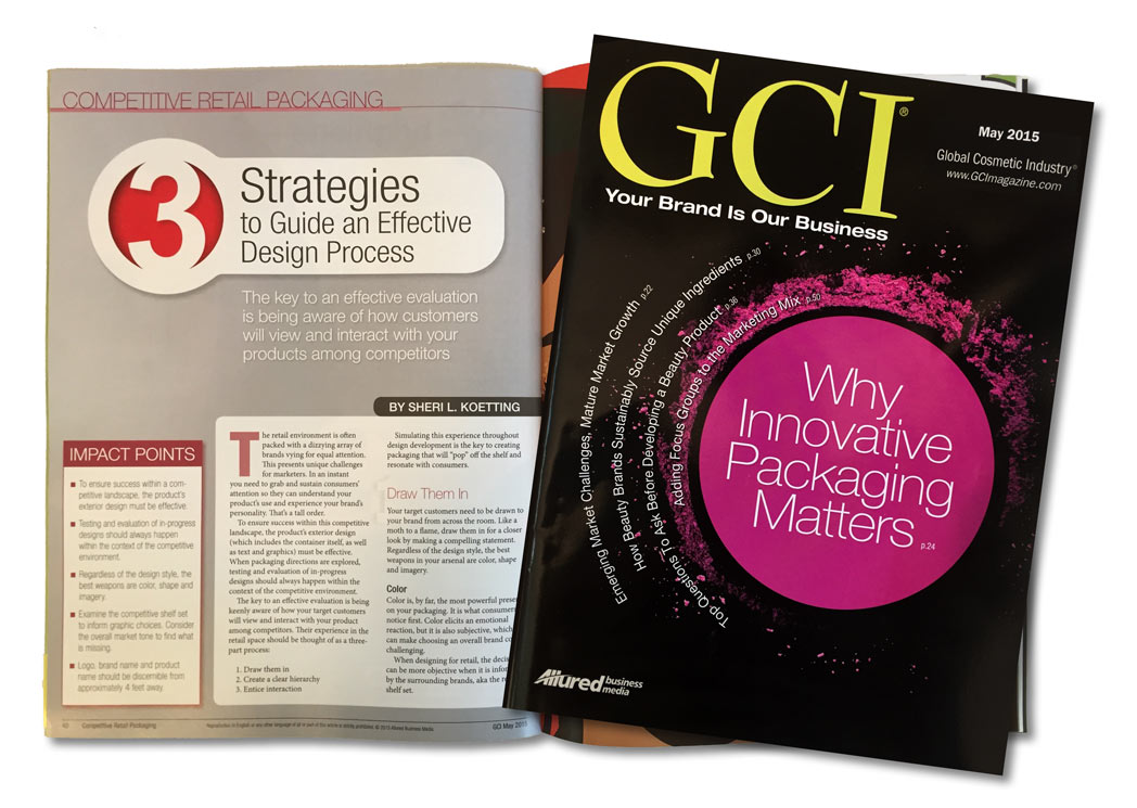
Designing retail packaging is equal parts science and art. GCI magazine recently asked Sheri L Koetting of MSLK to share effective strategies we’ve gleaned over the years to help guide their readers as they consider their own package design process. In the article, which appears in the May 2015 issue, we explore the top three considerations for creating competitive packaging that performs at retail. A recap of the article appears below:
The retail environment is often packed with a dizzying array of brands vying for equal attention. This presents unique challenges for marketers. In an instant you need to grab and sustain consumers’ attention so they can understand your product’s use and experience your brand’s personality. That’s a tall order. To ensure success within this competitive landscape, the product’s exterior design (which includes the container itself, as well as text and graphics) must be effective. When packaging directions are explored, testing and evaluation of in-progress designs should always happen within the context of the competitive environment.
The key to an effective evaluation is being keenly aware of how your target customers will view and interact with your product among competitors. Their experience in the retail space should be thought of as a three-part process:
- Draw them in
- Create a clear hierarchy
- Entice interaction
Simulating this experience throughout design development is the key to creating packaging that will “pop” off the shelf and resonate with consumers.
1. DRAW THEM IN
Your target customers need to be drawn to your brand from across the room. Like a moth to a flame, draw them in for a closer look by making a compelling statement. Regardless of the design style, the best weapons in your arsenal are color, shape and imagery.
Color
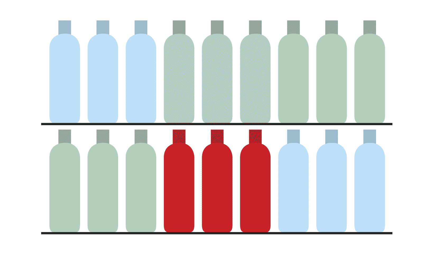
Color is, by far, the most powerful presence on your packaging. It is what consumers notice first. Color elicits an emotional reaction, but it is also subjective, which can make choosing an overall brand color challenging. When designing for retail, the decision can be more objective when it is informed by the surrounding brands, aka the retail shelf set.
Go into the field and observe various shelf sets where your products might appear. You will immediately get a sense of the dominant colors, lighting, and shelf heights within these environments. All of these factors matter when determining the best packaging for retail conditions. A marketer with a keen understanding of the sales environment will know when to fit in and when to stand out. For example, if cool colors dominate the typical shelf sets, you might consider going for something warm.
Shape and Graphics
Second to color, shape is a powerful differentiator. Unique bottle shapes as well as graphic shapes on the package itself can be seen from across the room, contributing to your brand’s overall mood. If you are producing a significant quantity of packages, consider creating a unique profile with a custom mold. This is a great way to stand out from smaller brands that use existing generic stock components. If you are working with stock components, you may opt to specify less commonly used items such as lids, pumps, and caps to distinguish yourself.
If you aren’t able to use a custom mold or source unique components, bold and exciting graphics may be the way to stand out. Examine your competitive shelf set to inform graphic choices. Consider the overall market tone to find what is missing. More often than not, you will see that competitors fall into conventions that you would do best to avoid. For example, if everyone else is using typography without imagery, you should explore using photography or illustration. Test your ideas by looking at how these elements are experienced from across the room. The shapes should be strong and simple enough to be more impactful than those of your surrounding competitors.

2. CREATE A CLEAR HIERARCHY
Once you’ve grabbed your customer’s attention, your logo, brand name, and product name should be discernible from approximately 4 feet (an average aisle width) away. As their eyes scan across different products, they will begin to understand what each product does and the personality of the brand behind it. Create a clear hierarchy to make this process quick and intuitive for the consumer.
Levels of Hierarchy
It is important to establish a brand architecture, determining the levels of information on your package and what elements to prioritize. How do you want your target customer to navigate your brand? Is it by flavor, scent, or ingredient? Or perhaps it is by problem/solution? Depending on the complexity of your line, you might need to communicate the efficacy level within a good, better, best system. As a general rule, effective packaging clearly communicates what the product does, while also helping to suggest that you have products to meet other needs.
Consistent Placement for Easy Scanning
Careful consideration should be given to how the hierarchical elements of your product are placed on the package. The logo, product name, and description should be arranged in a way that reflects your priorities, while also being visually pleasing. Aesthetics are important. However, it is more crucial that consistent placement of these elements on the package face allows consumers to determine quality differences in a quick scan of your products.
If your products are of similar sizes, there should be a consistent alignment for the logo, product name and descriptions. If products are of varying sizes and shapes, this may not be possible. In these instances, the placement of elements should be at consistent ratios from package to package.
As your line grows and new products are added, be sure to adhere to your established hierarchy. While it may be tempting to use new discoveries to tweak the packaging with each new product addition, this will lead to inconsistency and brand dilution. Instead, redesign all packages once you’ve compiled several changes that need to be made.
3. ENTICE INTERACTION
Armed with an understanding of your brand and product offering, your customer should be enticed to pick it up. Since this interaction is equal parts visual and tactile, it should be used to guide choices about components, materials, special accents and dispensing methods. These extra details will further differentiate you from competitors and are a big part of the enduring at-home experience of using the product.
Choose Cohesive Components and Materials
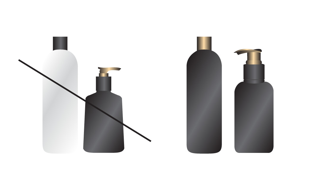
Whenever possible, it’s best to choose consistent packaging components so your bottles, tubs, caps, pumps etc. all work together as a cohesive set. Visually unrelated components not only create consumer confusion at retail but can also be an indication of different manufacturers and inconsistent quality of goods.
Gather your products together to inform sound material choices. Within a single product tier, all containers should have the same finish and cap color. The shapes of these containers should be cohesive as well. Even among a variety of shapes, design details such as rounded or square edges can unify the shapes so all products seem to be the same set.
Choose Materials that Correspond to Price Point
Another crucial factor that affects material choice is your target price point. Is your brand a luxury or economy item? Where is it being sold, and what competitive products do your target customers consider? You need to choose materials that are attractive to your customer and correspond to your price point. Choosing low-quality materials for a luxury product may save money in the short term, but will likely denigrate the value and perception of your brand in the long run. Think about what your target customers will be proud to display in their homes.
Use Special Accents to Indicate a Premium or Hero Product
You may have a premium product or line that is at a much higher price point than the rest of your products. If this is the case, your material choices should be consistent with the rest of your products, with one or two decisive departures to indicate a jump in quality. This is what is commonly referred to as good/better/best, or in our simplified example, good versus premium.
In this scenario, you will want to make your overall material choices first, choosing cohesive components and materials that are in line with the average price of the brand. For the hero product, do something extra to give it a more distinctive feel. You can choose a different kind of bottle and dispensing method, so the experience of picking up and using the product feels different. You may also consider other touches to make this product stand out: foil stamp accents, a unique hangtag, special seal, etc. The possibilities are limitless, and any of these strategies are valid. However, don’t get caught up in adding every bell and whistle. Resolve to choose one thing and stick with it, ensuring that this product indicates premium quality but still fits into a cohesive product lineup.
Consider Memorable Dispensing Methods
How your product is dispensed becomes a distinct part of the brand, as noteworthy as the formulation itself. Often these unique experiences are what consumers will associate with your brand every time they use the product at home. Success here could position you as a leader in your category. Get to know the formulations and use the products that you will package. What is the viscosity of the product and what dispensing method will serve it best? Whether it’s a pump, roller, dropper, or something else, the choice needs to make sense for ease of product application.
Putting it all Together
Creating competitive packaging that resonates with consumers is not the result of a single designer’s creative genius. Rather, it’s an objective, collaborative process informed by a number of factors along the way. Let your brand voice, target customers, competitors, and price point guide you toward rational graphic and material choices. Evaluate prototypes next to surrounding competitors, using the analysis above, to ensure that your packaging gets noticed. This way, you will know exactly how to position your brand effectively. These design strategies will set you up for success, enabling you to rise far above the competitive noise that is so pervasive in the retail environment.
