
Innovative Catalogs From Anthropologie
Every week at staff meeting, each designer brings in something that inspires them. Recently I’ve found that I’m often showing the Anthropologie catalog as an example of truly inspirational art direction and sales strategy. Such is the case with their recent issue focusing on the printing heritage of the Hatch Show Print Shop.
Hatch Show Print Shop is the nation’s oldest wooden type printing press. Based in Nashville, Tennessee, Hatch made its mark printing posters promoting country music stars. In fact, it is now maintained by the Country Music Hall of Fame.
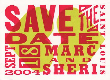
I’ve been a fan of Hatch posters since I was a kid visiting Nashville with my parents. I love the haphazard quirky style that comes from assembling piles of hot type and overprinting, rather than knocking out and trapping each color as they are laid down. I’ve only had the pleasure of working with them once, on the save-the-date cards to our wedding, but the results (above) were amazing.
You can simply tell Hatch what you want the poster to say and they’ll do the rest, or as I did, provide a pencil sketch, some art direction, and they’ll match your intention.
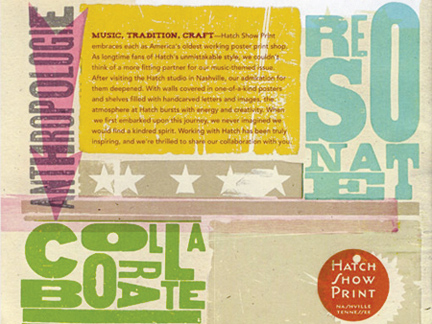
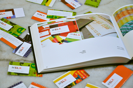
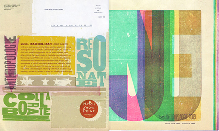
A little loose art direction, mixed with that love of overprinting imperfections is certainly the case with the Anthropologie cover. Anthropologie commissioned Hatch to print up a few artist prints for the cover to their June catalog. They then scanned the printed prototype as artwork and mass-produced the catalogs using their standard web printing press. The results are actually compelling. The cover retains the hand-touched quality of a Hatch print with a little trompe d’oeil.
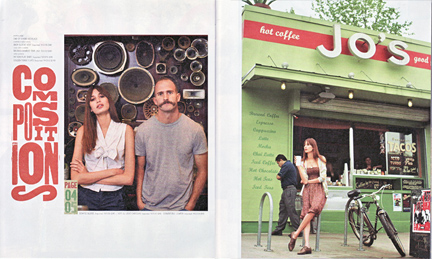
On the inside, the story line is about a day down South, presumably in Nashville, but it’s actually shot in the far more picturesque, funky town of Austin. The city of Austin does a much better job of capturing the actual spirit and flavor that Hatch prints convey. Besides Hatch, the city of Nashville seems to have lost its soul completely in the 90s when the quaintness of the old downtown was replaced with a Hard Rock Cafe and Planet Hollywood.
The catalog story line is punctuated by vignettes of type and page number folios handled as artwork as outlined above. I find the piece overall to be very compelling and visually stimulating. The wooden type and styling are a perfect fit for the Anthropologie brand and it’s a really creative way to keep a direct-mail catalog interesting.
