2009 Design Prediction: Generic-Modern
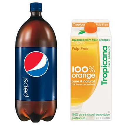
I know, I know… the only thing designers complain about more than corporate branding is corporate branding redesign. Both Pepsi and Tropicana unveiled new brand designs in the past few weeks. From the looks of it, the marketing department finally decided to modernize the brands, as designers across the world had hoped for years. Yes, we had been begging them to control all the starbursts, call-outs, dropshadows, glow effects, and whiz-bangs in their packaging. We had hoped for a controlled color palette and streamlined information. From the looks of it, they really did remove everything – including the spirit of the brands.
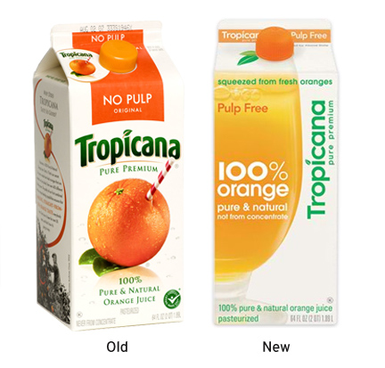
First let’s start with Tropicana. For as long as I can remember, the brand symbol was an orange with a straw poking out of it. Hokey? Maybe, but it was a brand staple that positioned them as the freshest orange juice on the market – straight from the grove. While I can’t argue that I liked the look of the old Tropicana packaging, at least it had an angle. They’ve replaced the image of the orange with a straw with a simple glass of orange juice and the copy “100% Orange.” It feels very grocery-store brand. There’s really no concept behind the design at all. Furthermore, we’re finally catching up with the sans-serif revolution, except here it just seems lifeless and flat.
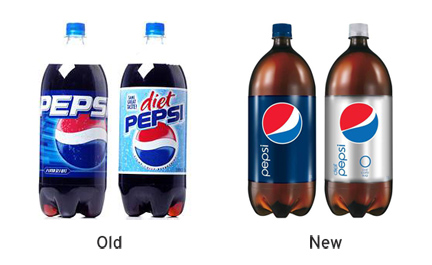
I don’t know what to say about Pepsi. On one hand, I want to commend them for the huge task of removing all the excess clutter on the packaging. I would say this stripped down look would be considered modern and radical ten years ago, but now it just feels stale. They’re one of the few companies with such widespread recognition that they can boldly rely on a symbol, color and name to sell the product. I don’t necessarily think that gives them a pass to abandon all concept and meaning, though. While I personally miss some of the brand identities from Pepsi’s past (specifically the 1940 and 1984 brand designs), my guess is that they’re trying to set themselves apart from Coca-Cola (the classic) with a modern look (the choice of a new generation). Fine, then why not do really modern instead of hanging on to a look that was trendy ten years ago? Develop the look of a new generation rather than the look of a generic-modern generation.
As for me, I’m going to make a personal resolution for 2009 to try to use sans-serif typefaces more carefully, and take a break from a few of the overused (ahem.. Chalet).


