Journey to Center of the World
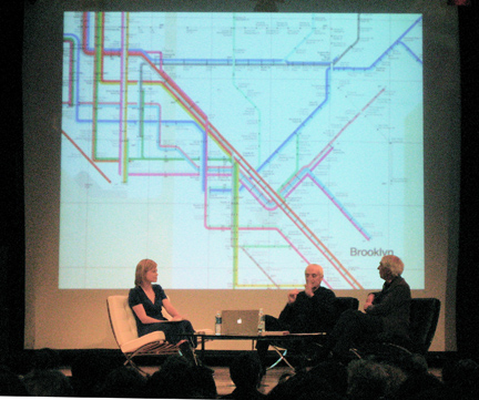
Tonight Katie, Ellen, and all went to hear a lecture from two of our profession’s most influential designers, Massimo Vignelli and Wim Crouwel (both were featured in the film Helvetica.) It’s always inspiring to hear design practitioners who have more enthusiasm than people one third their age. These two had that… and then some. At 79 years young, Dutch legend Wim Crouwel had so much optimism for the future of design, that I couldn’t help feeling optimistic, too. (It should be noted, that I’m not the “glass-half-full” type.)
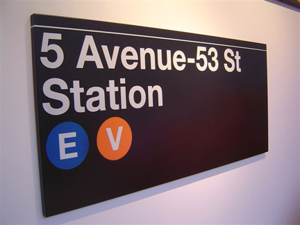
But it was Massimo who stole the show. Though he has a reputation of being a hard-lined, old-school, fundamentalist, I found him to be warm, charming, funny, and energetic. Powerfully smart, too. Beyond the many dirty jokes and funny anecdotes, he fondly recounted the comprehensive designs created for the NYC Subway — specifically the still-radical looking 1972 map (click the super-sized map after the jump).
His basic theory was that the map should show a linear path as clearly as possible, freely distorting the actual geography in the process (note the square representation of Central Park). I couldn’t help but notice an amazing phenomenon that was short-lived in NYC history: Queens was the center of the city.
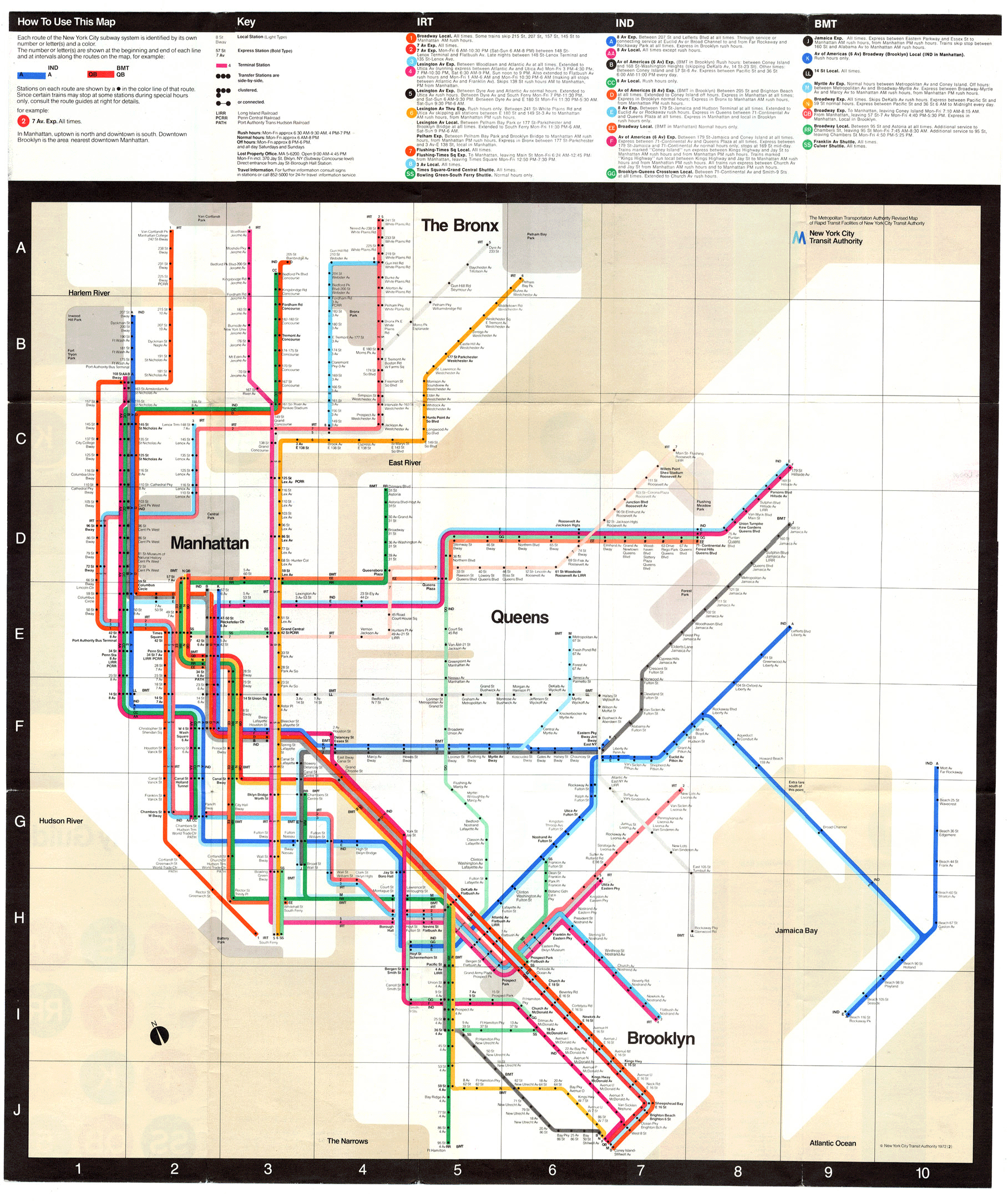
Over the years, the map would be redesigned by lesser designers into more “realistic” versions, capturing the city, yet never capturing people’s attention the way the 1972 version had. If Mr. Vignelli’s map didn’t have the longevity that he had hoped for, the signage system with its bold use of (you guessed it…) Helvetica and colorful round icons for train lines, continues as an enduring graphic icon for the city.
.