MSLK Helps Cheeky Greeting Card Brand Discover its Inner Soul
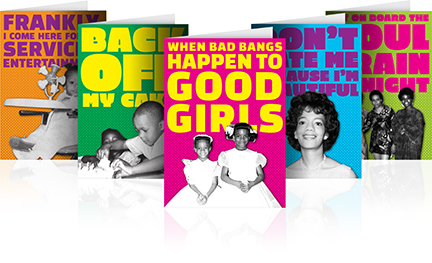
We’ve been working on a 360° rebranding project for Prucheek, a line of cheeky greeting cards for people of color. Prucheek came to MSLK with great ideas and potential, but their products had not been well-executed. We went into the project with two goals:
1. Breathe new life into the brand and give it the distinctive voice it deserves.
2. Increase the quality of the design and production to a competitive level.
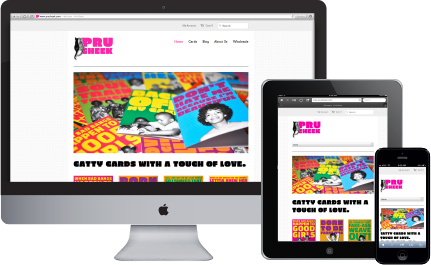
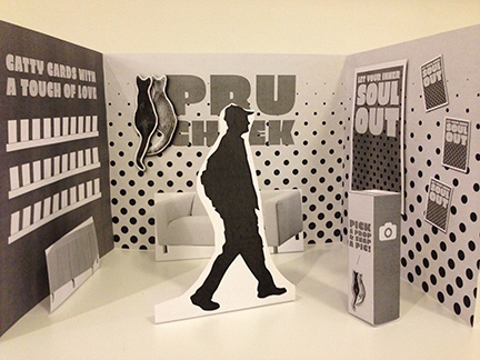
This is one of those truly great before and after stories. Since designing the first set of cards, we’ve gone on to create a responsive e-commerce site, sales catalog, and trade ads. We’re currently working on a trade-booth design for the National Stationery Show in May. Read more to see project imagery and gain deeper insight into our process.
Strategy
We began our process with a brand audit of the current products to determine the elements worth keeping and letting go. We determined that each card would consist of 3 elements:
1. A bold tongue-in-cheek statement.
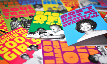
2. Retro black and white photography
3. Additional cheeky comments from two cats that are the brand’s mascots.
Since the cats figured so prominently in the brand, they inspired us to create a new tagline: “Catty Cards with a Touch of Love.”
Design
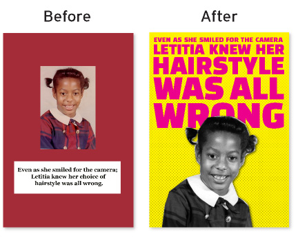
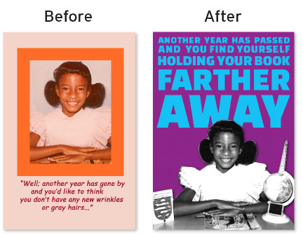
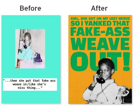
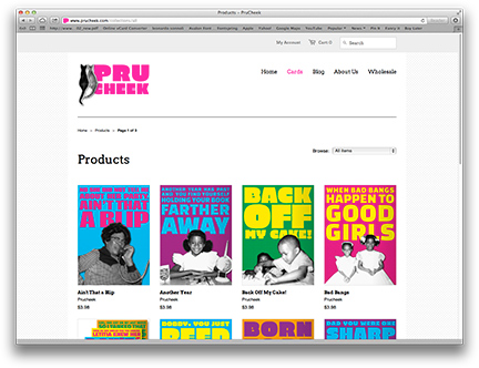
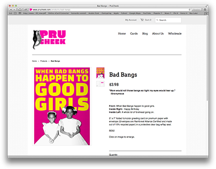
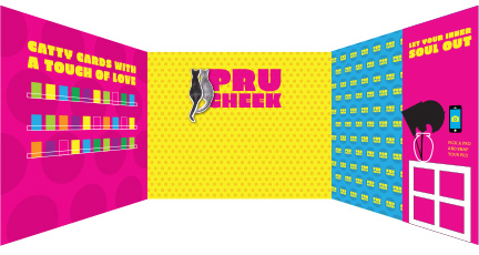
We delivered with a bold, retro design that shouts from across the room. We built a kit of parts, a palette of 6 colors and 3 quirky typefaces, which allowed us to maintain a consistent look across the cards with many possibilities for variation. On the front of each card, huge stacked typography in very bright colors, form the background for the main character of the card. On the inside, the cats appear on the left and give snarky responses to the statement on the front. We extended the card design onto a new, responsive e-commerce site that will serve as Prucheek’s primary storefront. Currently, we’re working on the design of the Tradeshow booth at the National Stationery show, making this truly a 360° repositioning.
Success
April Pruitt, the creator of Prucheek, could not have been happier with the result. She said it best herself at our first presentation:
“I had no idea what you were going to do would be that different. You were able to create what was in my head but wasn’t able to voice. I’ve never gone this far before. I’m so glad that I’ve done this and I have tears in my eyes…”
April has big plans for marketing her cards with her new MSLK-designed e-commerce site and trade-show booth. Buyers who had previously told her that the design and quality of the cards weren’t up to par are now eager to take a second look. She can now approach them confidently with a great product that is poised to become a leader in this niche market of the greeting card industry.
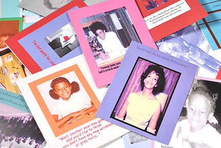
Cards Before the Rebrand
New Logo
5 “Hero Cards”
Individual Card Before’s and After’s
Sample Card Inside
Website
In Progress Trade-booth Design
