Ecofont: Color You Like, As Long As It’s Green
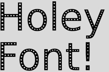 I just found out about Ecofont, a font designed specifically to use 20% less ink, thus saving money and lessening your environmental impact as you print (the elusive “win/win”). Using tiny holes in the stroke of each letter, it’s intended not to call attention to itself, while maintaining legibility — the idea being that you won’t miss what you can’t see. Despite the fact that I’ve built a career on choosing fonts purely based on aesthetics, I really love this idea. Particularly for utilitarian applications like directories and phone books. Plus, it’s free and available for anyone to use. For more info click here; to download click here.
Want To See More Content About Award Winning Art + Design?
Stay up to date with expert information on the ever-evolving beauty industry. We share the best practices brands are using to connect with consumers in new and meaningful ways.
More Like This
Balancing Search Engine Optimization and Blog Content
With the opportunity for frequently updatable content, blogs have become powerful tools for search engine optimization, enabling businesses to get ...

Watershed, Figment A Huge Success!
Thank you to all who came out on Saturday (despite the weather) and Sunday to experience our exhibit, and join ...

NY1 Runs Feature on MSLK’s Take-Less Installation
NY1 ran a short feature on MSLK's Take-Less eco-art installation at the Figment Art Festival. NY1 Arts Report, television 2010