
Life Savor
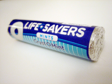
The new design for lifesavers completely captived me while walking into a local deli. This package cut through all the clutter due to its sheer simplicity. I just had to buy it. Never mind the fact that if I just landed on planet Earth today, I would no doubt be saying “I love the Life-O-Savers packaging.”
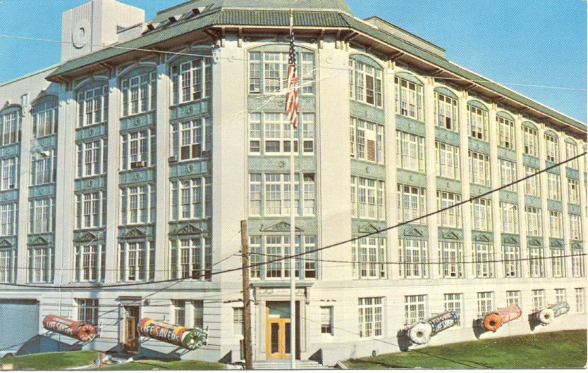
I have a particular love for the Lifesavers brand, having grown up only a few miles from their old Port Chester, NY headquarters. Unfortunately, the building has been converted into condos, and has been stripped of the larger-than-life packaging replicas that once flanked the outside, as seen below in a 1950’s photograph.
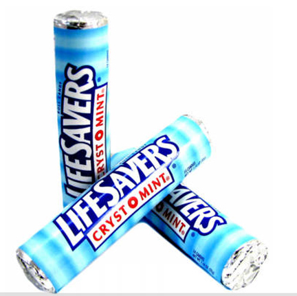
Getting back to the new packaging, I find it refreshing that a brand — an iconic one at that — chose to take the high road, instead of junking the design up with claims, burts (NEW LOOK, SAME MINTY FRESH TASTE!!!), or anything else to clutter an otherwise tasteful design. It’s rare to see an established brand reposition itself in such a bold, clean manner. Let’s refresh ourselves as to where they were coming from:

While I can argue that the new package really doesn’t need a photograph of the product (it wasn’t there before), it’s really a huge improvement from where they were before. It’s encouraging to see that the brand managers didn’t underestimate their audience’s intelligence — hopefully saving their brand’s life.