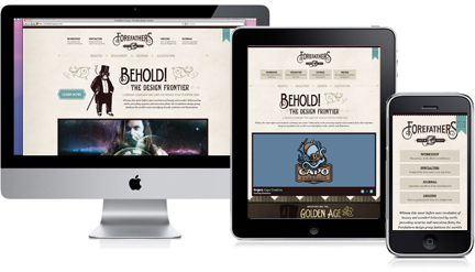
Adapting to All Devices with Responsive Web Design

Everyone is browsing the web with smart-phones and tablets, so now more than ever it’s important to consider the experiences on these devices. Many companies accommodate mobile users with a separate site. There are instances where this may be appropriate, yet the complexities of maintaining 2 url’s is usually not ideal. One of the new web buzz phrases, responsive web design, is the closest we have to an all one solution. The technique involves creating multiple layouts (usually 2 or 3) that are targeted to the resolutions of desktop, tablet and mobile.
On a desktop as you scale the browser from it’s maximum to minimum width, the page layout adjusts accordingly. In most cases, what was a 2 or 3 column layout on a desktop, becomes a single column when sized for mobile. Check out the sites below and do this exercise. First, make the browser as large as you can. Notice where the logo sits in relation to the navigation, the amount of columns and image size. Now slowly make the browser smaller until you can’t get any smaller. You’ll experience the site “snapping” into different positions, representing how the site would appear on desktop, tablet and mobile. In the second and third examples you’ll also notice that text block widths and image size are also changing, making for truly flexible designs.
As always, it’s important to consider your target audience when accessing whether it makes sense to create a responsive design. Do you need a mobile optimized site or will a mobile friendly layout suffice? A site that is mobile friendly isn’t necessarily targeted to the resolutions of devices other than desktops, yet by virtue of not using flash, will be viewable mobile devices. You simply have to zoom in and “swim” around the site in order to view it. By contrast, mobile optimized sites are very easy to navigate and follow a design structure similar to an app. Simple vertical lists prevail, since there is little room for multiple columns, side bars and drop down menus.
Analyze your audience and figure out your needs in the site map planning stage. If most of your users are on desktops, it’s probably ok to have a mobile-friendly site. But, if your needs change, you can always make the site responsive at a later point, since the technology behind the technique is not complex.

