A Serious Communition Gap in the New GAP Logo
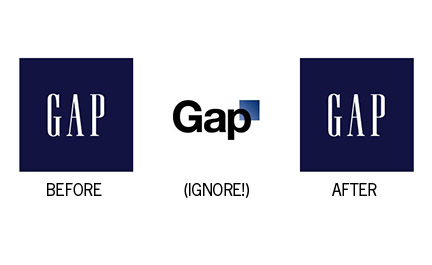
So much can happen in a week. A company can unveil a new logo, receive a public flogging, ask for free submissions, and then revert back to its original logo. If all goes well for clothing chain The Gap, most people will never know that the brand just did one of the biggest belly flops in the history of branding…
Yesterday Gap’s president issued a press release saying:
Since we rolled out an updated version of our logo last week on our website, we’ve seen an outpouring of comments from customers and the online community in support of the iconic blue box logo.
Last week, we moved to address the feedback and began exploring how we could tap into all of the passion. Ultimately, we’ve learned just how much energy there is around our brand. All roads were leading us back to the blue box, so we’ve made the decision not to use the new logo on gap.com any further.
“At Gap brand, our customers have always come first. We’ve been listening to and watching all of the comments this past week. We heard them say over and over again they are passionate about our blue box logo, and they want it back. So we’ve made the decision to do just that – we will bring it back across all channels.
“In the meantime, the website will go back to our iconic blue box logo and, for Holiday, we’ll turn our blue box red for our seasonal campaign.
“We’ve learned a lot in this process. And we are clear that we did not go about this in the right way. We recognize that we missed the opportunity to engage with the online community. This wasn’t the right project at the right time for crowd sourcing.
“There may be a time to evolve our logo, but if and when that time comes, we’ll handle it in a different way. “
I’d hate to suggest in any way that I am against the act of rebranding. I do it for a living. This whole experience is bad for everyone: bad for Gap, bad for the designer who devised this logo, and bad for all designers. Publicity of bad branding makes everyone nervous. It’s like most things in life: only the negative stories get publicized, while the good ones are rarely told.
Make no mistake, this was a disaster. A rebranding campaign like this is a major investment of time and money. But because the new logo was so bland and devoid of any rationale from the start, OF COURSE it was possible for the Gap abandon it within one week.
When you stand for nothing, it’s easy to abandon your new brand.


