| Sep. 15, 2008 | Posted by: Marc |
Jazzin’ up the Ritz
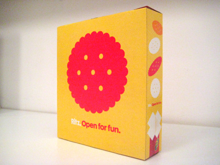
The other day I bought what I thought was the same-old, same-old Ritz crackers. Wrong! Obviously a wayward design elf at Nabisco took it upon themselves to have a little fun.
You’re looking at the back… the front is still a bit schlocky, yet the fact that this minimal design passed through the ranks without being compromised is actually quite amazing.
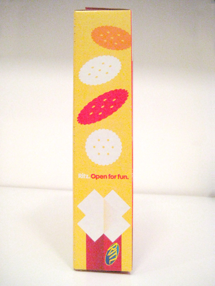
One can only hope that the front gets slowly phased out in favor of the back. The side is particularly great…
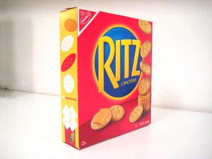
Here’s the front… fairly standard fare.


Clearly this package was a mistake. It’s almost like the boss was away and the package designer just quickly rushed out the art before anyone noticed.
Speed is the only way something this wonderful could ever pass through the approval ranks. It would certainly NEVER survive a focus group because it’s too…something…
It’s always too something…
Too good is what it is.
Wasn’t there some minor controversy over the iconic Ritz silhouette being used as an illustration for “cracker” in a baby book recently? This just made me think of that…
Lorraine, you seem to have a point. i did a little research and came upon this:
http://www.underconsideration.com/speakup/archives/004423.html
I wish I’d seen the street posters
Sheri, you’re totally right. Either that or they hired some great designer to re-envision the packaging. Everyone loved it and it was about to be printed until someone in marketing totally freaked out. The compromise was to print the new graphics, but paste the old front over it. “Brilliant.”