reactions

  • WORK
  • RESULTS
  • ABOUT
  • BLOG
  • F
  • T
  • I
  • R
email
CATEGORIES
  • Award Winning Art & Design
  • Things We Love
  • Social Media and Online Marketing
  • Design’s Impact on Business
  • Eco-Friendly Design
  • Fashion & Beauty Trends
  • Awards + Press
ARCHIVE

ARCHIVES

  • 2013
    • March
    • February
  • 2012
    • December
    • November
    • October
    • September
    • July
    • June
    • May
    • April
    • March
    • February
    • January
  • 2011
    • December
    • November
    • October
    • September
    • August
    • July
    • June
    • May
    • April
    • March
    • February
    • January
  • 2010
    • December
    • November
    • October
    • September
    • August
    • July
    • June
    • May
    • April
    • March
    • February
    • January
  • 2009
    • December
    • November
    • October
    • September
    • August
    • July
    • June
    • May
    • April
    • March
    • February
    • January
  • 2008
    • December
    • November
    • October
    • September
    • August
    • July
    • June
    • May
    • April
    • March
    • February
    • January
  • 2007
    • December
    • November
    • October
    • September
    • August
    • July
  • 2006
    • October
    • September
    • May
    • January
  • 2005
    • November
    • August
    • July
    • June
    • February
    • January
  • 2004
    • October
    • September
    • May
  • 2003
    • February
    • January
TAGS

TAGS

strategic brand development full service design agency nyc inspiration green branding MSLK eco-friendly graphic design brand development agency eco-friendly studio life corporate branding design agency Branding award-winning retail packaging design luxury branding award-winning packaging design strategic website design green graphic design graphic design for fashion retail graphic design
Feb. 25, 2009 Posted by: Sheri

Great Package Design, Down to the Bar Code

Most designers consider the UPC bar code to one of the biggest pains in creating consumer packaging. The requirements for using it make one of the largest, horsiest, and most unattractive elements on the package. In addition, the contrast required for getting a good read by most checkout scanners almost always requires that it be run in black on a white color block. Not so awesome, especially on an otherwise delicate or sophisticated design that may not be using the color black or white anywhere else.

When I was working on the packaging for  MOP, Modern Organic Products, our solution to this issue was to begin with the bar code and all of the required copy, ingredients, etc., creating a multi-faced packaging solution that was not only sophisticated, but leveraged that information into our look and personality.  Most designers leave the bar code off their  designs completely, creating the final solution with a big blank space in the layout for the bar code to be slapped on by others later.  Such lack of finesse and attention to detail is clearly not acceptable for these Japanese designers who have seized the bar code as another opportunity to playfully integrate the brand’s personality onto the packaging.

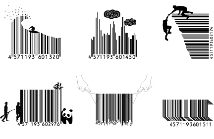
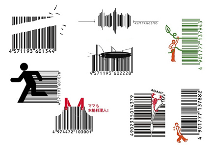
Here are some other examples:

Love the gardener plucking weeds – this would be great on a lawn fertilizer.

The chopsticks and noodles are killing me… Noodle packaging perhaps?

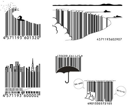
Waterfalls of bar codes, only in Japan. The souvenir stand at Niagara Falls needs to purchase the rights to this.

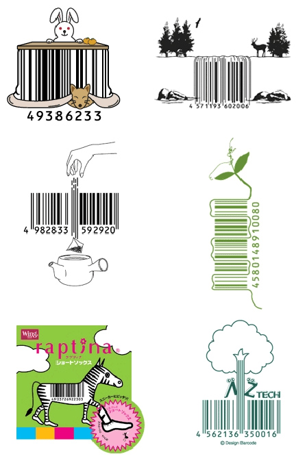
Love the tea bag falling through the code. How great for a simple tea package.

Designers, as you can see, bar codes don’t have to be feared or ugly. If used properly, they can be your friend and complement your brand identity. Companies, don’t waste the opportunities you have to leave a lasting impression with consumers.

4
Tweet
  • Category: Award Winning Art & Design, Design’s Impact on Business, Fashion & Beauty Trends, Things We Love

  • 4 Comments

    Love this! In theatre there is a tendency to paint things black if you want them to disappear. The scenic designer Ming Cho Lee says “If you paint it black it doesn’t go away, it’s just black.” Same principle, design everything you see!

    BTW, have loved the posts in connection with the Japan trip!

    By Angie on 2/26/2009 | 1:02 pm

    LOVE that expression.

    I’m also pleased that you enjoyed our highlights from Japan. It’s an inspirational place. Now I might take a break, lest anyone thinks this has become a Japanese travel blog!

    By sheri on 3/01/2009 | 9:34 pm

    sweet.

    By Raquel Raney on 3/30/2009 | 2:17 pm

    [...] Barcodes are nothing new, and there are still very innovative uses of them. In NYC, it seems that most people have smartphones, though I’m not sure if that is the same for the rest of the country. [...]

    By Ad Trends: Advertisers Become Increasingly More Clever With QR Codes. on 7/20/2010 | 8:06 am
    Leave a Comment
    CAPTCHA Image
    Refresh Image

    Reactions is a blog produced by MSLK,
    a marketing + design agency specializing
    in 360° branding for
    fashion + beauty.

    JOIN OUR LIST

    JOIN OUR MAILING LIST

    LIKE US

    LIKE US

    SHOP

    SHOP

    MSLK SHOP
    Directions  |  Shop
    © MSLK 2011