In 2008, MSLK helped Wigwam undergo the most extensive brand repositioning in the company’s history. Armed with extensive research, we restructured the brand architecture, bringing two sub-brands back under the Wigwam name. In 2012, we helped recapture market share from competitors and tap into the fundamental passion and motivation driving Wigwam’s core audience. The radical new design recast the brand as “The Performance Sock Company” — a point of difference evident in every pair of socks they manufacture.
Read project brief Read project brief

1. CHALLENGE
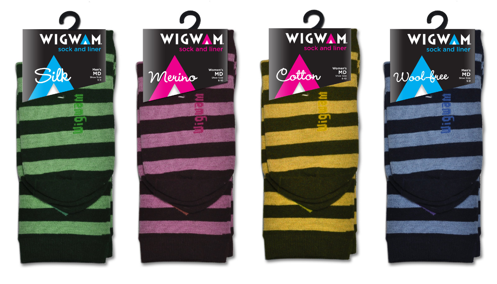
The 2008 MSLK-designed packaging sought to convey Wigwam as an established, all-American, family-owned brand which inspired athletes to get outdoors and conquer nature. Despite an initial success, a slew of competitors entered the market featuring new hard-hitting technology. Comparatively, Wigwam's more homespun positioning now fell short of touting its own patented technology. Wigwam again chose MSLK because of our deep understanding of their product line and our ability to help unearth core issues with the brand.
2. STRATEGY
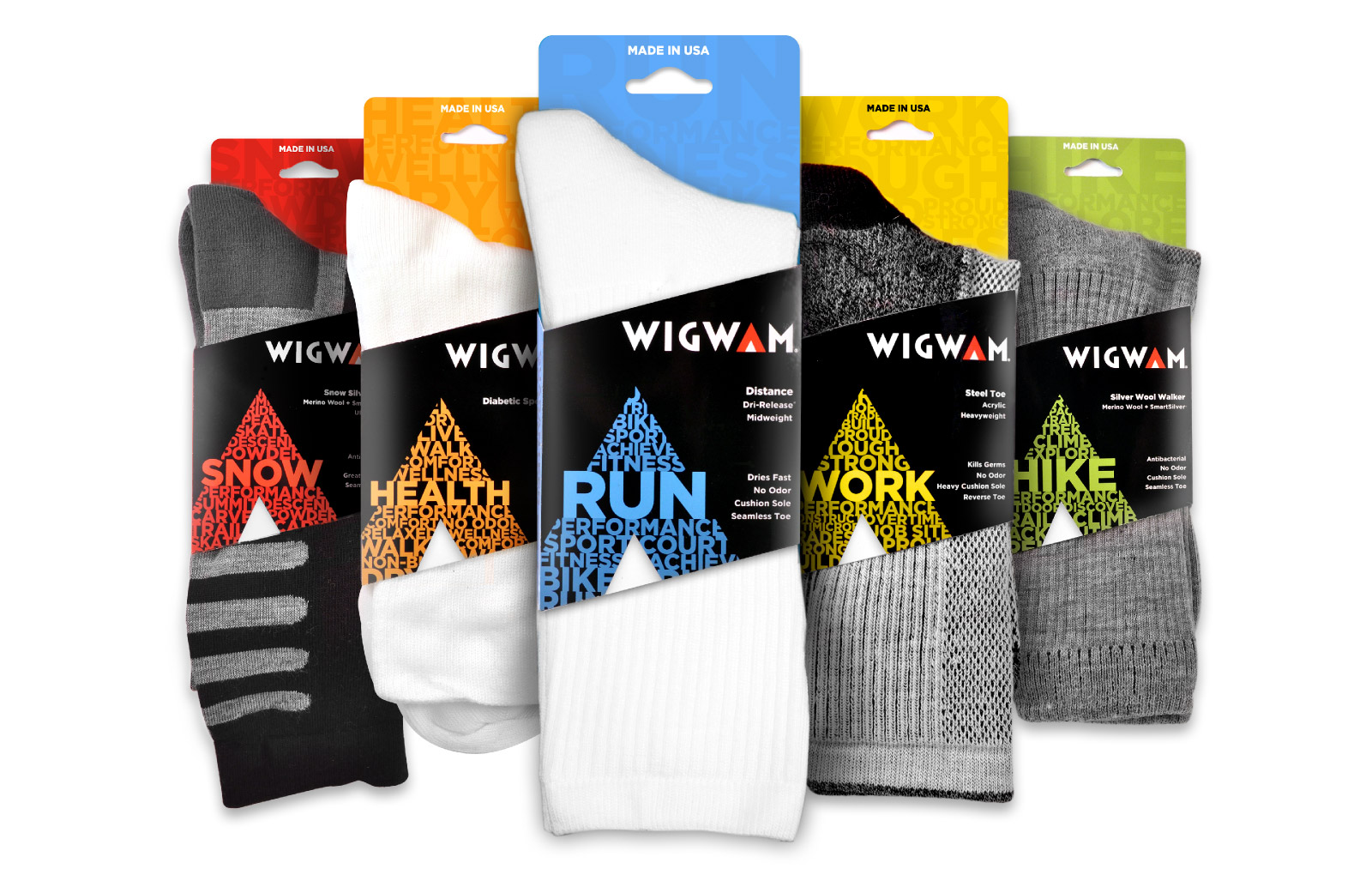
MSLK went through several exercises to reunite the team on the core objectives for the redesign. With over 278 product styles (not counting colorways), there were many technology stories to tell. Our strategy was to help tell these stories with an overarching message: there may be many styles, but only one level of quality. Even Wigwam's everyday socks employ top quality fibers. Our strategy was to reposition the brand as "The Performance Sock Company." Our brand audit and competitive analysis revealed that the Wigwam's teepee mark was their true brand essence. In order to convey performance, the teepee needed to break out of its container and appear less like a "seal of approval," and more like Nike's iconic swoosh.
3. DESIGN
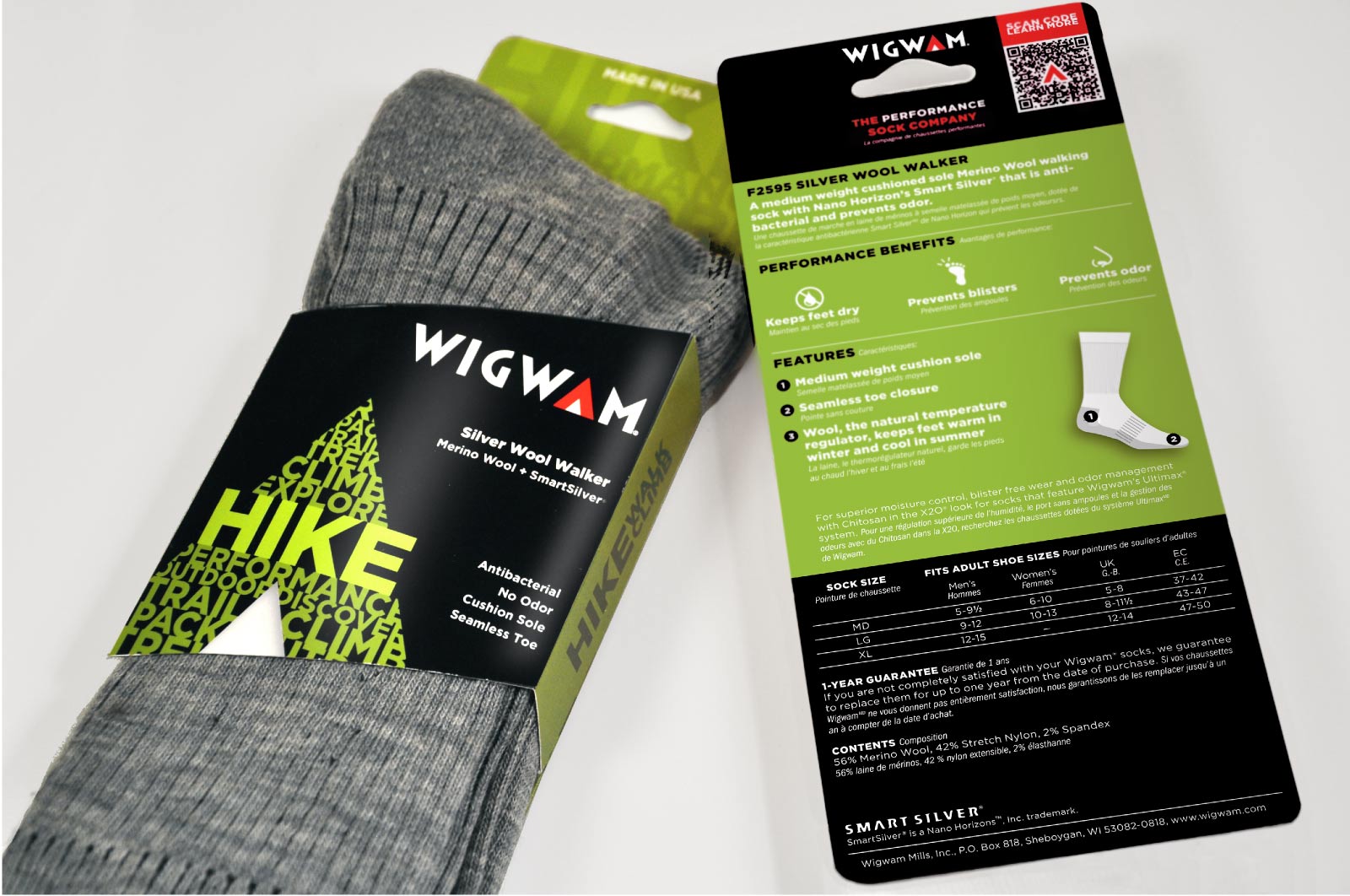
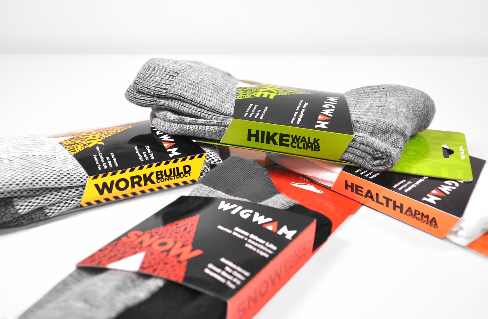
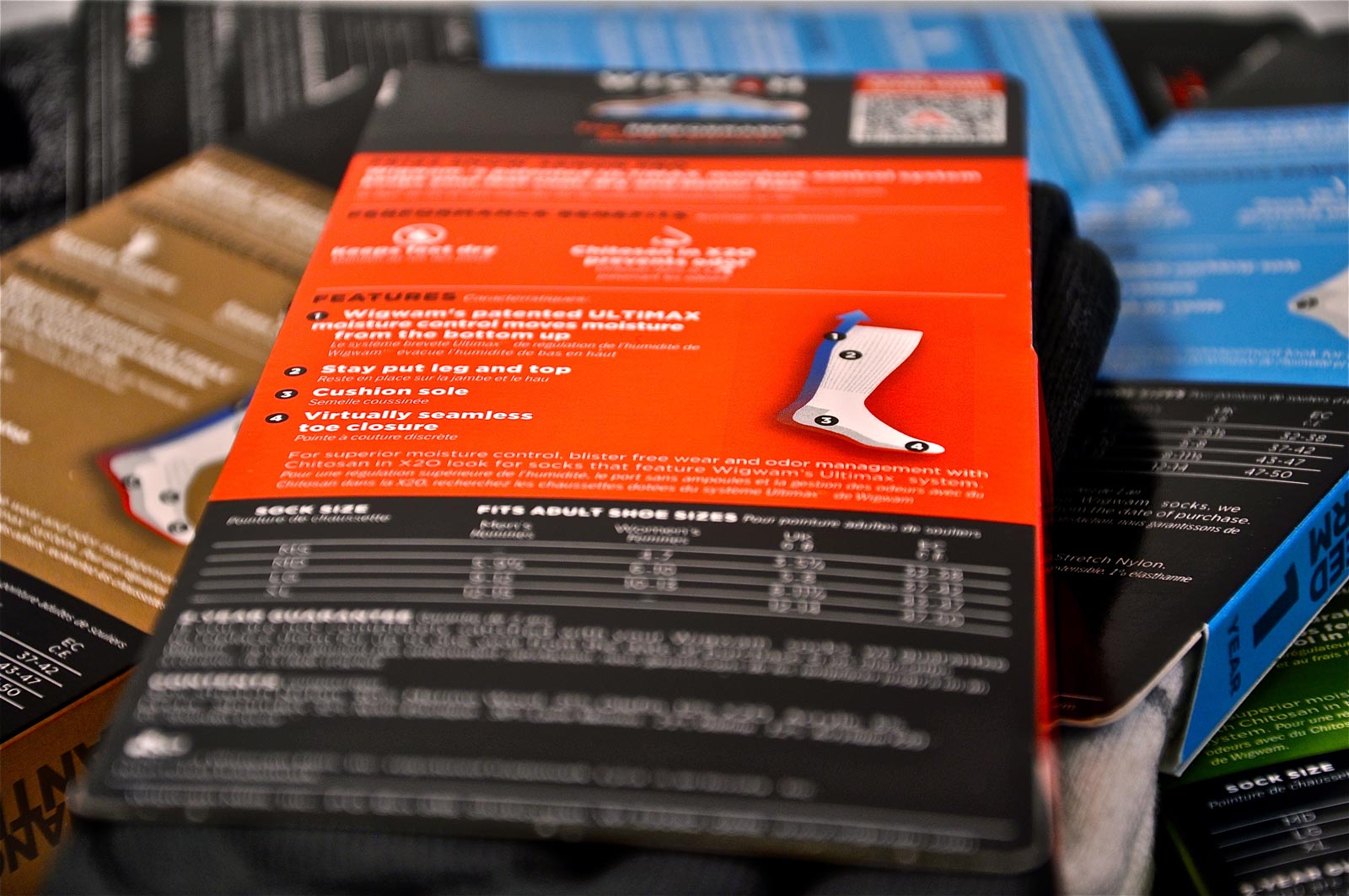
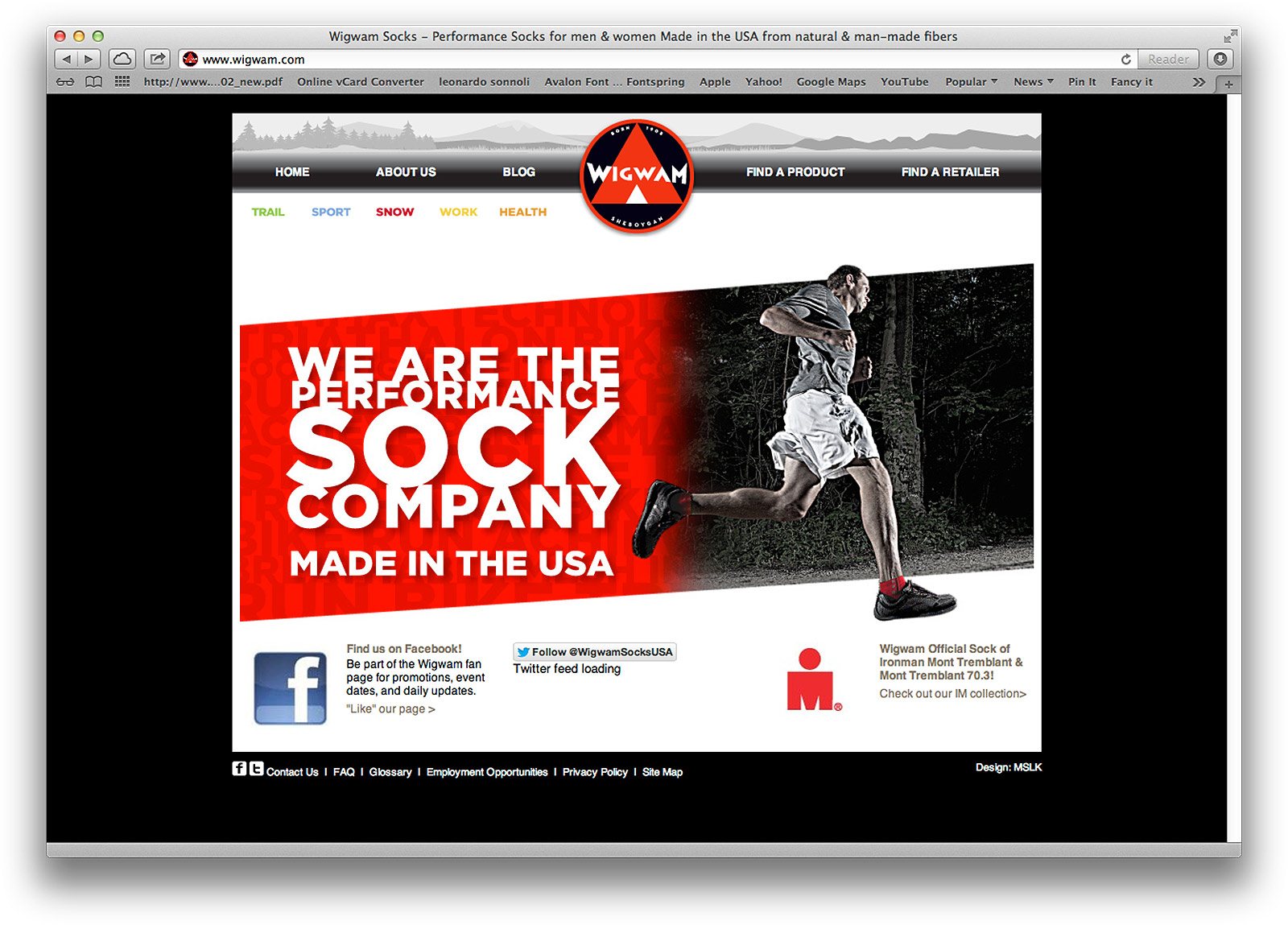
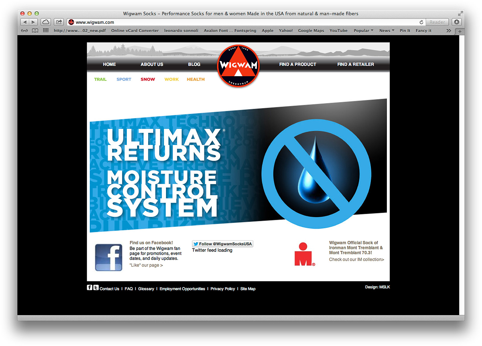
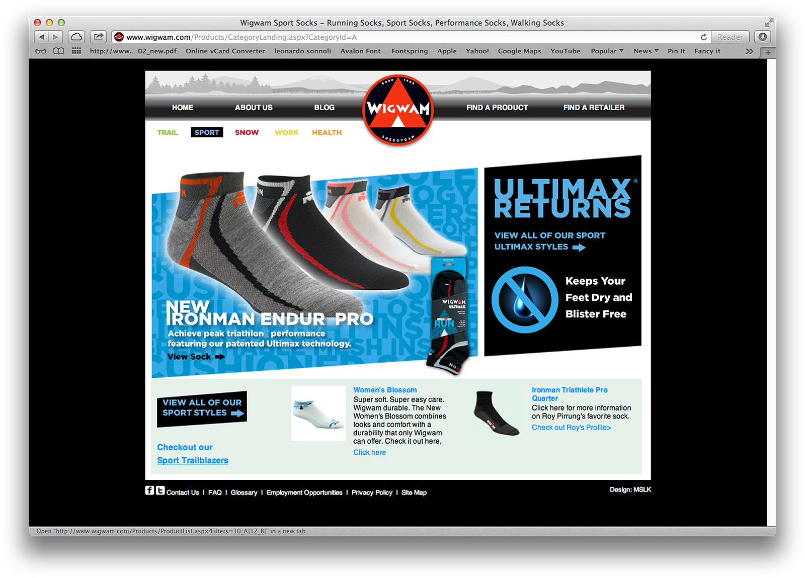
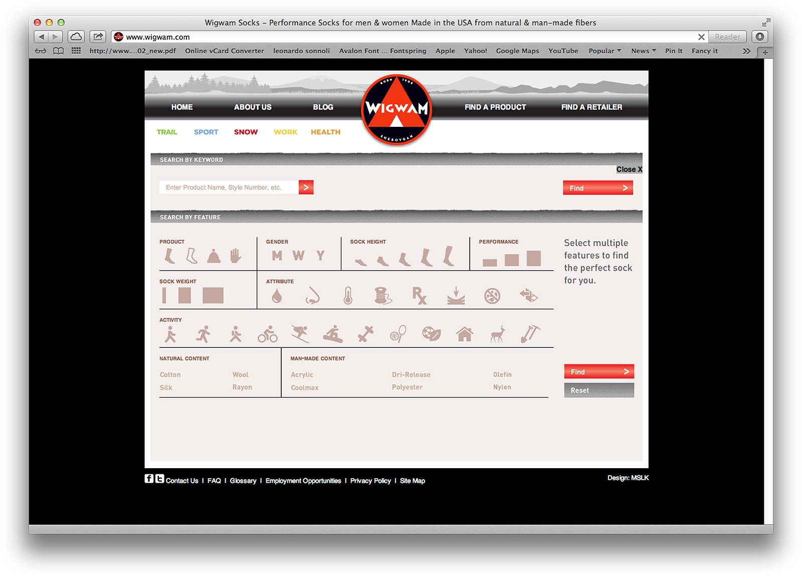
After exploring dozens of prototypes, two design directions were put through extensive quantitative and qualitative consumer testing. One design emerged as the clear winner. The new design was updated with sleek, angled edges to visually reinforce speed and performance, yet did not require any expensive retooling on the manufacturing end. Each package face contains a large teepee comprised of activity-focused words in bright colors. The package backs were revamped, eliminating information that did not instantly communicate performance benefits or speak of Wigwam's patented technologies. A QR code takes smartphone-enabled consumers directly to a web-page explaining the benefits of key technologies. Our online design strategy had always been to connect customers with the sock that best met their needs. Because Wigwam offers more features than customers might consider, we developed an interactive sock finder, allowing customers to filter products by the features that interested them most.
4. SUCCESS
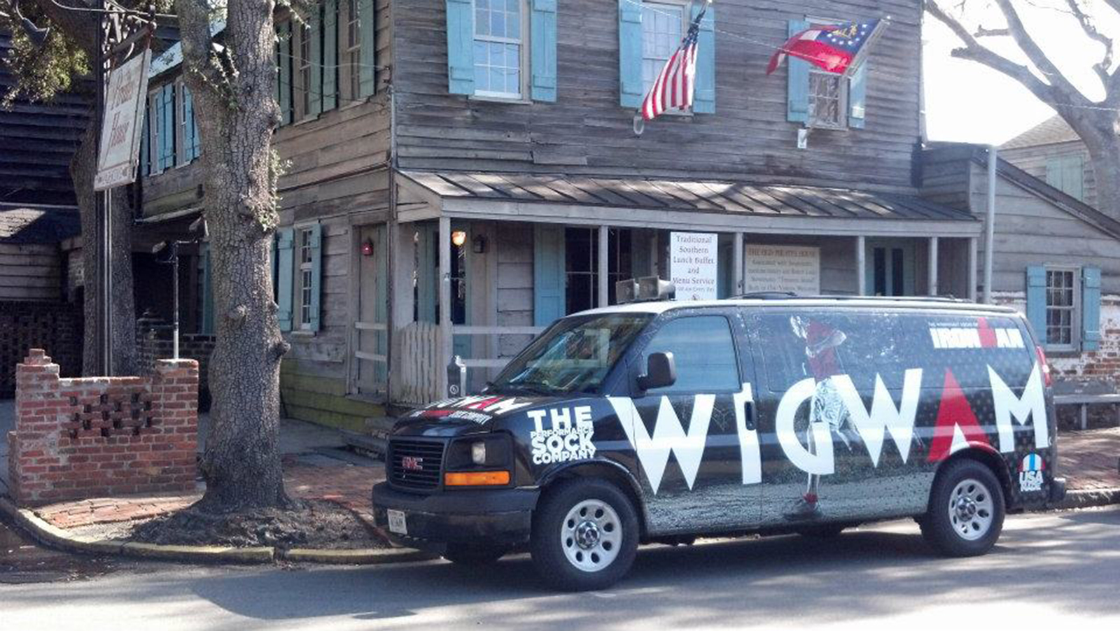
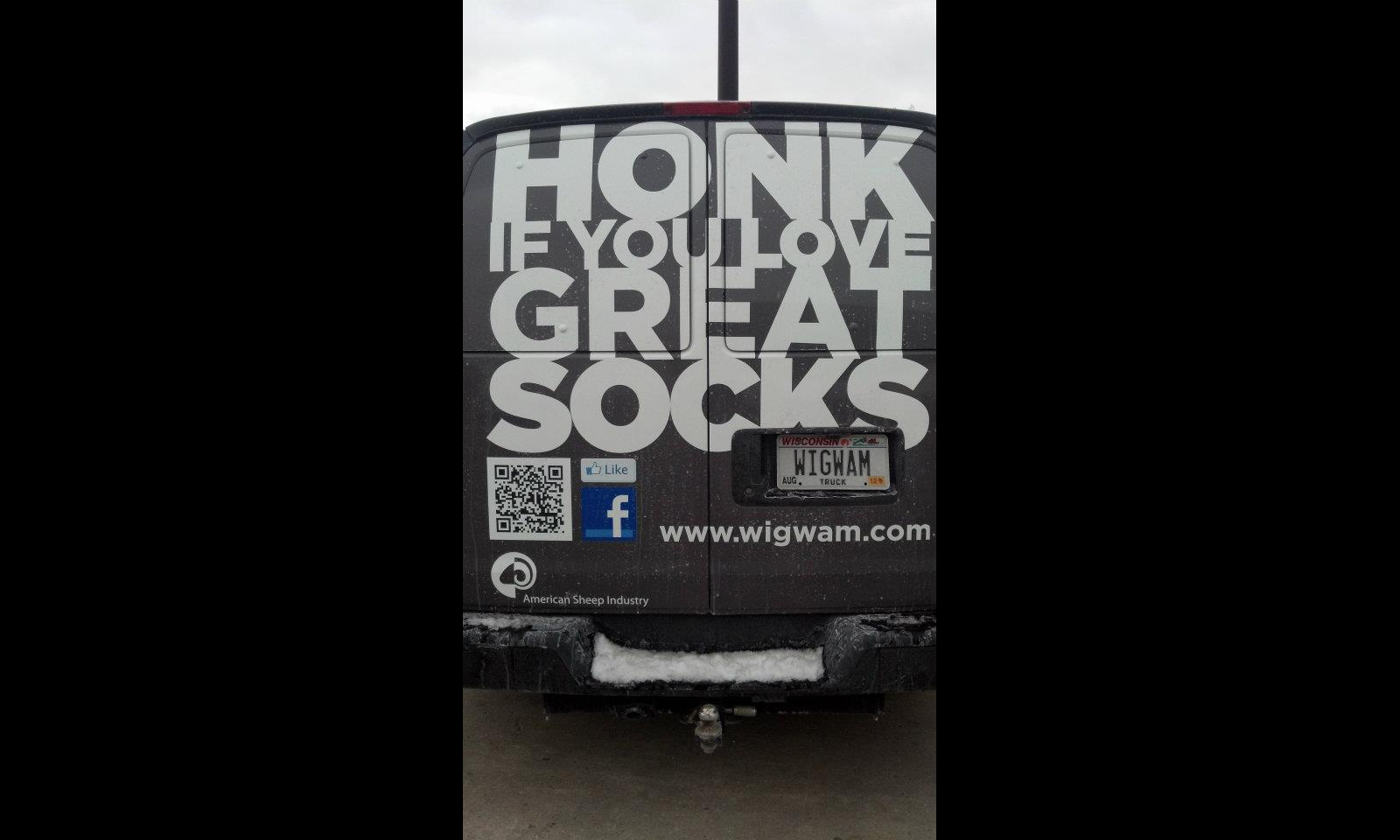
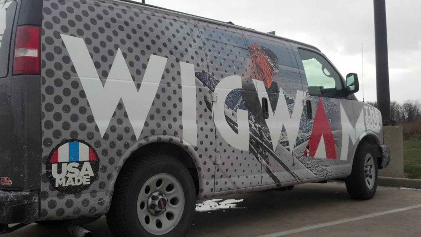
Even before hitting the shelves, our design received a 2012 American Package Design Award. In consumer testing, the new design showed a 26% increase for conveying Performance, far exceeding our existing design and edging out top competitors Nike and Smartwool. At a recent international sales meeting, reps overwhelmingly lauded the changes as ''being exactly what was needed to compete." Wigwam has eagerly adopted and incorporated our tagline and design direction into all of their promotional efforts, including their sales materials, point-of-purchase, tradeshows, social media, events and even their traveling promotional van.


