
COLORPROOF
Pioneer in Color Safe Haircare
gets a Colorful Rebrand

Acquired by Cosway Co. in 2020, the nine-year-old brand Colorproof was looking to refresh its brand image and positioning. While most haircare lines offer one option for color preservation, Colorproof offers six — pairing superior color protection with other desirable benefits such as smoothing, volumizing, etc. MSLK was tasked to help the Cosway team objectively evaluate crucial decisions in the packaging and brand restructuring process, redesign the brand identity and packaging, and bring to life a new visual and verbal story for the brand that truly captured market white space.
SERVICES
- Brand Strategy
- Brand Architecture
- Brand Story
- Brand Audit
- Copywriting
- Competitive Analysis
- Logo Design
- Packaging Design
- Photo Art Direction
LOGO
The CP monogram is an evolution of the prior Colorproof tree icon, reconfigured as a clearly defined C and P that also evokes a strand of hair.
BRAND ARCHITECTURE + NAMING RECOMMENDATIONS

Colorproof’s product portfolio had bloated to over 100 products, many with confusing names. These names, while clever and branded, did not clearly convey each product’s point-of-difference in the market. We worked with the Cosway team to identify unbranded keywords most relevant to consumers and suggested updates to product names and brand architecture to better meet those needs.
DESIGN EXPLORATIONS
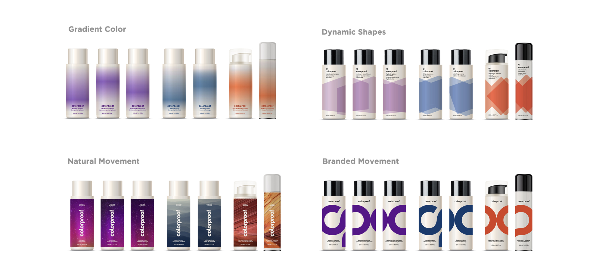
During our targeted design exploration, MSLK deliberately pushed the envelope of the existing Colorproof brand into several design directions, each dialing up different aspects of the brand positioning strategy. Gradients of color, dynamic shapes, images of nature, and repetitions of the brand logo playful dance across each product to differentiate regimens.
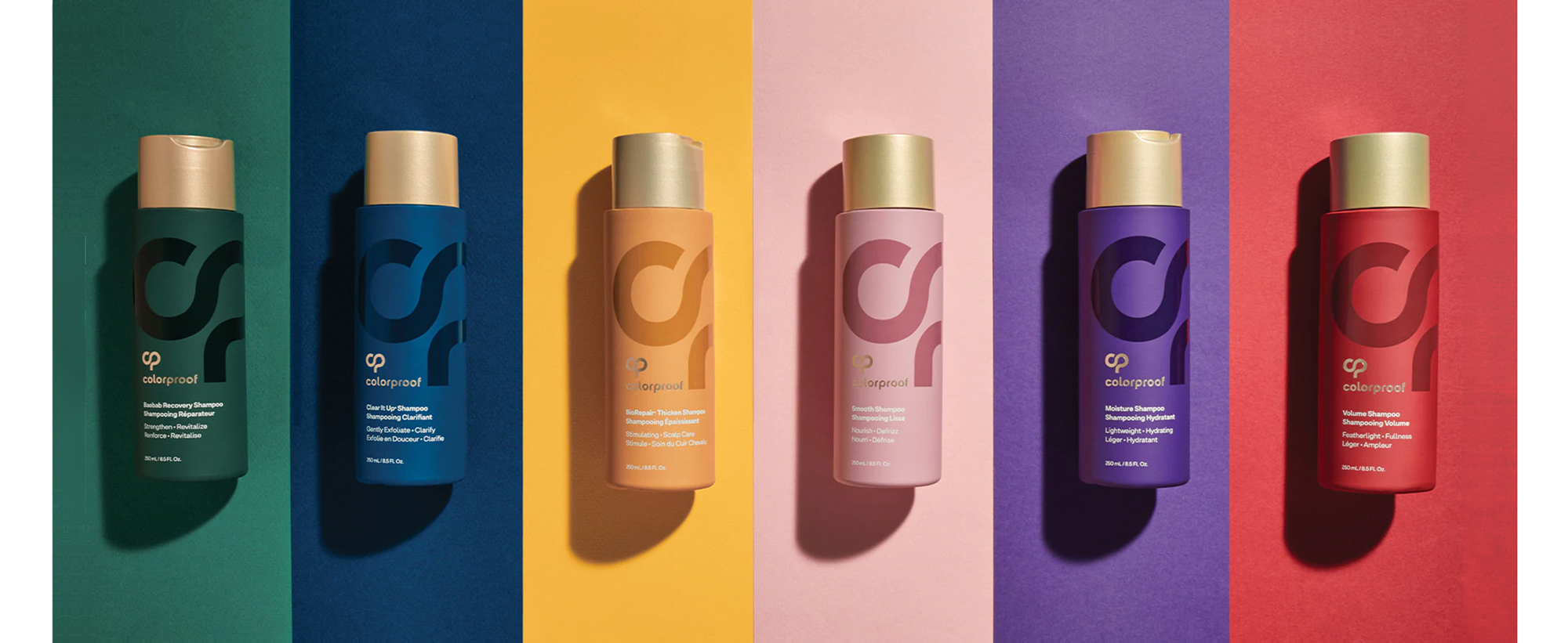
FINAL DESIGN

After initial exploration, the Colorproof team felt that a departure from the colorful packaging of the current brand to a unified primary package for all SKUs might be a bit too extreme. A shift to an investment in colored components per regimen was made. The resulting final lineup is full of vibrant color with a tone-on-tone spot gloss varnish on the newly developed logo.
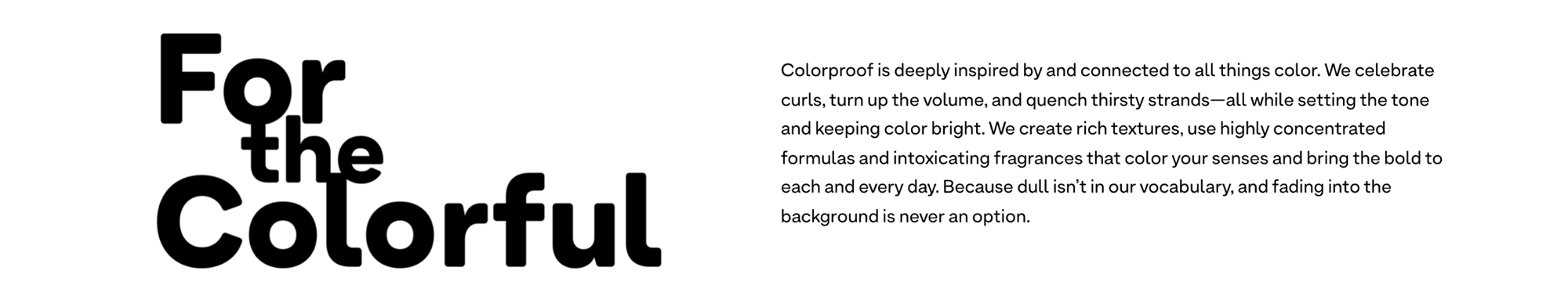
BRAND STORY
With a new direction for the packaging underfoot, MSLK brought the newly defined unique positioning and storytelling for the brand to life by redefining the key brand pillars, taglines and headlines for the launch campaign.
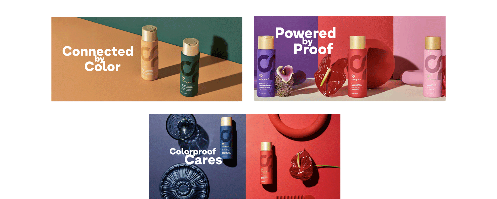
ART DIRECTION FOR PRODUCT PHOTOGRAPHY AND MODEL IMAGERY

Along with the words for the verbal storytelling of the brand, we also provided mood boards and art directions for the visual storytelling in product and model imagery. The strong, bold colors of the packaging and messaging are visually reinforced in the imagery. In model imagery specifically, color is used to visually connect user benefits with the color of the regimen to use.
“The Brand Architecture work was a very helpful exercise as it helped us identify gaps, bring back SKUs that we now see we have room for, and prioritize potential line extensions.”
– Sarena Kirby, Brand Manager, Colorproof
“With a simplified story and appealing shelf aesthetic, Colorproof has reemerged in the professional space as a leader in color care and has been praised by industry experts and beauty editors alike, siting 95+ press mentions in leading trade and consumer publications and winning numerous awards for its performance.”
– Cathi Ellis, Marketing Communication Director, Colorproof


