Pruning a few letters and adding a witty voice allowed this high-end garden and landscaping business to blossom. Spanning a wide-range of applications including vehicle designs, uniforms, and business cards, the M. Erbs team has a brand image that is as beautiful and sophisticated as the quality of their services.
Read project brief Read project brief
1. CHALLENGE
High-end landscaping firm Mrs. Erbs was founded by Sara Erb. When Keith Wallock purchased the company, he was concerned that the current branding did not reflect the quality of service the company provided. In addition, Keith was not sure if a name change to reflect the new ownership was needed, and came to MSLK for an overall brand repositioning.
2. STRATEGY
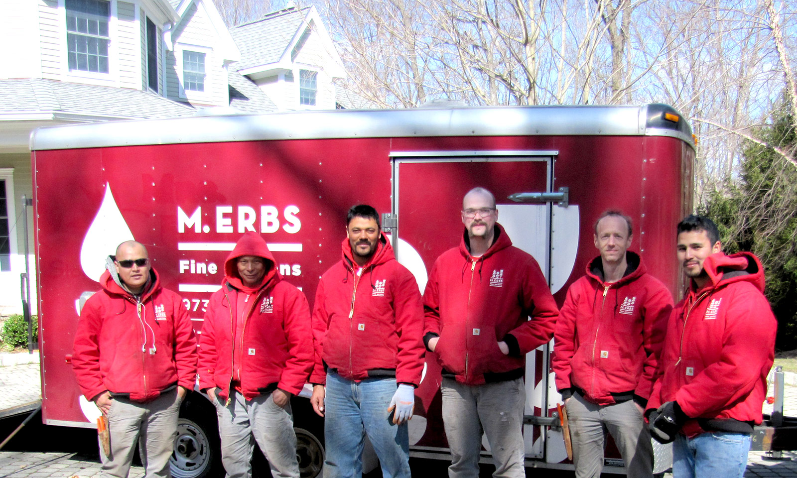
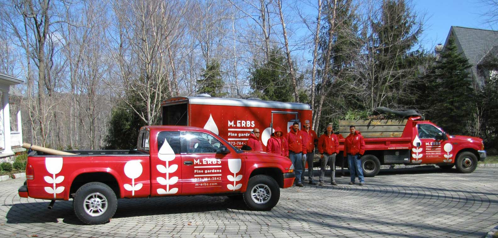
MSLK conducted a brand audit, customer and stakeholder interviews, and competitive analysis. This process gave insight into the brand's existing equity. Our research uncovered that there was no equity in the existing logo, and that everyone was comfortable with the new ownership, regardless of the name. Customers consistently recalled the company's red trucks in their driveways and the beautiful flowers that would follow. Our new marketing plan would help the company satisfy their customer's desire for more information about their gardens.
3. DESIGN
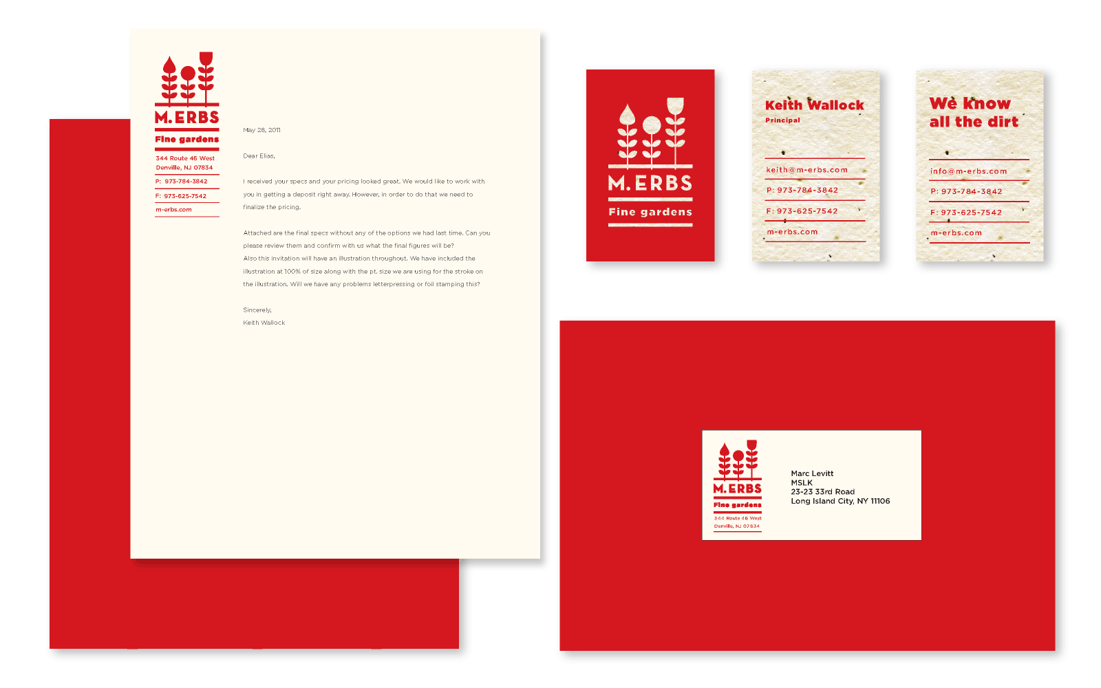
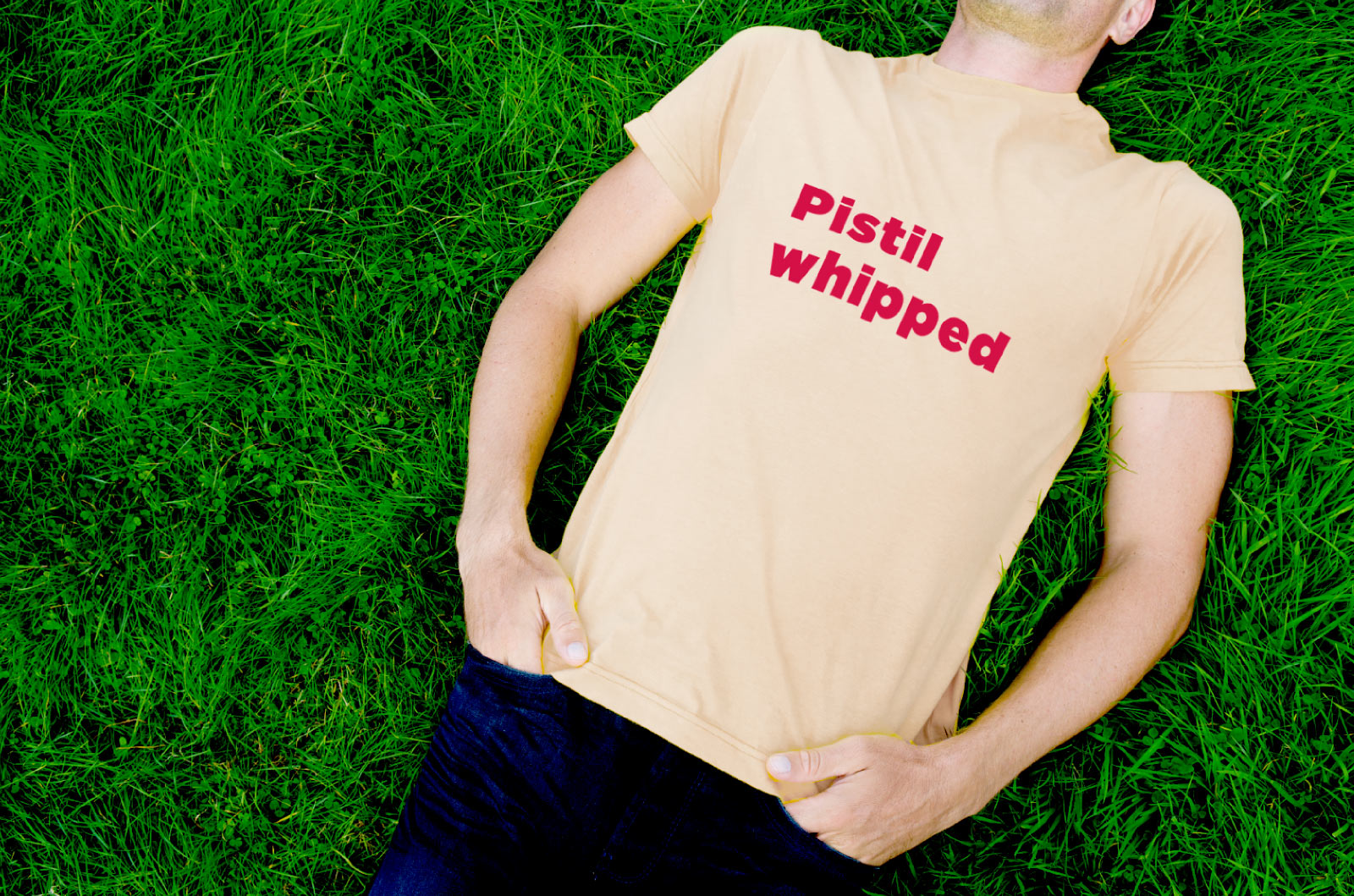
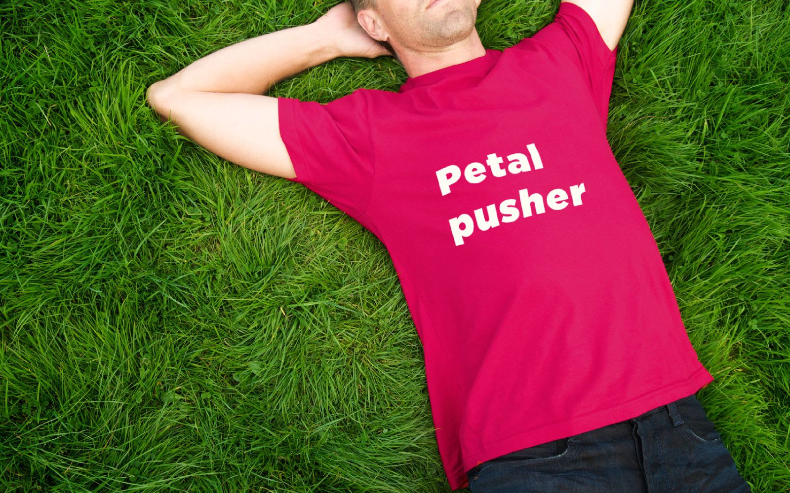
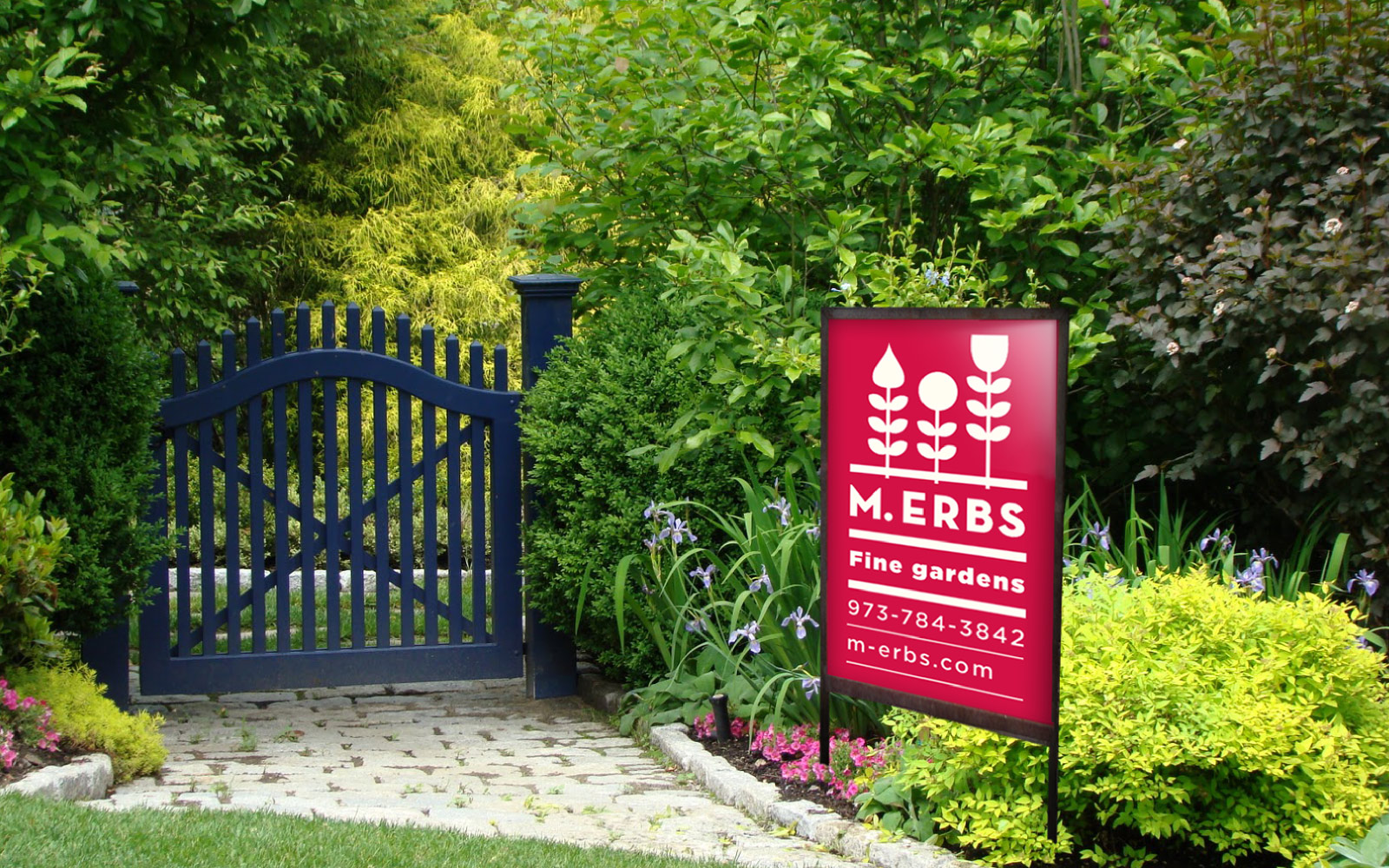
We addressed the company's name with a subtle shift from Mrs. Erbs to the more elegant and gender-neutral, M. Erbs. This was the perfect way to keep the past while moving forward. We heeded our research and kept the company's color red while developing a modernist logo featuring flowers and layers of soil. Beyond just visuals — we developed a witty personality and voice for the brand, reflecting their passion for gardens. This brand voice takes the form of witty phrases that are printed staff uniforms and vehicles. Online we addressed customer requests for more information and inspiration by compiling images of the company's work by garden type and creating a seasonal email newsletter.
4. SUCCESS
From the outset of the project, Keith’s measure of success was to see his staff become excited to wear their uniforms. Now that each item has a touch of wit and character, the staff proudly wear their uniforms at work. Some have even been known to wear them on their days off, too. The M. Erbs trucks have also garnered positive attention and comments from those who have read their witty phrases. As Keith noted, "The analysis conducted by MSLK gave me new insight into my brand. I am so pleased to have a unique positioning for my company that stands apart from competition."