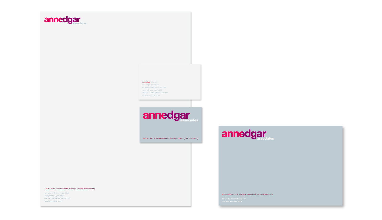
Anne Edgar is an expert at museum and cultural media relations. Because her audience is so design-savvy and visually-oriented, she came to MSLK looking for a minimalist brand identity to capture maximum attention. The unique typographic moment where we realized the last letter of her first name met the first letter of her last name became the basis for a sophisticated visual — and conceptual — campaign.
Read project brief Read project brief

1. CHALLENGE
Anne Edgar Associates is a New York City-based media relations firm whose clients are in the visual arts, as well as cultural institutions. They came to MSLK looking for a visual brand identity and online marketing program to help them stand out amongst an already visually-aware crowd. The challenge was to create simple, informational, creative materials that could be easily updated and creative without the use of any imagery or photography, which was deemed too specific.
2. STRATEGY
In order to create visual interest without imagery, MSLK capitalized on the letter "E" shared by Anne's first and last name and used that as the basis for everything. The website would uses this visual concept by have elements appearing from the divide in the middle. In addition, three sets of words pairs that followed the same overlapping language such as "memorable exhibitions" and "museum milestones," were established to define the firm's core capabilities at the forefront of the website.
3. DESIGN
In order to portray Anne Edgar as a perfect complement to serious institutions dealing with artistic content, a distinctive color palette of a bright magenta and purple was paired with a cool, mellow grey. In order to keep users engaged with the text-heavy content, MSLK created an interactive interface where a cursor's movement created hotspots with a color gradient. We further spoke to the firm's target audience by including crop marks, an industry-specific design element.
4. SUCCESS
More than a decade later, MSLK's design solution continues to serve as a prominent brand identity for the firm. Perhaps Anne herself said it best, "I continue to get positive responses from potential clients. Anne said, "Truly, in 9 years, I've never invested in anything that's been half as effective for my business."


