Don’t let the name fool you — Friends of Animals takes a hard stance on animal rights. Established in 1957, the organization has transformed the animal rights movement. What it hasn’t done is promote its great work. MSLK’s new brand positioning finally gives Friends of Animals a voice and a visual platform with an identity that “strikes out” animal abuse.
Read project brief Read project brief
1. CHALLENGE
Friends of Animals was founded in 1957 to help control the pet population through spay and neuter programs. Since then, its scope has expanded globally, to assist in the preservation and protection of wild animals — advocating for all animals' rights. In recent years, other animal rights groups have become much more media-savvy. Friends of Animals became aware that its important work was going largely unknown to the public. Moreover, it was not capturing the attention of the new generation of animal rights advocates.
2. STRATEGY
Our findings led to a simple conclusion: while Friends of Animals’ work is highly effective, it was not effectively communicating its achievements. The existing logo featured a paw print and handwriting, but was not memorable, nor unique among the competition. There was no visual continuity among all the communications. Moreover, “Friends” in the name did not fully communicate their position on animal rights. We set a goal to reach outside the animal rights community, bringing awareness to the unaware with everything the brand touched.
3. DESIGN
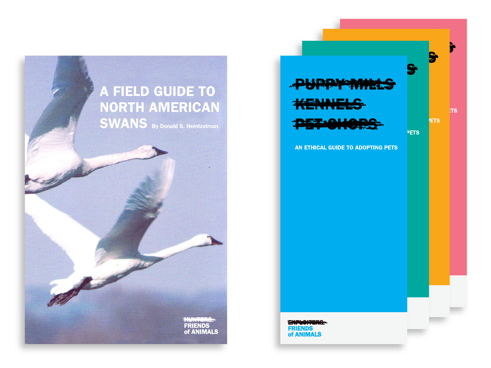
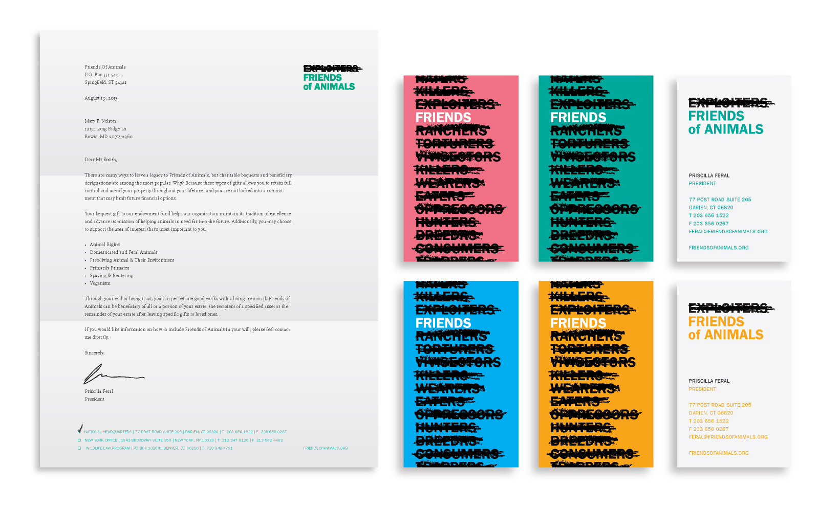
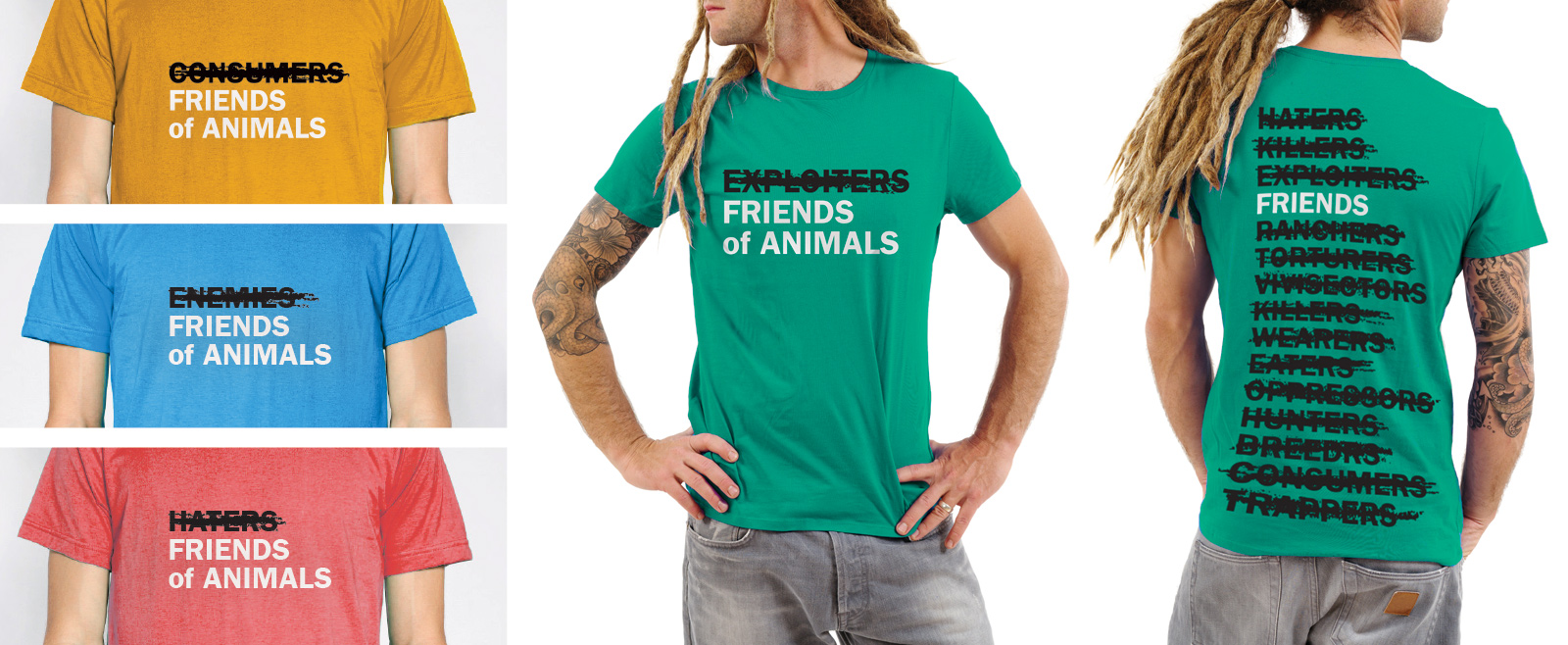
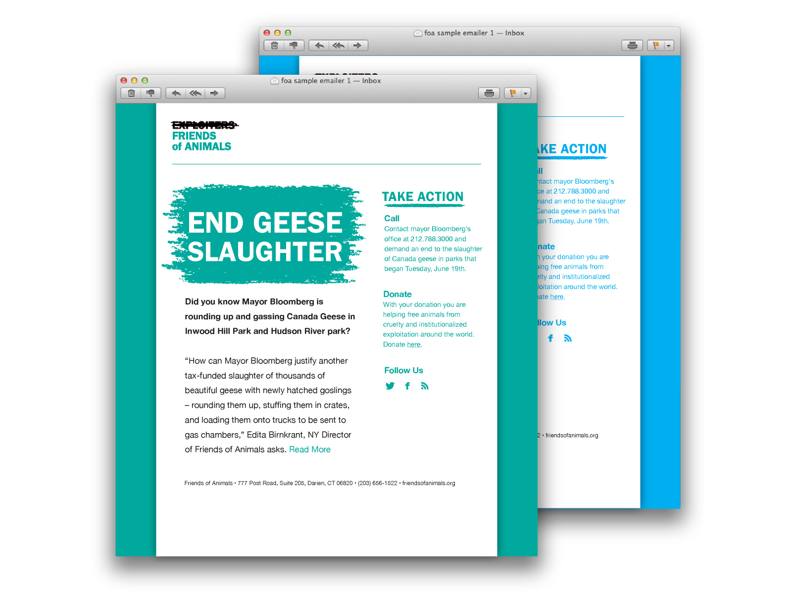
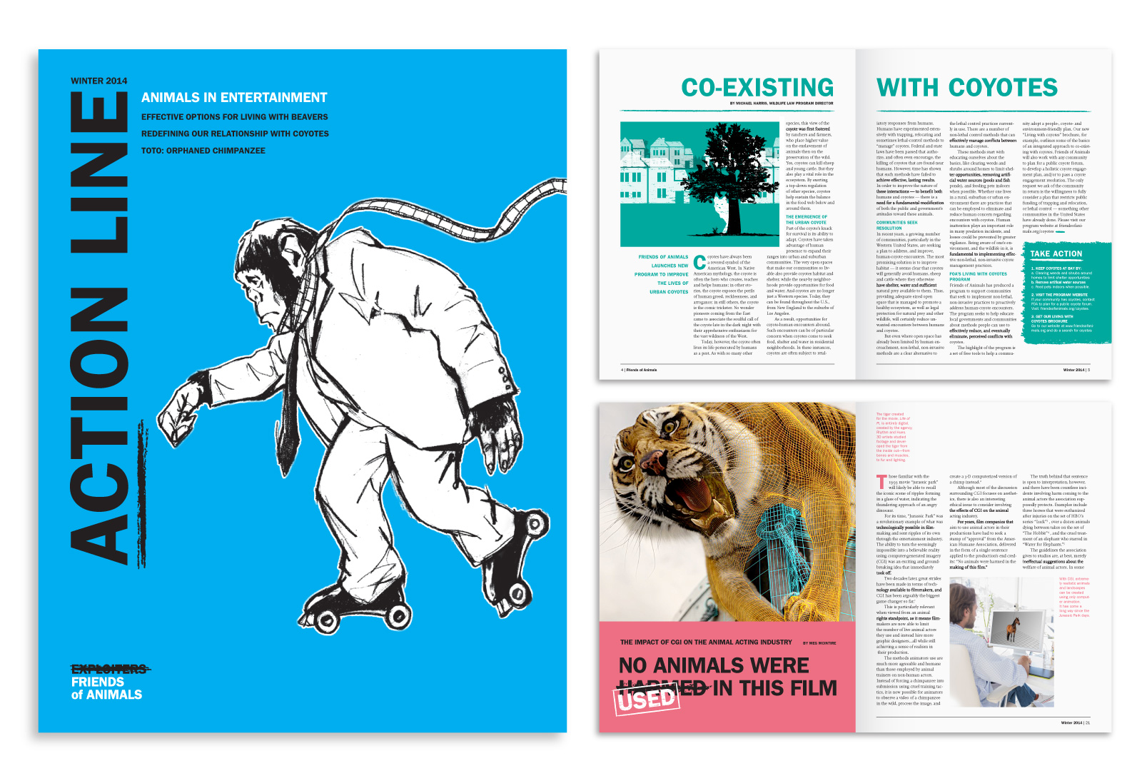
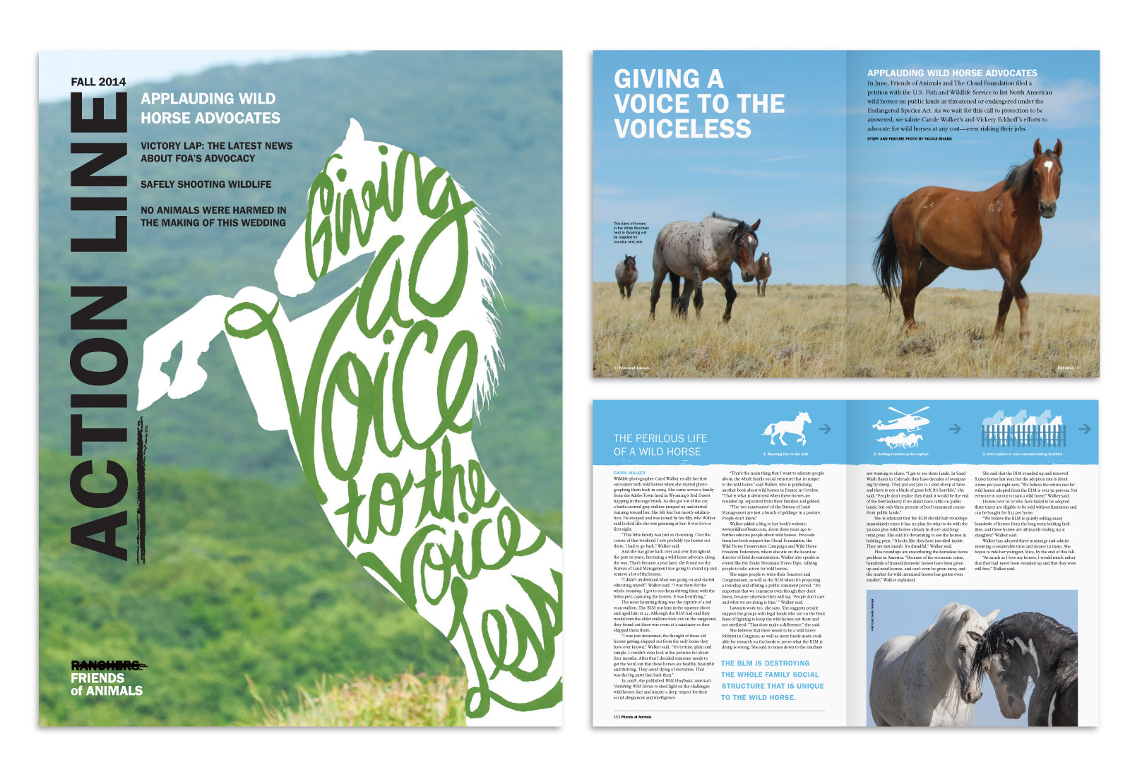
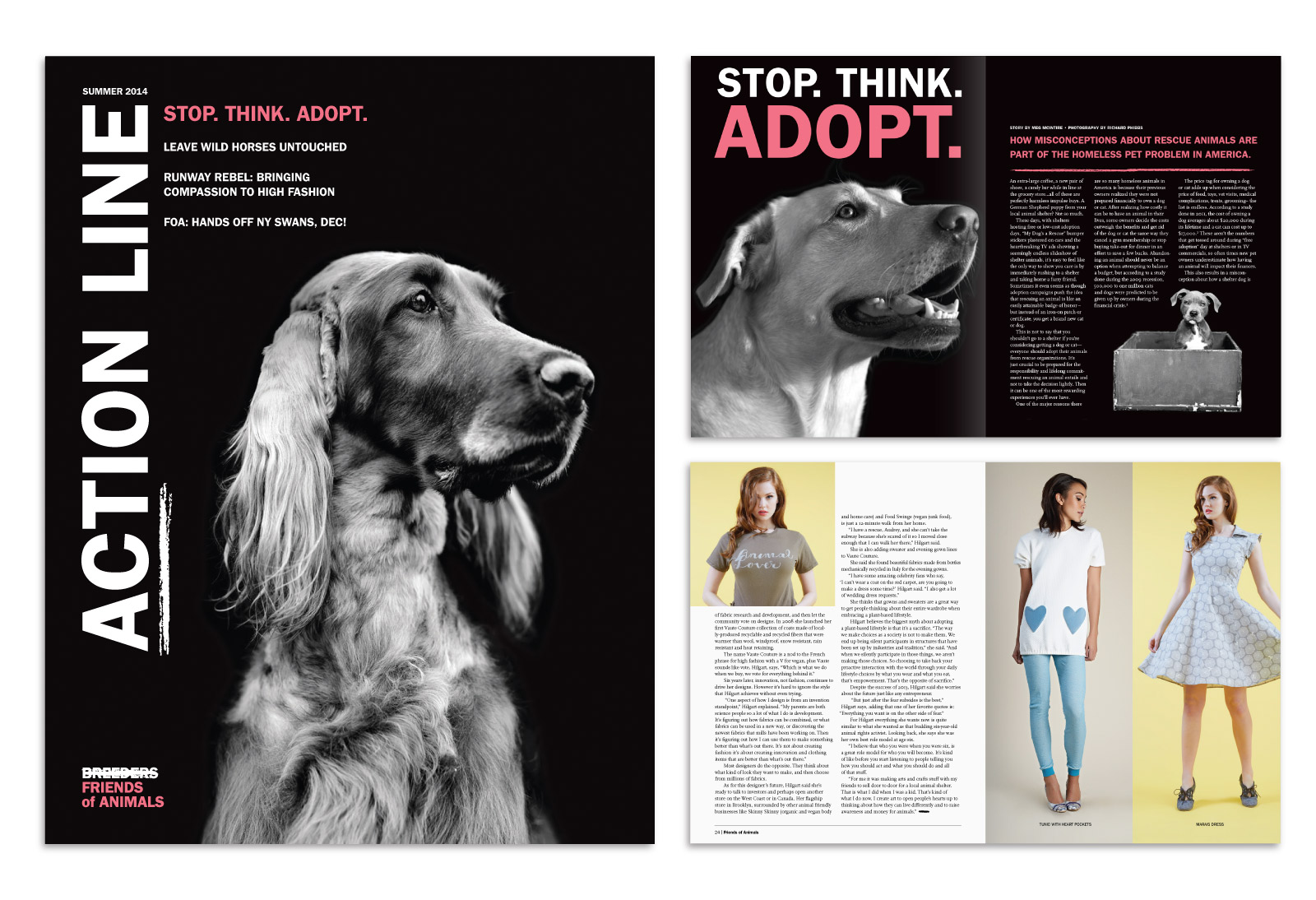
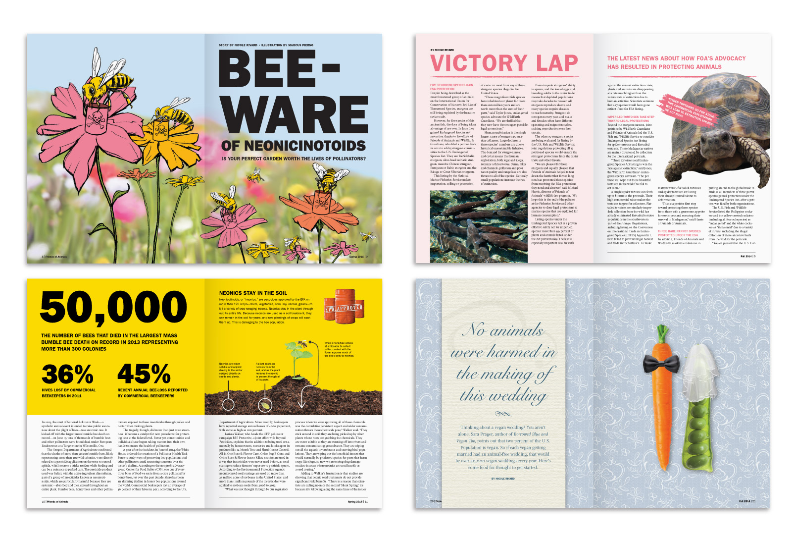
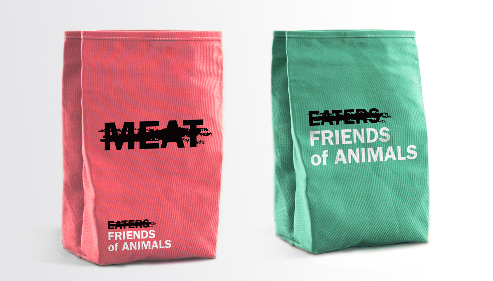
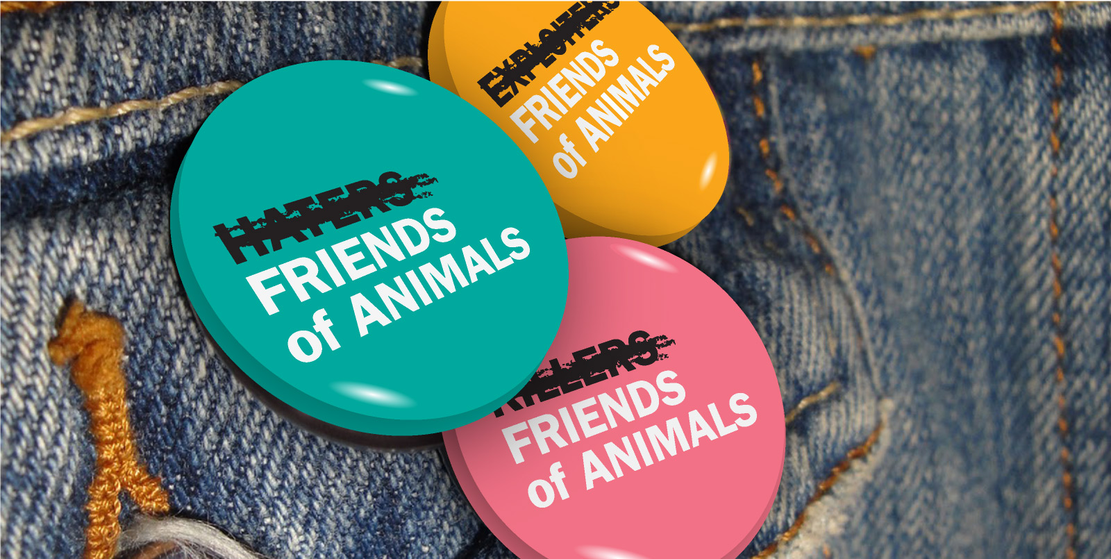
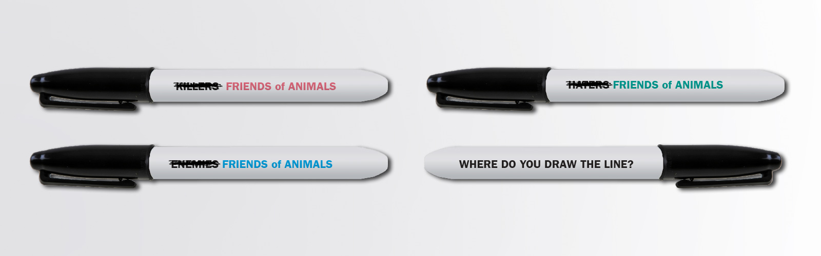
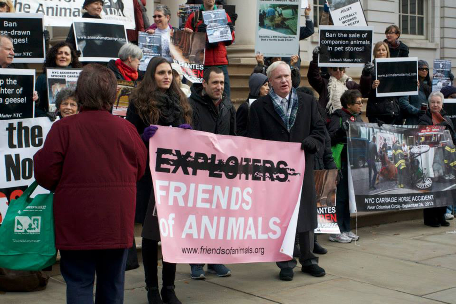
We started by focusing on the issues Friends of Animals resolves to strike out: the torture, killing, and abuse of animals. Inspiration came by literally drawing a line through these words, resulting in a design language of gestural scrawls, cross-outs, and underlines which evoke the wild, untamed spirit of nature the organization seeks to preserve. The logo is flexible, with messaging contextual to each application. To balance this aggressive new approach, four bright colors are used liberally throughout the design program to draw people in, conveying a sense of optimism. MSLK has since designed a wide-range of projects ranging from print and online communications to merchandise. The quarterly publication Action Line was transformed from what appeared to be a general-interest nature magazine into an exciting modern journal with a definitive viewpoint. Comprehensive brand guidelines were developed to give anyone within the organization rules to follow.
4. SUCCESS
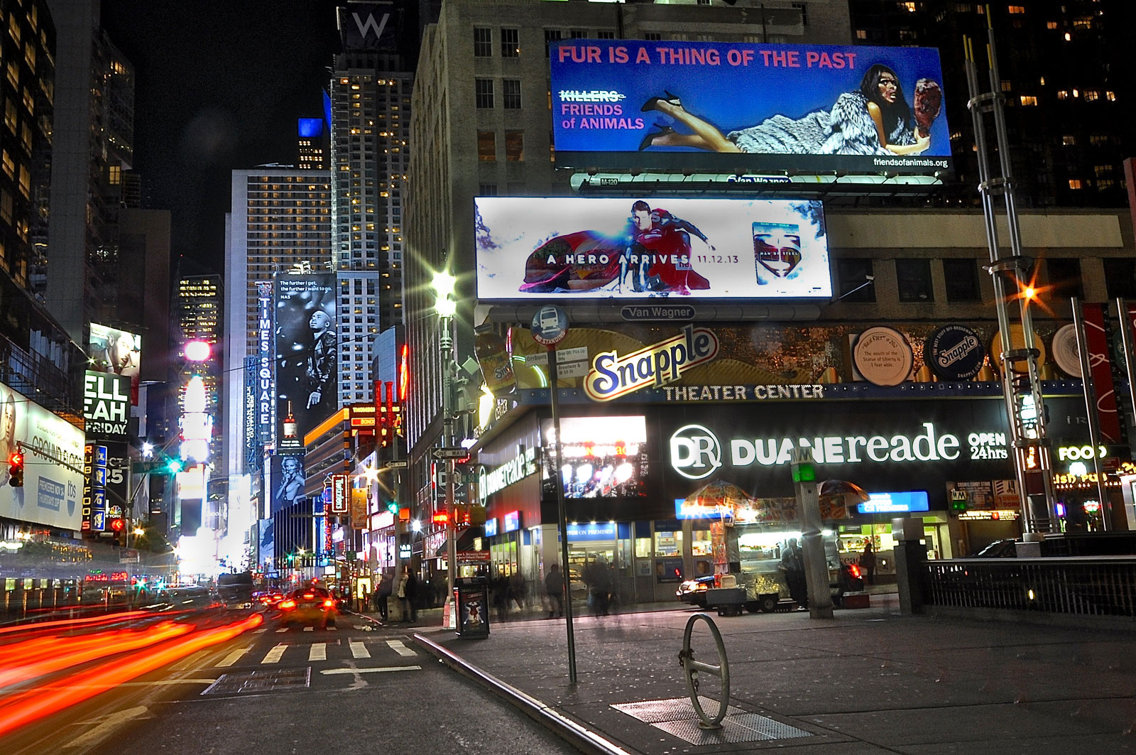
MSLK created a short video to help explain the rationale behind the new identity. The video — which was uploaded to the website and shared across social media — became the centerpiece of the brand launch. Associates who had expressed early concerns about the daring new direction embraced the new identity. Immediately upon the launch of the brand, MSLK helped design two large-scale billboards in Times Square. These billboards were part of an anti-fur campaign expected to reach 2 million people per day.
According to their president, Priscilla Feral, “It was really such a difficult and torturous process to think about our brand, thank you for guiding us through the discovery process. It produced solutions that we could have never envisioned on our own. Then it became fun and exciting. This clearly was the solution we needed!”