Alkemist Labs is a pioneer natural products testing company that guides health and beauty companies in verifying claims and formulations for FDA approval. We created a unique, memorable identity that has become their new seal of approval, extended on everything from official certificates of analysis to ad campaigns, trade shows and their website.
Read project brief Read project brief


1. CHALLENGE
Alkemist Labs lacked a unified brand presence and clear messaging to convey their services and points of difference. Before enlisting MSLK, they had multiple names and logos that were used inconsistently across different platforms. Furthermore, their website was difficult to navigate, containing dense information without top-level messaging to clearly guide users through the experience.
2. STRATEGY
MSLK conducted a series of stakeholder interviews to truly understand Alkemist Labs' service offering and communication needs. Our analysis yielded four overall recommendations:
• Their overly detailed logo seal needed to be simplified into a bold, memorable mark that could be used to brand all materials across all media.
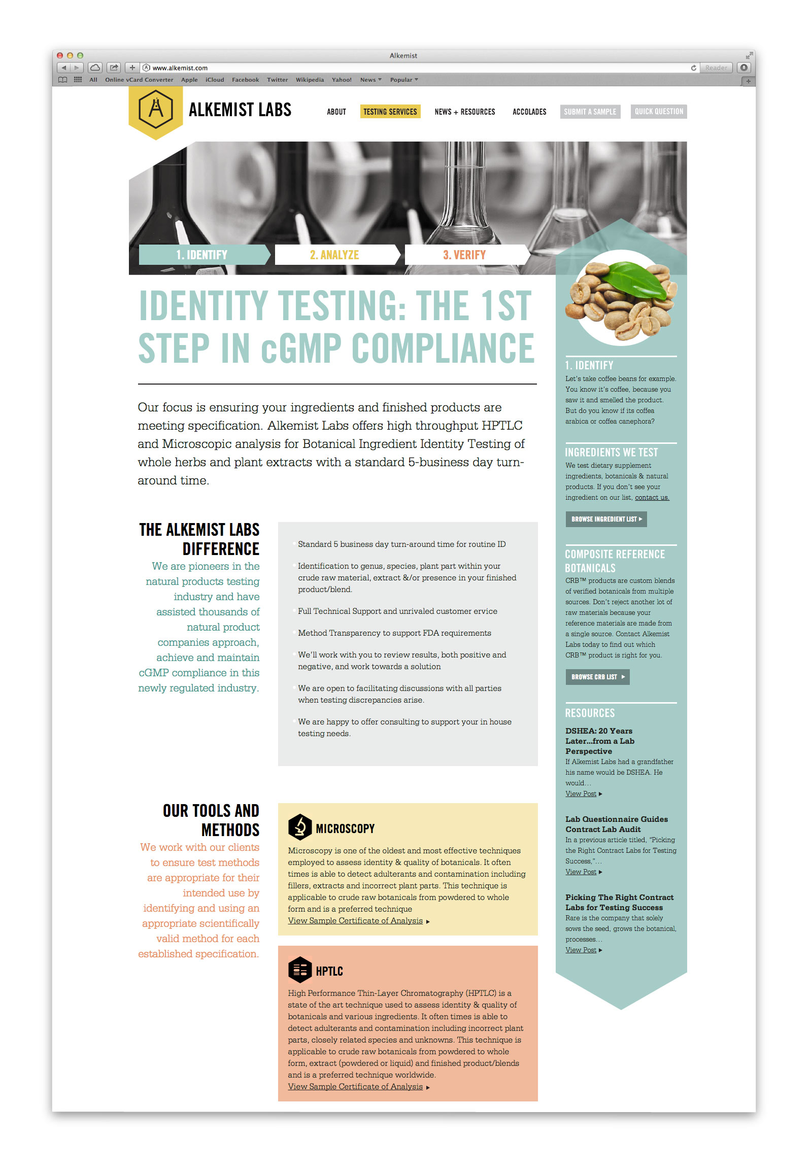
• They had a variety of testing methods that would be best to treat as 3 distinct steps to clearly communicate their testing services as a process: Identify, Analyze and Verify.
• Everyday examples and natural language should be used to explain complex testing concepts, speaking directly to health and beauty marketing directors
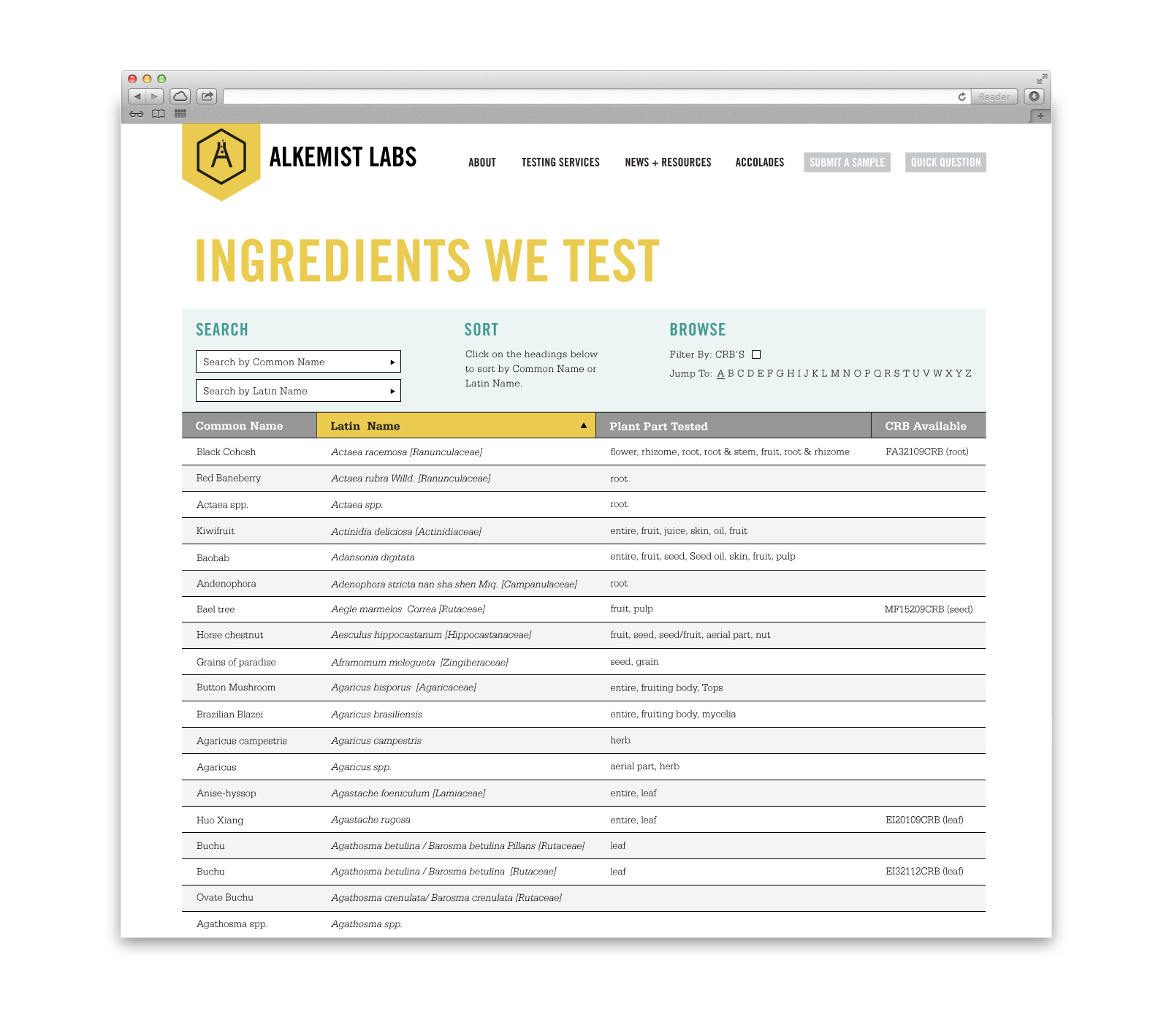
• Alkemist Labs' list of reference ingredients, which was a pdf containing thousands of entries, should be simplified into a searchable database that could be updated easily.
3. DESIGN
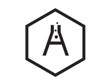
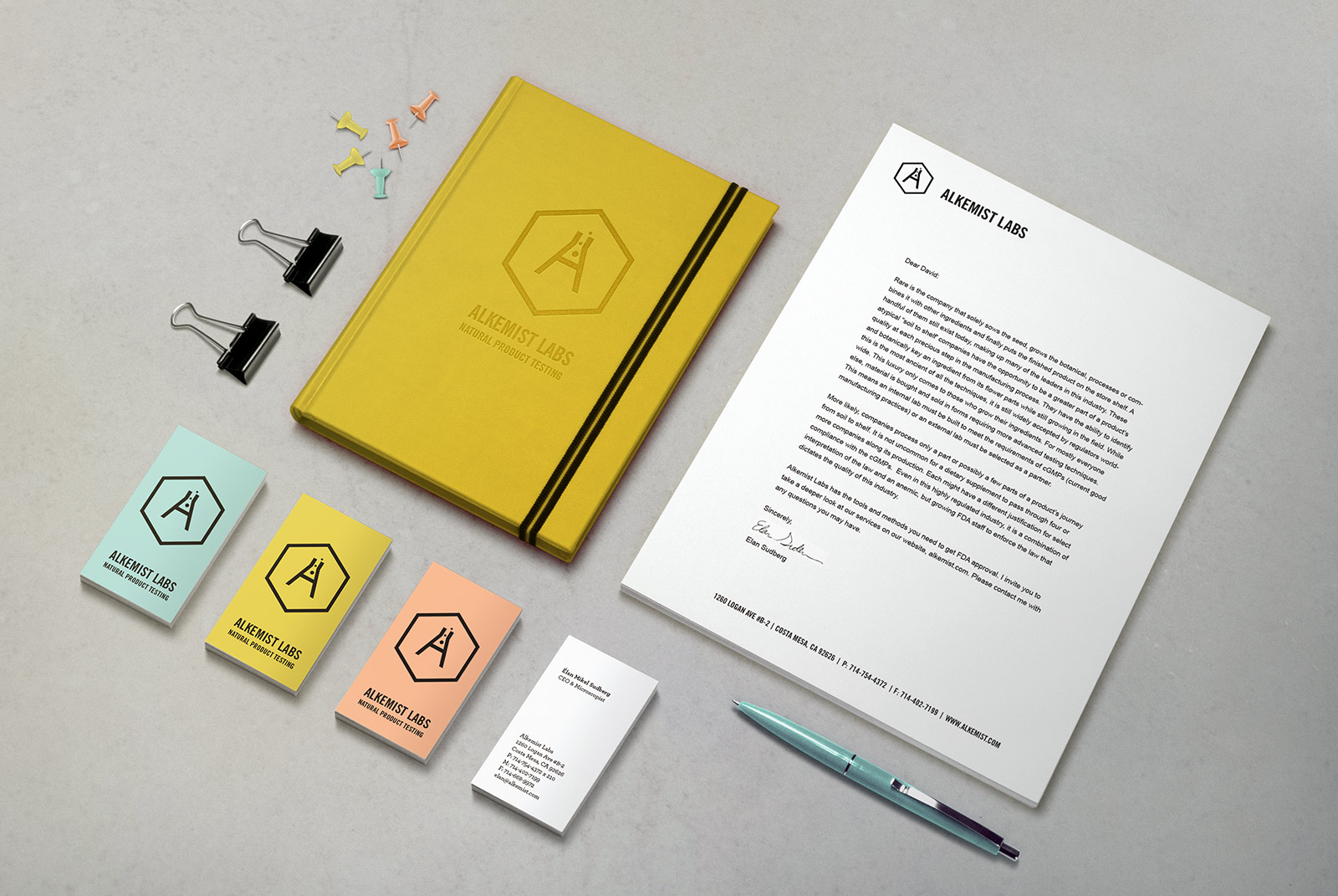
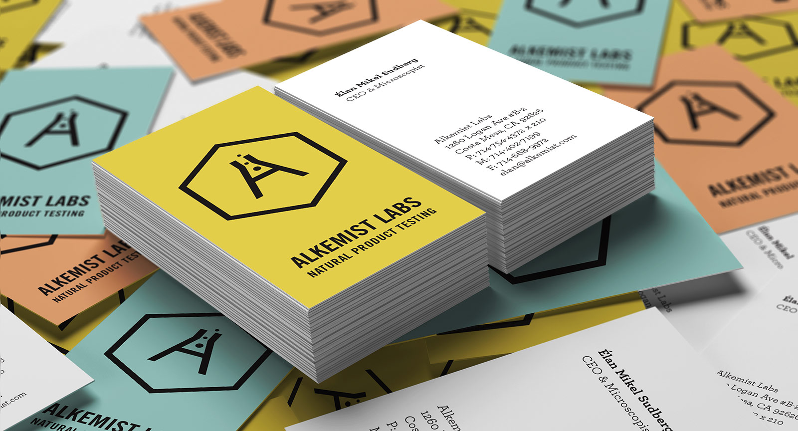
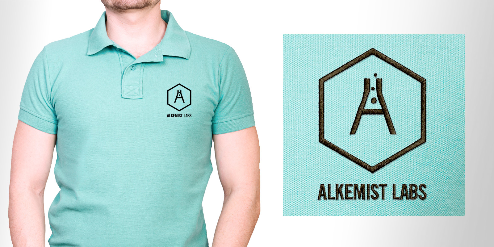
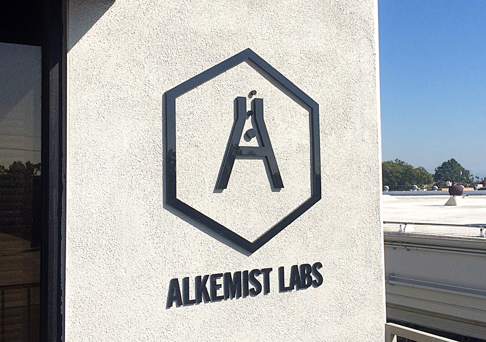
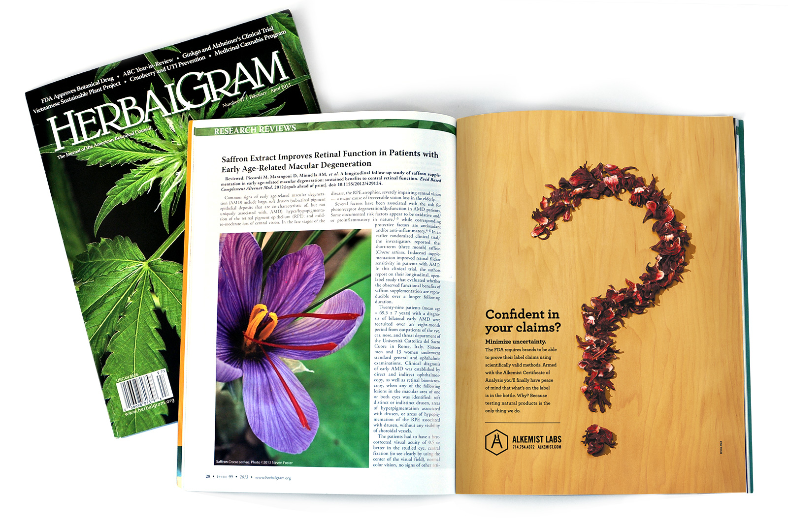
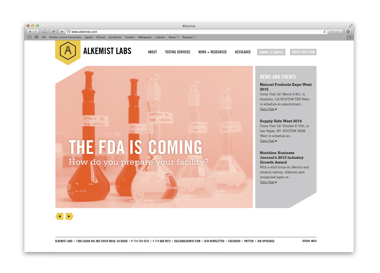
Alkemist Labs' new logo is a unique symbol created by fusing the letter “A” with a beaker. Surrounded by a hexagon, referencing molecular structure, the mark serves as their seal of approval appearing on everything from certificates of analysis to ad campaigns, trade shows, and their website. As their most vital tool in reaching new customers, the website uses the hexagon as a main visual element, combining with duotone photography and a sophisticated color palette to effectively guide users through the content.
4. SUCCESS
The comprehensive brand repositioning reinvigorated buzz around the company. Appearing in numerous industry publications such as American Herbal Products, as well as trade shows, the new identity has received rave reviews. Alkemist Labs now has the tools to convert customers more effectively and solidify their place as global leaders in natural product analysis. Perhaps CEO Élan Sudberg said it best himself: “After MSLK’s brand repositioning and marketing, we had our best month ever. Consistently my sales increased by 20% which we attribute to the positive buzz, marketing awareness and general positive energy around our brand.” The Alkemist rebranding has also been honored with the Type Director's Club Award for typographic excellence, appearing in an international exhibition that toured cities throughout the U.S., Canada, Europe and Asia.