Gracious Home: Brand Identity
 Challenges Gracious Home, a well-known upscale houseware and hardware store located in Manhattan, had difficulty maintaining their brand identity due to inconsistent variations of their logo. As the company explored the idea of expanding locations, it was crucial to restore the logo’s elegance and bring back its legibility. Strategy MSLK sought to refine the typography of the existing logo yet retain the overall essence of what customers recognized as Gracious Home. Design MSLK began by making subtle adjustments to the letterforms and letter spacing of “Gracious Home.” These intricate details refined the logo and maximized legibility. In addition, the tagline “Look No Further” was set in an upper case, sans-serif font to quietly complement the logo. We further accentuated the logo by strategically punctuating the tagline with the registered trademark symbol. Success Gracious Home’s redesigned logo provided a fresh new look that did not detract from the original brand identity but rather leveraged it. The subtle and light touches that MSLK employed were successful at retaining the overall essence of the company.
Want To See More Content About Made by MSLK?
Stay up to date with expert information on the ever-evolving beauty industry. We share the best practices brands are using to connect with consumers in new and meaningful ways.
More Like This

Wigwam: 2012 Packaging Redesign
Challenges Launched in 2008, the existing packaging sought to convey Wigwam as an all-American, family-owned brand with offerings for ...
Kristine Foley: Direct Mail
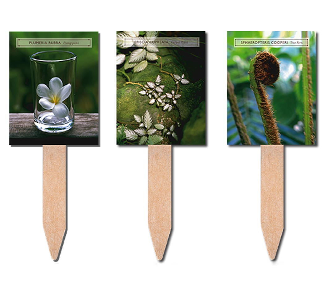
Challenges Kristine Foley, an emerging garden and landscape photographer, was looking for a direct mail campaign that would connect her ...
Beauty IOD: Report
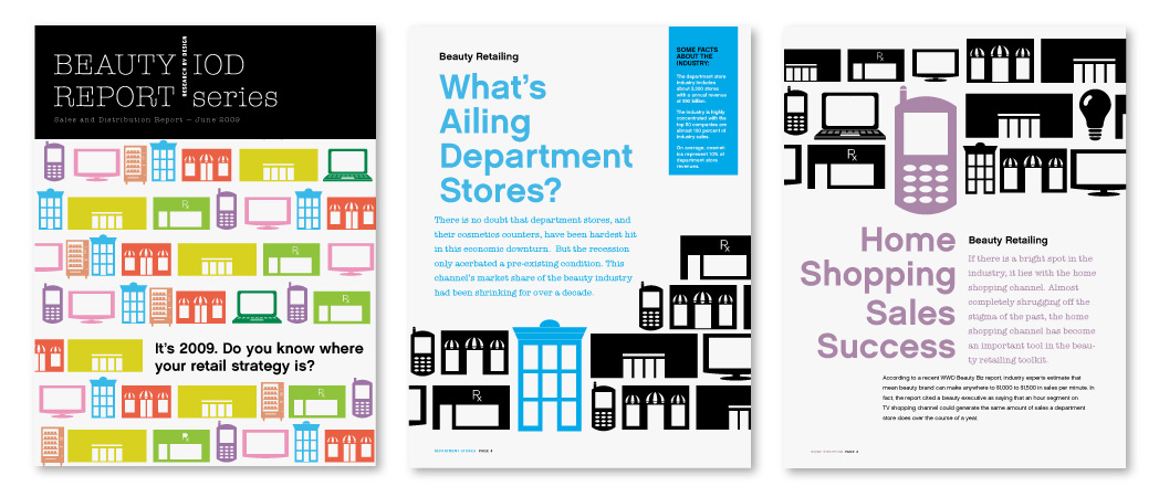
Challenges Beauty IOD Report, a research report focusing on emerging retail venues and strategies relevant to the beauty industry, needed ...