Redken: New on 5th Brand Identity
 Challenges Redken 5th Avenue NYC sought to rename and reposition their number one sales tool, a monthly catalog, featuring their salon quality hair care products. Strategy Commonly referred to as the “dealsheet,” MSLK suggested this new publication be called “New on 5th” in an effort to evolve the catalog into more of an editorial business magazine which always has new content each month. Design Rather than a traditional masthead, MSLK created a bold graphic that could be recognized at a glance and consistently complement the cover model imagery. Our ultramodern approach graphically represents Redken’s NYC connection, particularly its 5th Avenue heritage, capturing the fashion-forward essence of the hair care brand. Success MSLK’s design solution has been in use for over five years now, on over 60 issues. MSLK’s design solution successfully repositioned the monthly catalog, became iconic to the Redken brand, and continues to identify each publication.
Want To See More Content About Made by MSLK?
Stay up to date with expert information on the ever-evolving beauty industry. We share the best practices brands are using to connect with consumers in new and meaningful ways.
More Like This
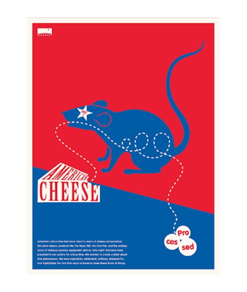
Elseware: American Cheese Poster
Challenges Elseware, an industrial design collaborative, needed a promotional poster for their exhibit, American Cheese: Processed, inspired by kitschy products ...
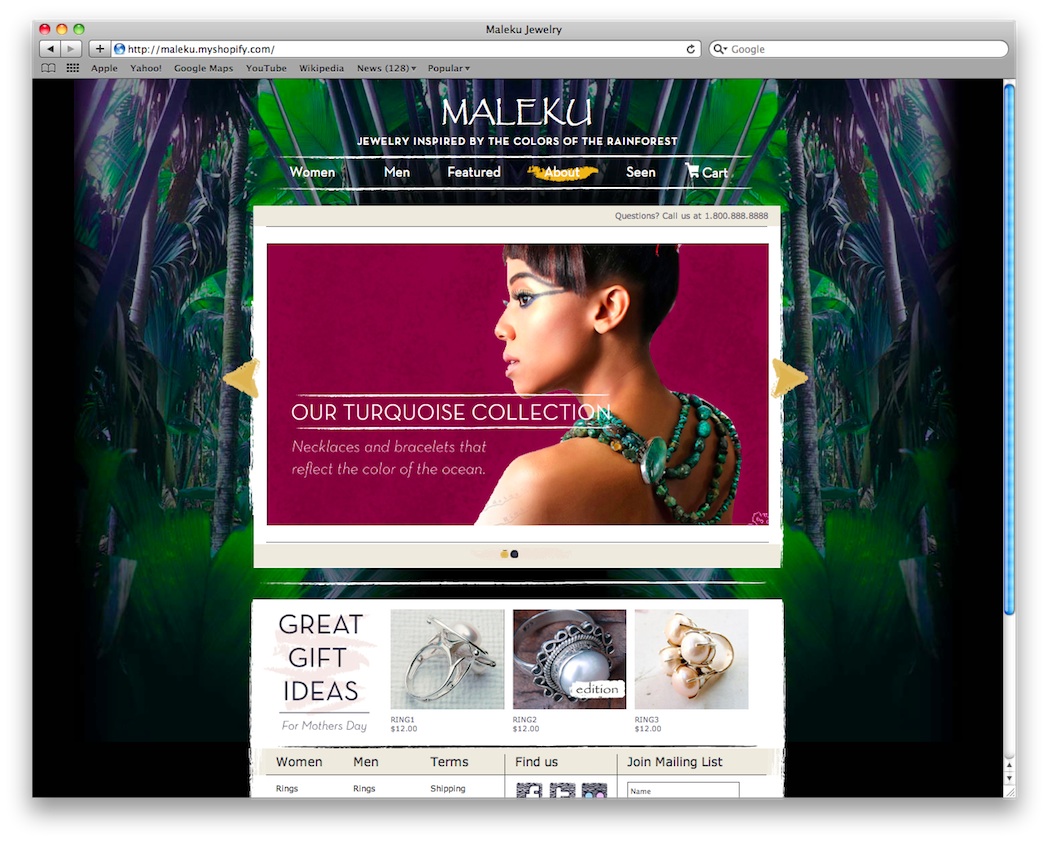
Maleku: Website
Challenges After winning of Nolcha's Beyond the Runway competition, jewelry designer Ileana Rojas-Bennett needed a website that would better position ...
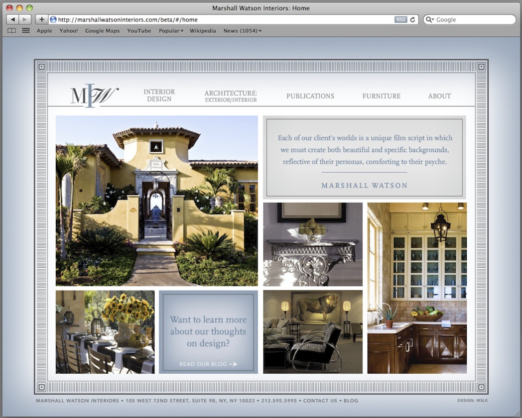
Marshall Watson: Website
Challenges Marshall Watson Interiors, a leading interior design firm, was looking to create an online presence for themselves. Despite being ...