Separating Fat from Fiction
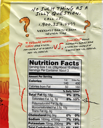 Sun Chip’s new packaging makes an attempt to speak to consumers about the product’s nutritional facts in a clear, friendly manner. It’s great how they are using handwritten graphics in conjunction with the cold, FDA-mandated nutrition facts (which happen to have a Vignelli-inspired heavy black-lined design employing Helvetica). A nice touch, especially since package backs typically aren’t used for “selling.” There’s some other do-gooder facts to be found on the back, as well.
 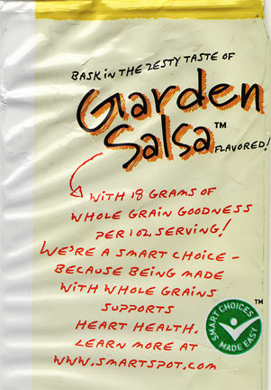 Little handwritten facts about the virtues of whole grains. The green badge is a 3rd-party endorsement which their website describes as “…a quick way to be sure that the products you’re choosing are contributing to a healthier lifestyle.” We like that, right?
  A sponsorship program to help benefit breast cancer research. Is this any of this award-winning design? No. But it’s a nice example of a company taking steps to help consumers and others, using friendly graphics which are appropriate to their cause. On the flip side, while I understand that we might not ever see an organic version of this Frito-Lay-owned brand any time soon, I would like to see a few less oddball ingredients listed like “DISODIUM PHOSPHATE” and “RED 40 LAKE.”
Want To See More Content About Award Winning Art + Design?
Stay up to date with expert information on the ever-evolving beauty industry. We share the best practices brands are using to connect with consumers in new and meaningful ways.
More Like This
Tim Burton’s Point-of-View
Tim Burton's show at the MoMA revealed to me that he's a man with an obsessive vision. From Tim's point-of-view, ...
Dumpling Men
When asked what my favorite restaurants in NYC are, I simply pander to my audience. I do this because experience ...

Hypercolor is the New (Old) Fashion Trend
The 90's heat-activated trend is back. Touch a green shirt you will leave yellow fingerprint; blow on a purple shirt ...