Obama’s Amazingly Designed Campaign
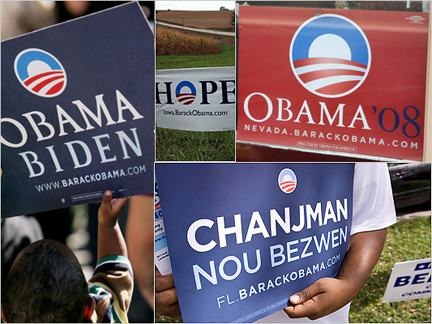 Regardless of where you sit politically, one cannot help but marvel at the amazing strength and cohesiveness of the recent political campaign of Barack Obama. At least from a visual standpoint. Not even counting the grassroots efforts of Shepard Fairey, the campaign had a disciplined approach in its choice of colors, and consistent typeface. Mostly, it was the logo that did it for me. The amazingly prolific graphic design author and historian (and MSLK fave) Steven Heller recently interviewed Sol Sender, the logo’s creator. For an interesting read on how all the rules of traditional political campaigns were broken, have a read here.
Want To See More Content About Award Winning Art + Design?
Stay up to date with expert information on the ever-evolving beauty industry. We share the best practices brands are using to connect with consumers in new and meaningful ways.
More Like This

Thursday Night is Gallery Night
Every month for the past 4 years, MSLK has worked with Michael Mazzeo to shoot images for our Redken dealsheets. ...
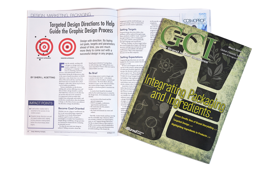
Gci article: targeted design directions to help guide the graphic design process
GCI beauty magazine asked MSLK to share our unique process of establishing strategies for Target Design Directions in their March 2014 issue, “Integrating Packaging ...
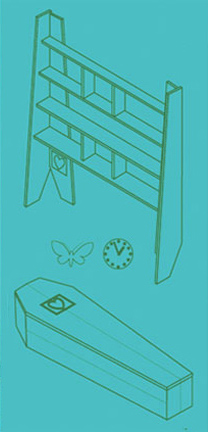
Some things you CAN take with you…
While doing a little research on repurposing materials, I stumbled across this bookshelf designed to carry you into the great ...