Ecofont: Color You Like, As Long As It’s Green
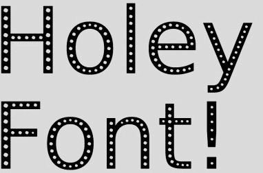 I just found out about Ecofont, a font designed specifically to use 20% less ink, thus saving money and lessening your environmental impact as you print (the elusive “win/win”). Using tiny holes in the stroke of each letter, it’s intended not to call attention to itself, while maintaining legibility — the idea being that you won’t miss what you can’t see. Despite the fact that I’ve built a career on choosing fonts purely based on aesthetics, I really love this idea. Particularly for utilitarian applications like directories and phone books. Plus, it’s free and available for anyone to use. For more info click here; to download click here.
Want To See More Content About Award Winning Art + Design?
Stay up to date with expert information on the ever-evolving beauty industry. We share the best practices brands are using to connect with consumers in new and meaningful ways.
More Like This

Those that can, teach. Celebrating the 40 year legacy of richard wilde
Last night SVA honored Advertising and Graphic Design Department Chair, Richard Wilde for 40 years of excellence in design education. ...
Fashion Designers Reimagine the Christmas Tree
Every year, big name fashion designers and architects create Christmas trees to be auctioned off for charity in Paris at ...
Tryvertising
It's the scent strip gone haywire. Marketing company, First Flavor, would like to introduce you to Peel n' Taste technology. ...