Pana-Mime
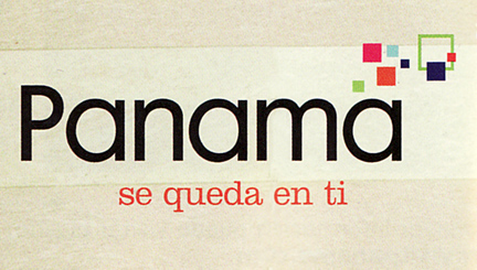 I came across this logo for Panama tourism in a magazine the other day. Does the colorful cluster of shapes look familiar? A little too familiar perhaps? That’s because it is! They totally ripped off the Bahamas logo! Ok, while I couldn’t verify that the Panama logo was designed after the Island of the Bahamas logo (small technicality), I can say that they certainly don’t wear it as well. Judging by this logo, I would think Panama is an IT company… Click below to see the (far more successful) Bahamas logo, designed by Duffy & Partners in 2005.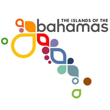
Want To See More Content About Award Winning Art + Design?
Stay up to date with expert information on the ever-evolving beauty industry. We share the best practices brands are using to connect with consumers in new and meaningful ways.
More Like This

Sheri and Spark to Host a Talk at the MYOB Conference
This September 25-28th I'll be attending the HOW magazine's Mind Your Own Business Conference in Austin, Texas. While I am ...
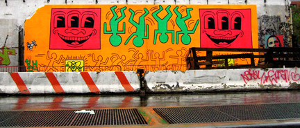
Street Art for the Haring Impaired
I was on Houston Street the other day and saw this Keith Haring mural. As a kid I was obsessed ...

Let Sleeping Cats Lie
Spotted on Spring Street: Life imitates art?